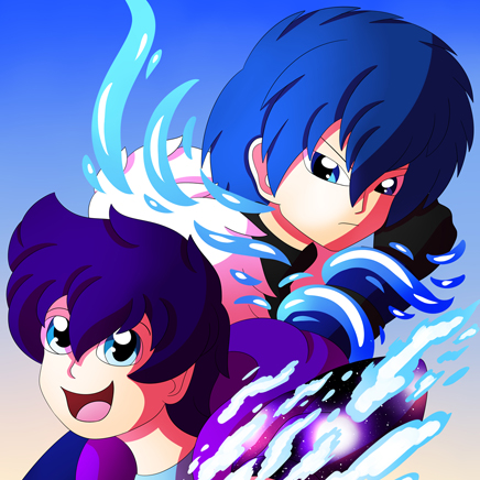
I won't go too deep into your comic, but the things that caught my attention were:
- the shadows are too dark
- too much saturation
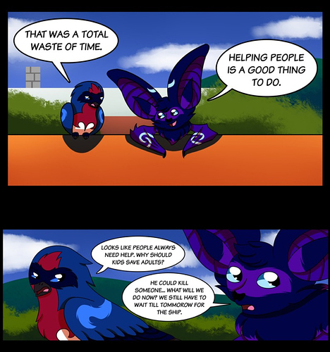
like on this example:
It's quite hard to look at it and your characters lose focus with so much bright and dark shadows. I would avoid using gradients like the one on the roof(?) to make the coloring more consistent (thought it could work well on shadows)
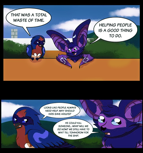
I tried to fix it with a very quick editing so you can see what I mean:
I also think you could go wild on your panels and lettering like, on the first page:
The action is on the left side of the second panel, but it doesn't give me the feel of something exploding(?), the duck's expression is pretty hilarious and it's a shame it wasn't on focus D:
This is what I'd do:
I used motion blur and increased the "BOOM" lettering to give extra action feeling
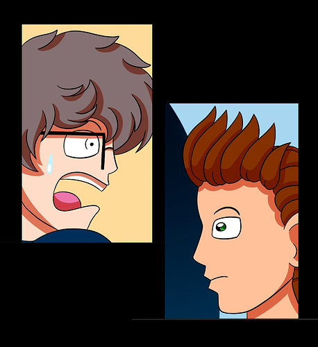
I know you are making in a scroll format, but if there is an action happening, or two characters having the same feeling at the same time like here:
Looking at it, I feel like it's pausing/breaking between their expressions (sorry, I don't know how to word this lol), since they are in shock at the same time, I did this:
(sorry for the grey line below, I just noticed it now e__e)