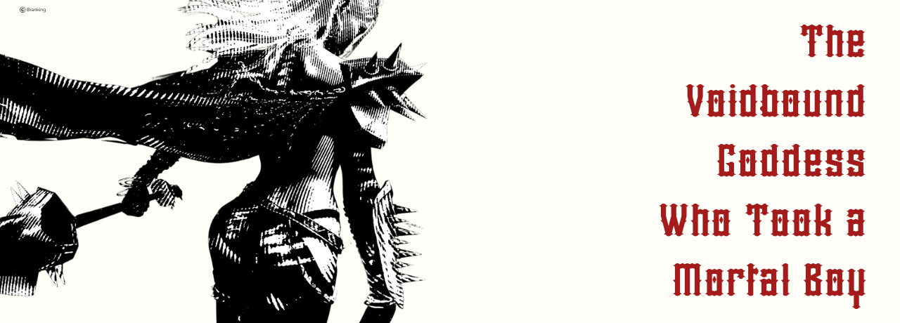
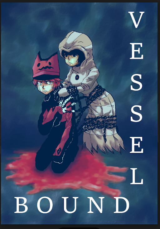
Cover 1(left)
Very good placement of character, title, and author name. The font is good and the background feels like it fits well. The foggy cloud aspect was a great use of extra space.
3.5/5
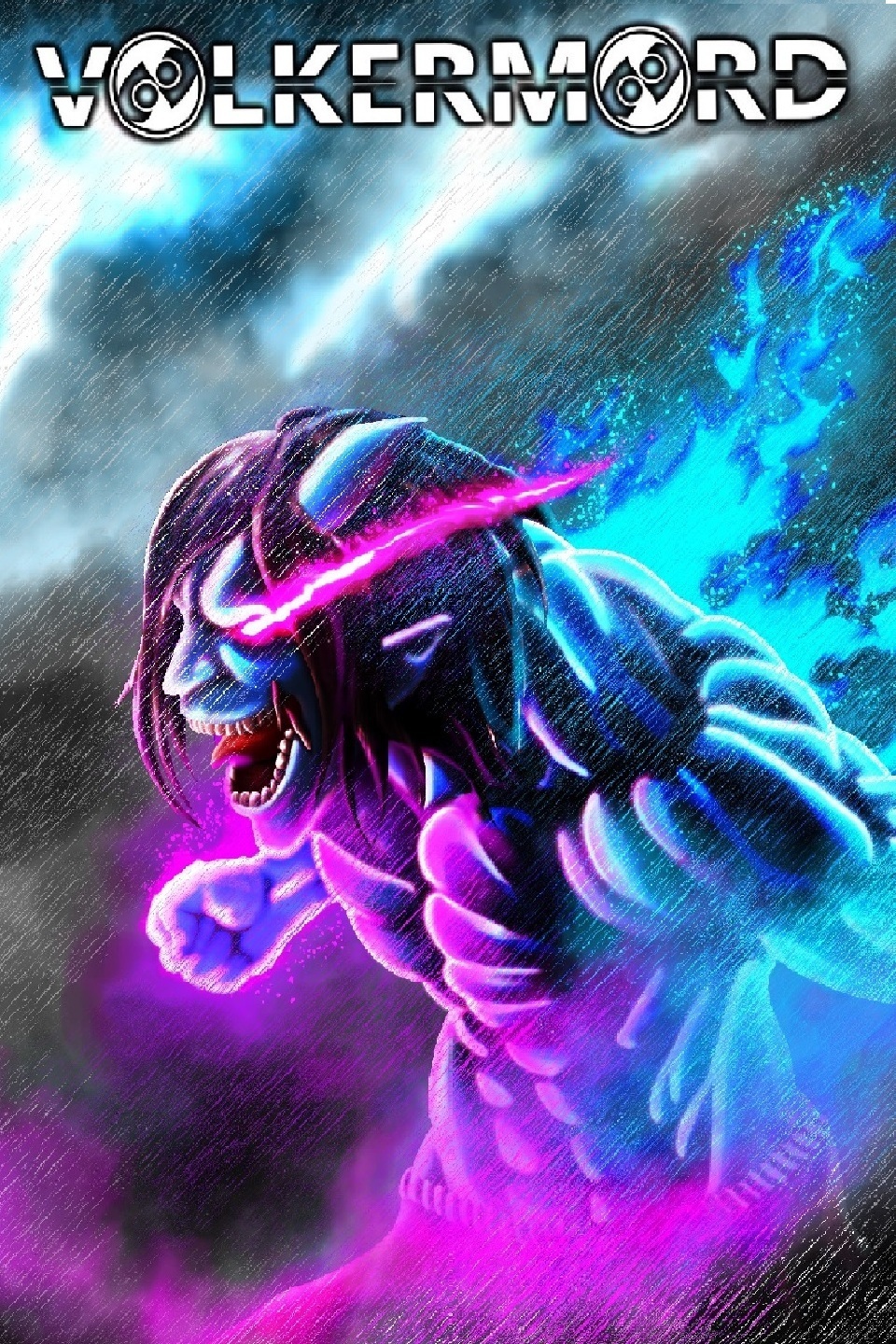
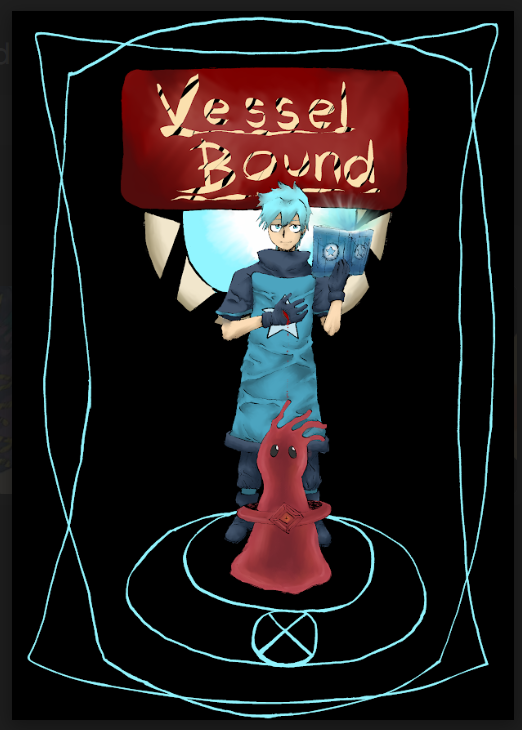
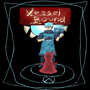
Cover 2(middle)
Same with font and placement as before. Very well done! The color pallet is better than the prior with the contrasting red and blue.
4/5
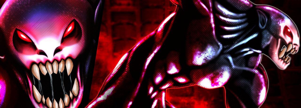
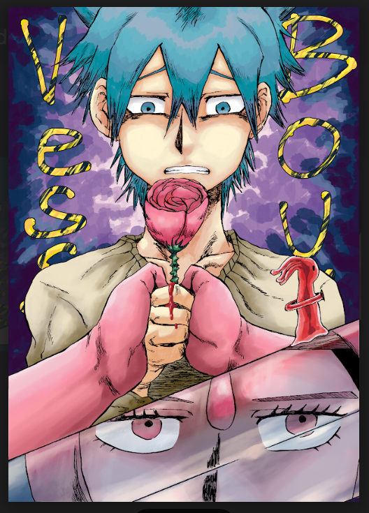
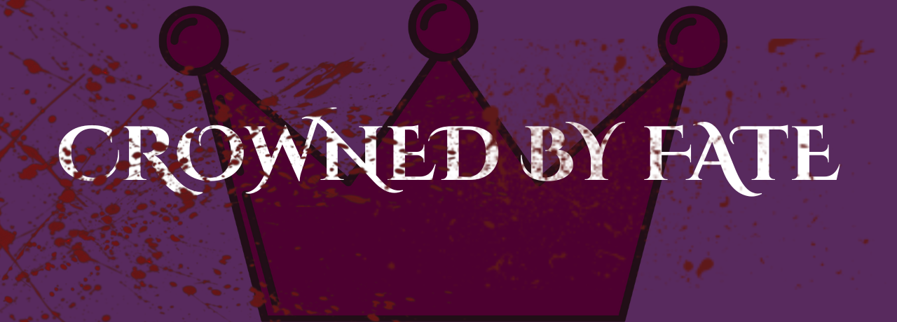
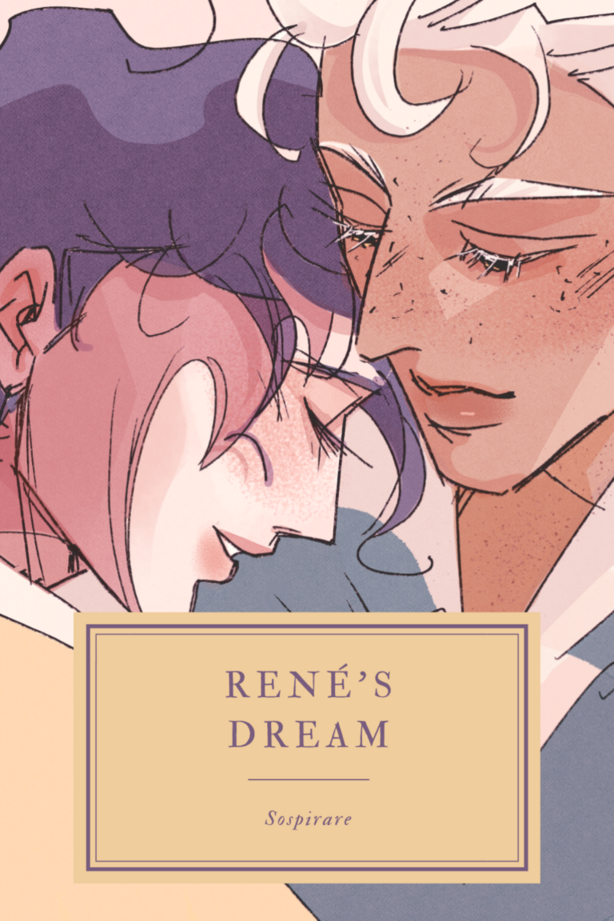
Cover 3(right)
Same font and placement as before. This is the best color contrast of the three. There is no wasted space and the character focus is perfectly on the MC.
5/5