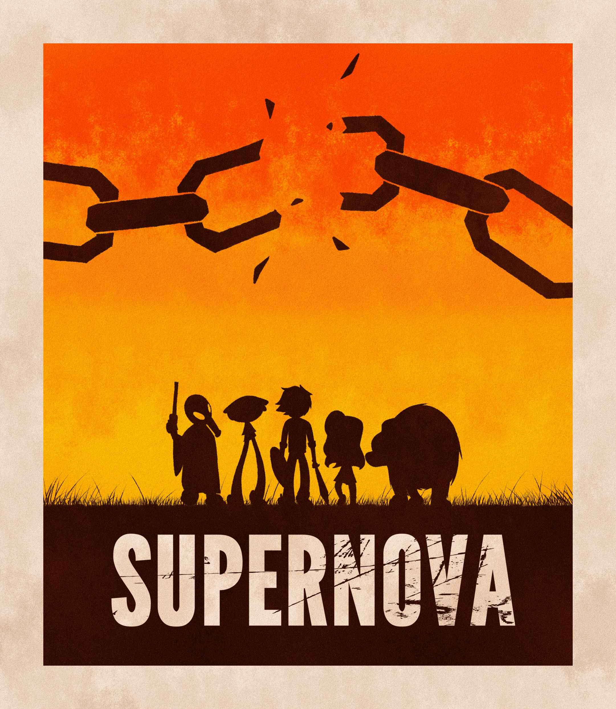
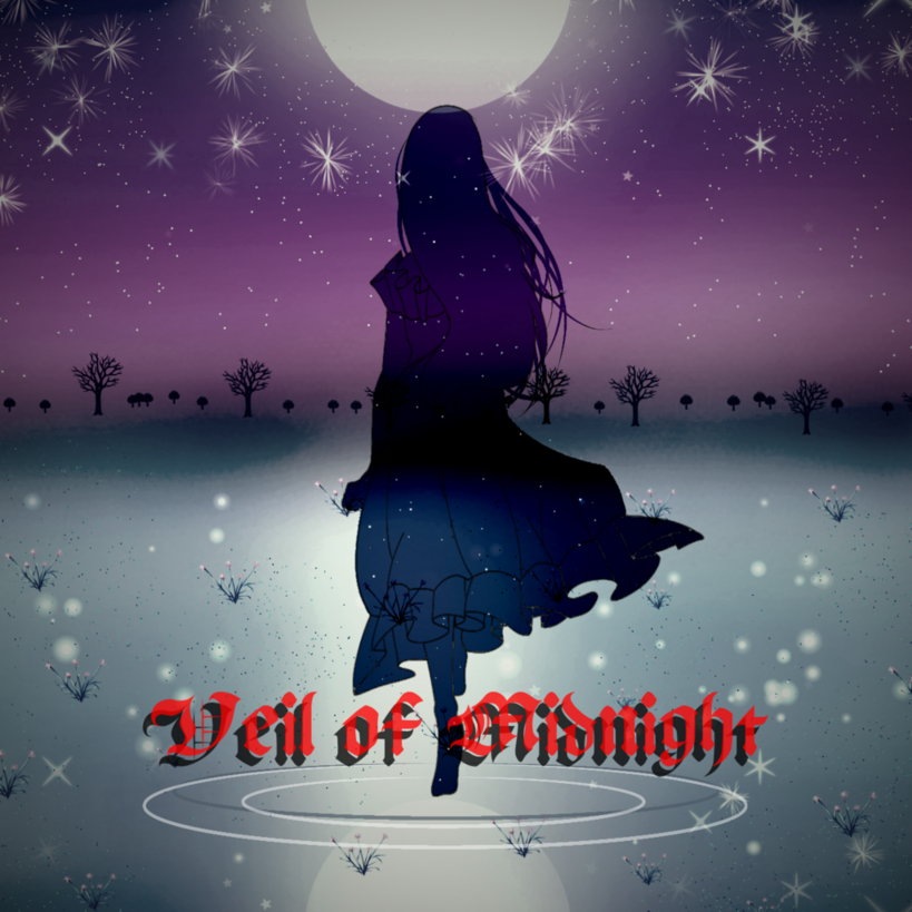
Volume 1
Good title placement and colors. Feels very similar to Disney's Aladdin. Character framing is nice with little to no wasted space.
5/5
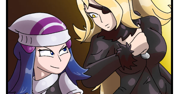
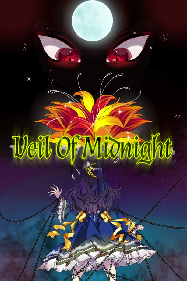
Volume 2
Same as before with the placement and font. The character framing is very good still. Though the color scheme feels like it melds together and makes it hard to focus between the eye and blades gem.
3.5/5
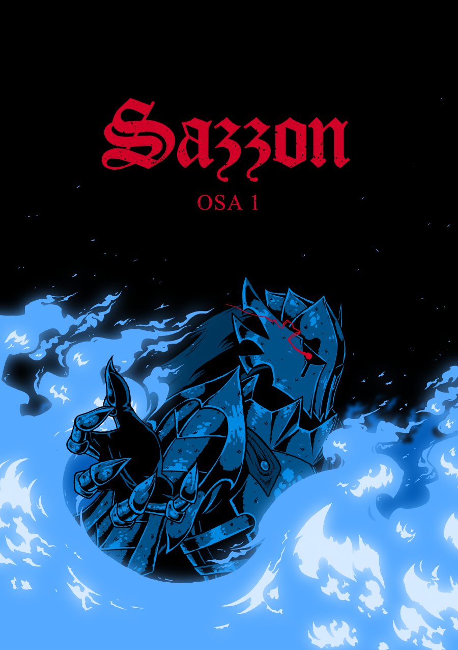
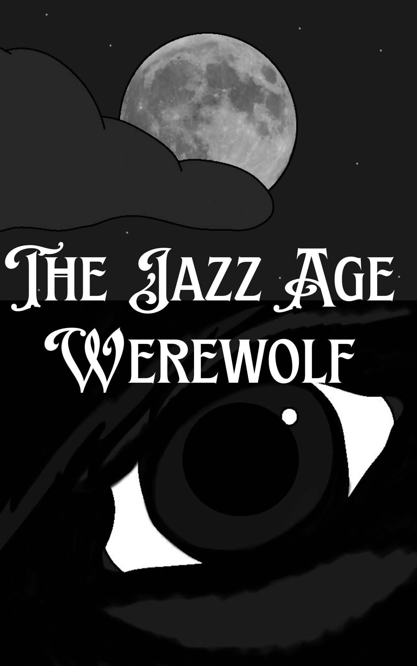
Volume 3
Same with the title placement and font as the last two. The color for the title is a nice contrast with the blues. However, it has a similar issue to the last one with the color melding but is not nearly as difficult to find a singular focal point. All three are really good.
4/5