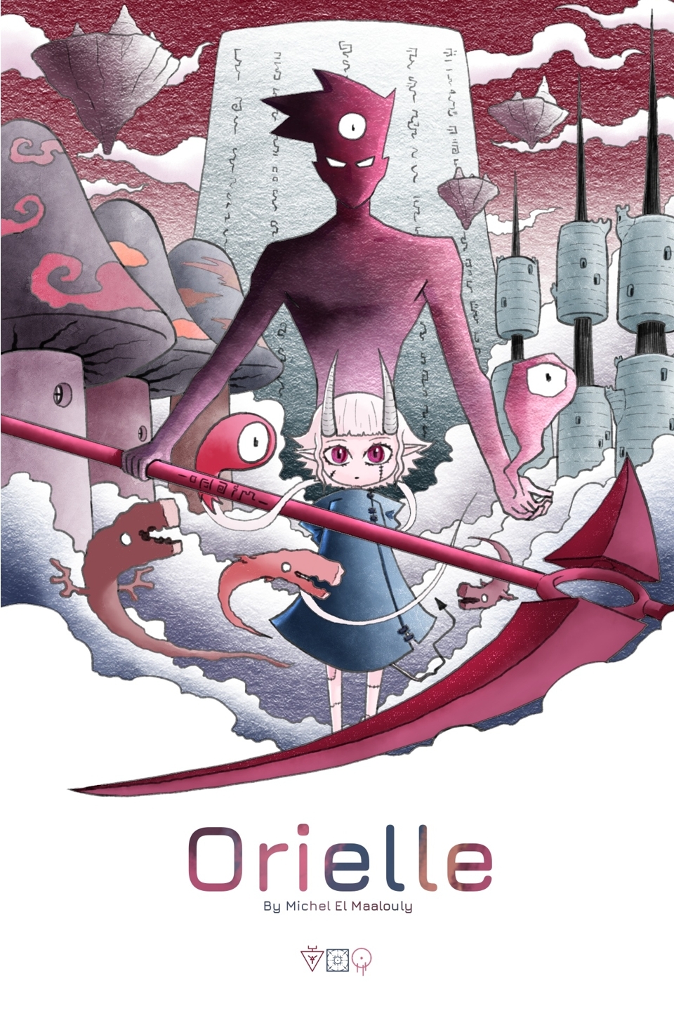
1.
This one is pretty good. The framing and title are good. The MC and the red creature are well placed and seem to be the focus. Good color contrast too. Though the pure black background leaves so much empty space.
3/5
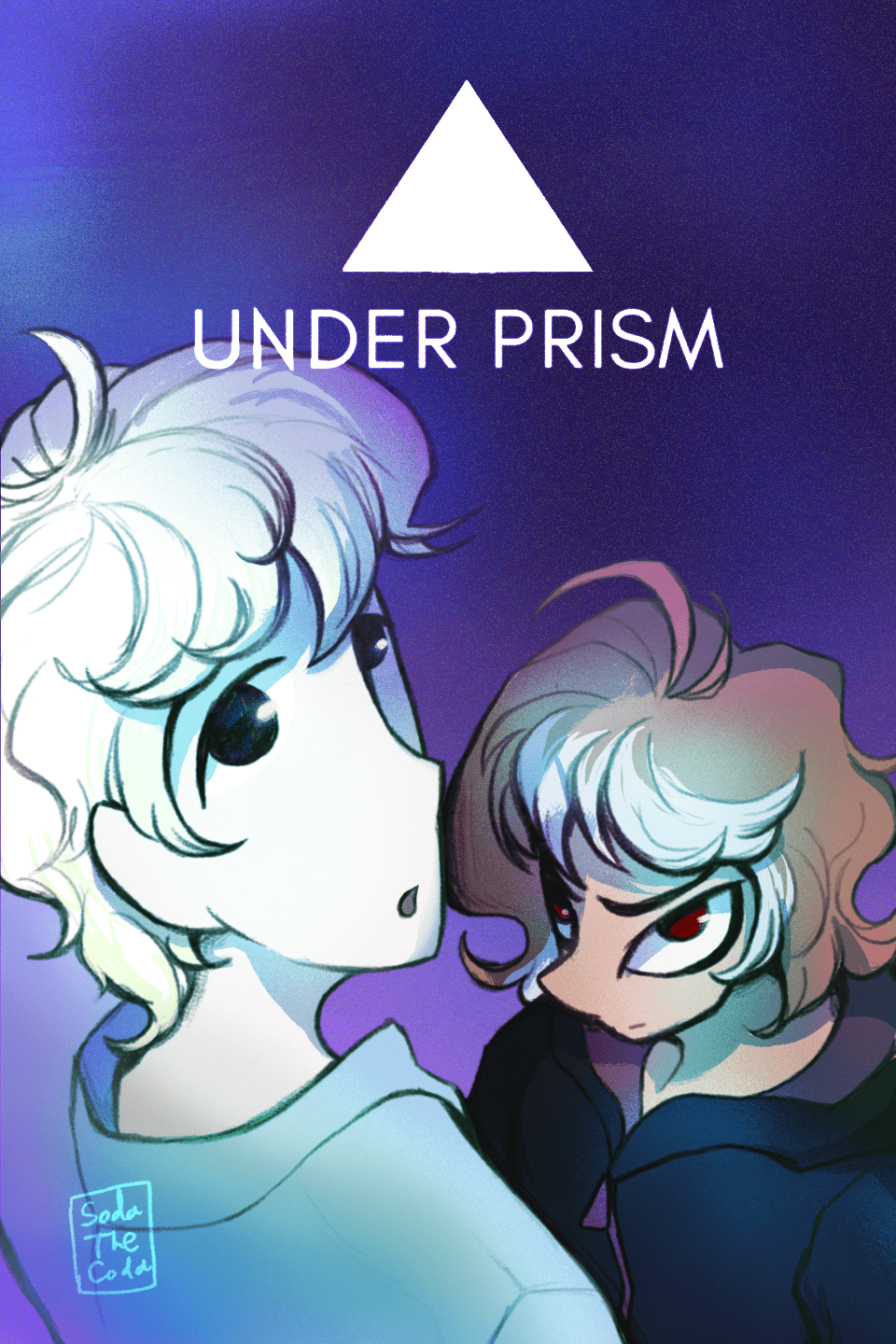
2.
I love this. The expressions, the use of focal points, and the color contrast are so good.
5/5
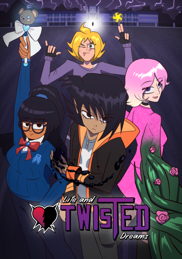
3.
This is good. Same praises as the prior except the title placement feels a little weird.
4/5
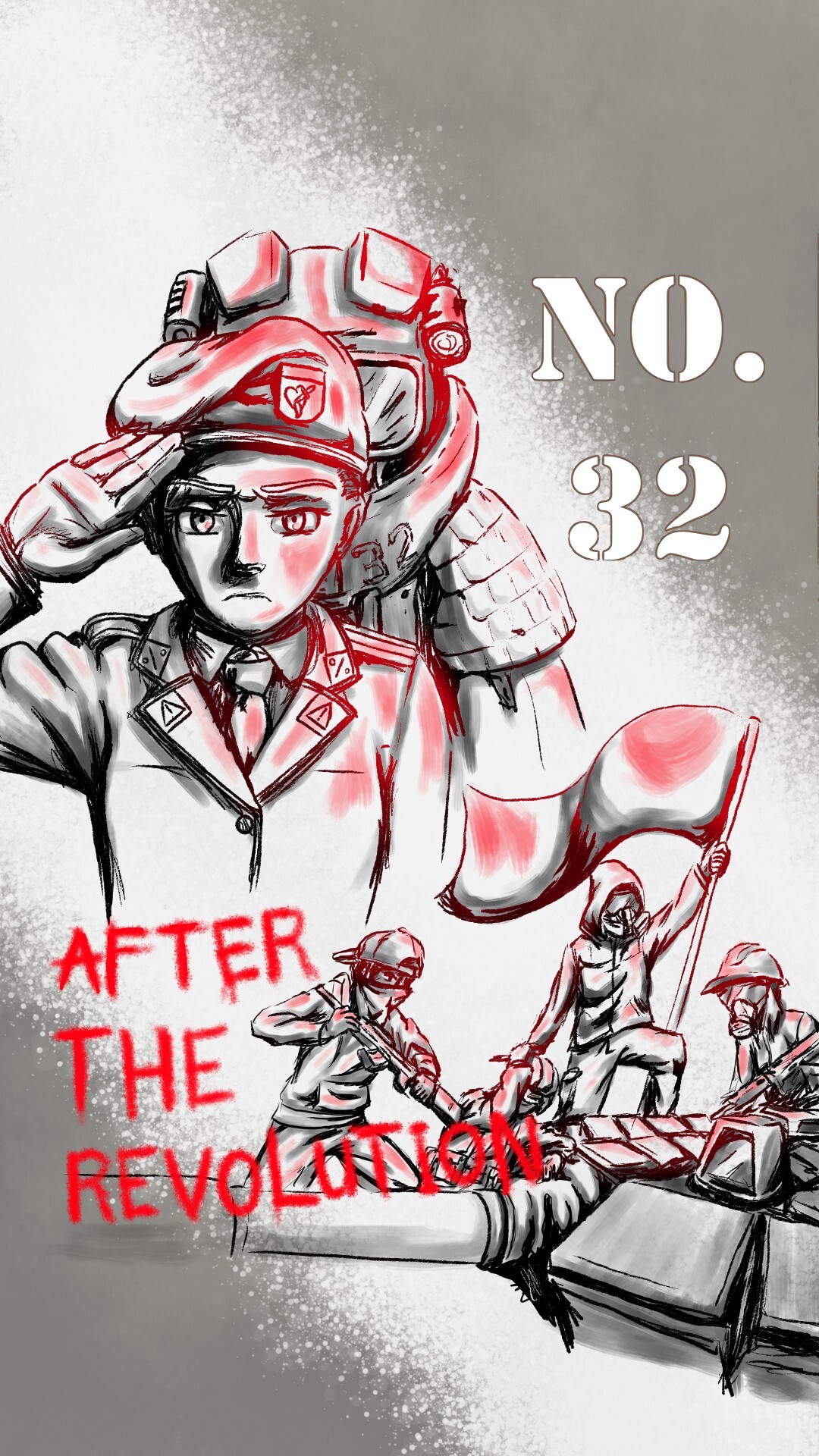
4.
The title placement is way better on this one. I love the character framing. It feels dark and foreboding. The colors look flat but that may be a stylistic choice.
4/5