4.5/5Simple, yet fits all the criteria of a good cover. The way the split in the middle sits, makes it hard to tell if they were cut in half, split themselves, or are stabbing themselves in the brain out of annoyance. Would rate higher if it included the authors name on the cover. That said, I am having a hard time figuring out where you would even put your name.
Thanks a lot for your feedback!
Here are my book covers:
3.5/5The framing is on the MCs face and the title is good. The font is accurate to Pokémon and Ben 10 somewhat so good job there! The lighting is good but there is a lot going on here. There is no wasted space though.
Here is mine : D~! Also, congrats on getting married~<333!
4/5Love the color contrast. Red and black usually complement each other. I would add your name to the bottom where there is a little space personally, so that you can be identified through the cover. The character focus and design are great! I am curious as to whether the name is "Rooted To Get Her" or "Rooted Together," which may be an intentional choice, but it can be confusing in the case of searching the title.
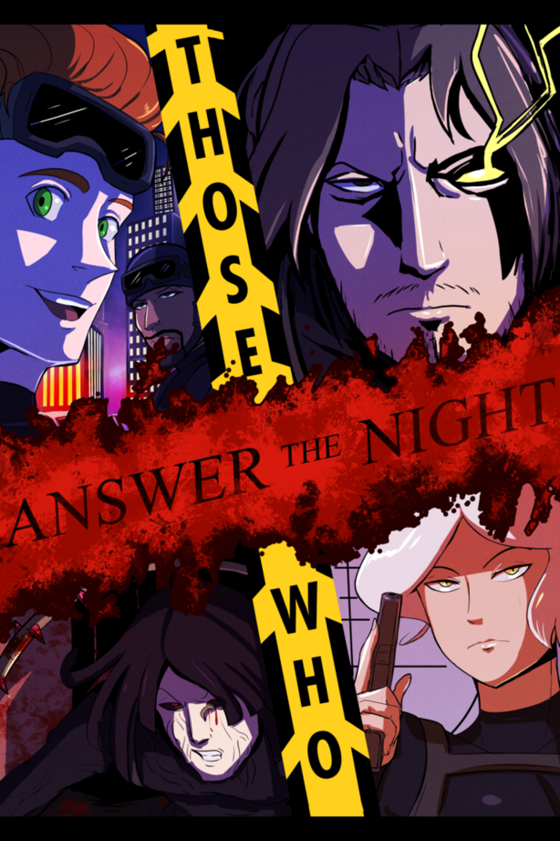
5/5Everything about this is perfect! It has intrigue, a dark setting, minimal color scheme, lighting, title, font, author name placement, sizing, focal point, and there is no wasted space! Masterfully done!
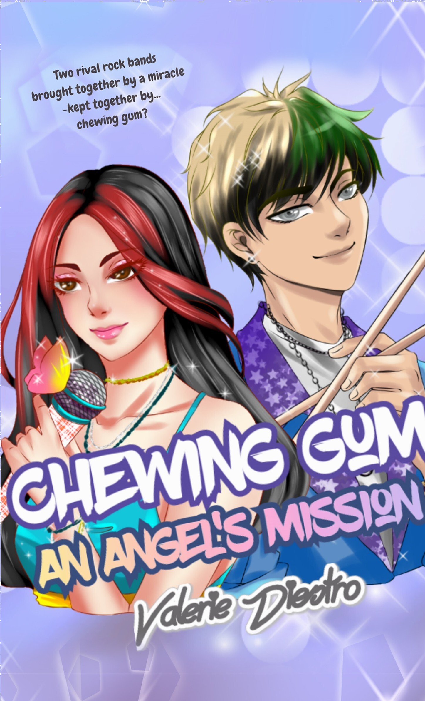
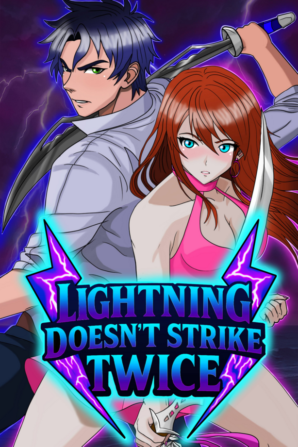
Novel cover4/5Good job using space. The characters are well focused. The woman's arm does bother me a little where it goes under his hand but that is nothing that I can remove points for, just a personal thing. The title, subtitle, and authors name have a great fonts and placement. Though you could make them bigger if you so wished.
Comic cover4.8/5The titles and author name are the same as the novel so my view doesn't change on that. The action dynamic is very good with good focus on both characters. The color palette and contrast is a nice addition compared to the novel cover.
Here's Issue 1's cover and the series link here https://tapas.io/series/The-Good-Neighbors-/info
I already did one for you but sure.
3/5
2.7
I like the lighting and the color palette. The title font is good for the style but the placement is a bit awkward. It lacks your name which is okay, but it is preferred. Love the character.
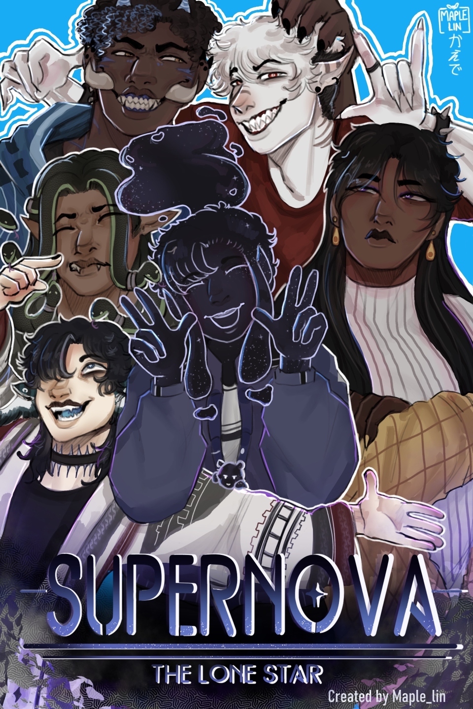
5/5 loving the style! Reminds me of the Manga, Monster.
2/5There is so much open space but I love the framing. The title is okay where it is but the font is too bland.
3/5Better. There's still a lot of open space. The font for the title is way better and the framing is amazing.
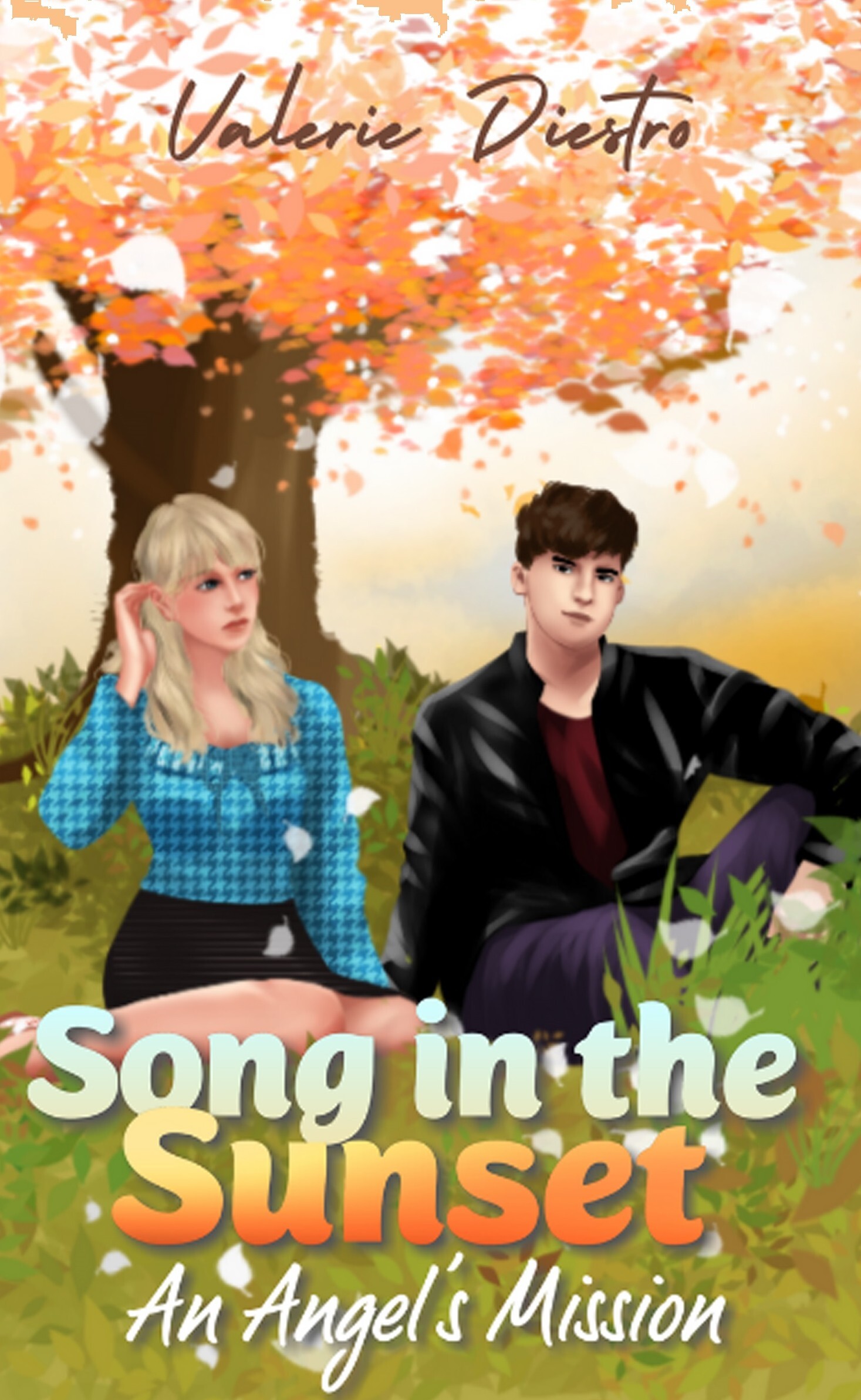
4.5/5Love the title font and placement! There's little open space and the character focus is great! The lighting is also pretty good.
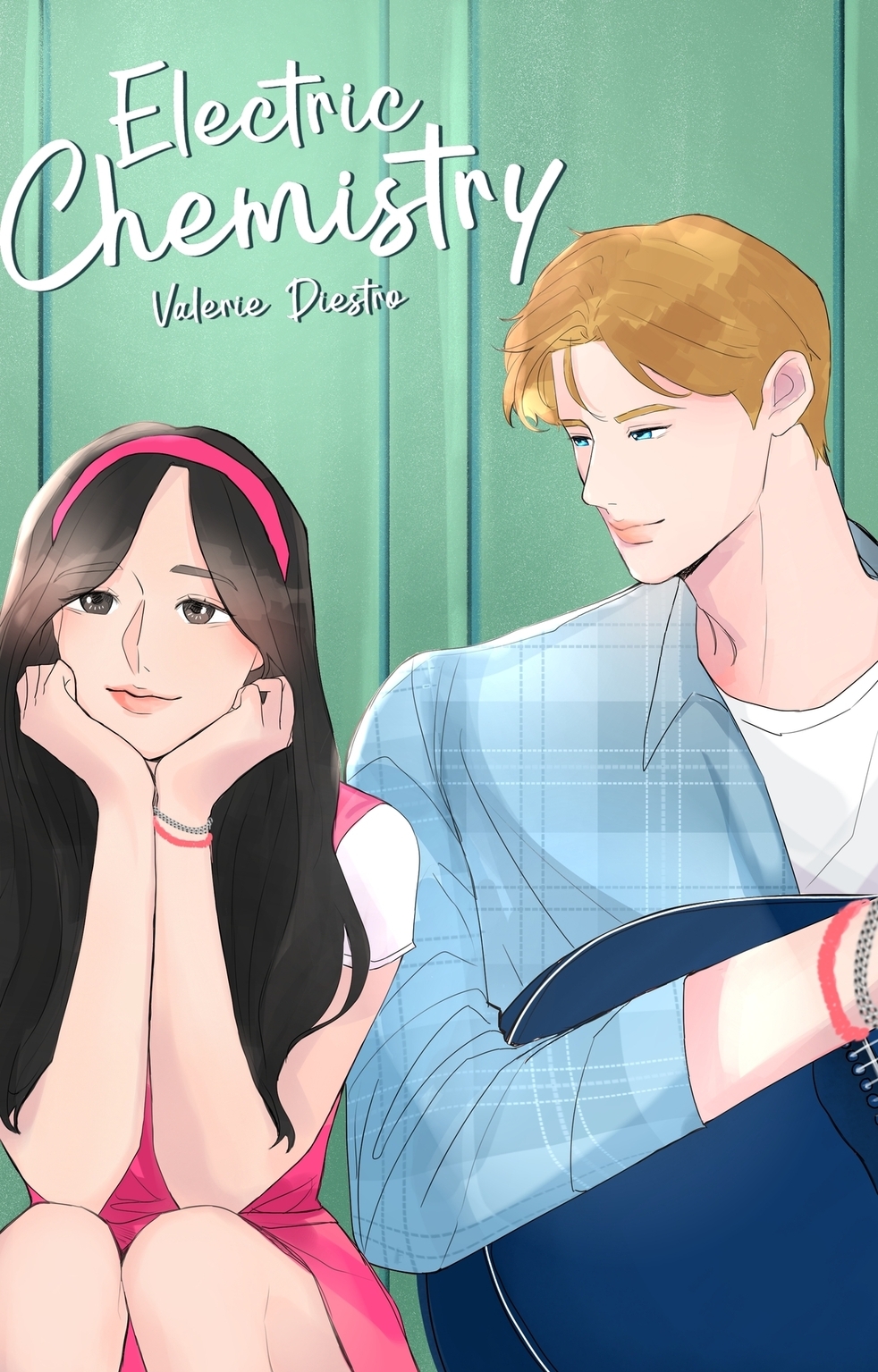
4.5/5Love it! The title, font, color palette, all amazing. It is lacking your name so I did lower the rating for that. Though that could be easily fixed or ignored, depending on your personal opinion.
This is my comic's cover! It's a monster world based comic!
This is new for the sketchbook/ side quest.
This is one of the most recent ones for Elsie but here we go! (I have two)
Newest addition to my collection
4/5
There's a lot less going on here but there is still a lot of detail that sticks out well. Compared to the other, I like this one better.
4.5/5
Looks pretty good and there's little to no unused space. I am lowering a half point for lacking your author name but it is good otherwise.