Thank you! lol If I had a penny for every time someone compared Traveler to Zelda...
I think, and no offense to any of the comics I've already reviewed, I loved those too, but I think yours is my favorite so far. It's just got so much personality and I absolutely love the crazy design of the world these characters reside in. Especially when they get to Phobos, I just really really dig it.
At first the pacing was a bit... excruciating. I nearly resorted to just skimming and giving a review that way, but I decided to push a bit more and I'm glad I did! I think the main thing that swayed me over was your dialog. It's a very dialog heavy comic, which works in this case since the art isn't supposed to be the main spectacle. You build up these character's motivations so well in the first portion that their actions (and how their absolute laziness and carelessness landed them in that situation) fit their characters perfectly. Also the subversion of audience expectations in the most recent gag is just downright hilarious (the chocolate fingers vs cocaine bit).
The art style honestly isn't my cup of tea, but that didn't keep me from enjoying it. You're very creative with how you use your panels. This particular one was good:
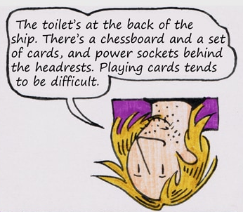
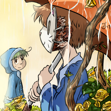
He's just upside down because they're in space. Brilliant. Like I mentioned before as well, your backgrounds are so detailed and interesting and full of things to look at, it's great!
Things to improve... The pacing does drag at some portions, I think this is in fact due to the dialog heavy aspect. Sometimes the dialog is too heavy, if you get my meaning. Some scenes took longer than I think they should have, but the pace seems to be picking up the farther along we get, so you're improving!
I don't know your process of getting your hand drawn art onto the computer, but maybe do a digital pass to clean up any small errors. Most notably, I can see the edge of the paper on each page. Some simple cropping can fix this.
I don't really have much else to say other than people should check it out! 20 subs is way under what you deserve!
Here's the link, people! https://tapas.io/series/Carlas-Adventures
Bonus round: Spend those extra minutes when you're typesetting to really make the text fit the word bubble. Sometimes the words aren't too even in the bubble, and I imagine this is even harder to do since you draw the bubble traditionally. Generally, as much space on all sides as possible is what you want to go for. Uneven text looks sloppy, and lots of people notice without even thinking about it. And you've got some whacky looking speech bubbles (which I love) so I bet it's even even harder!