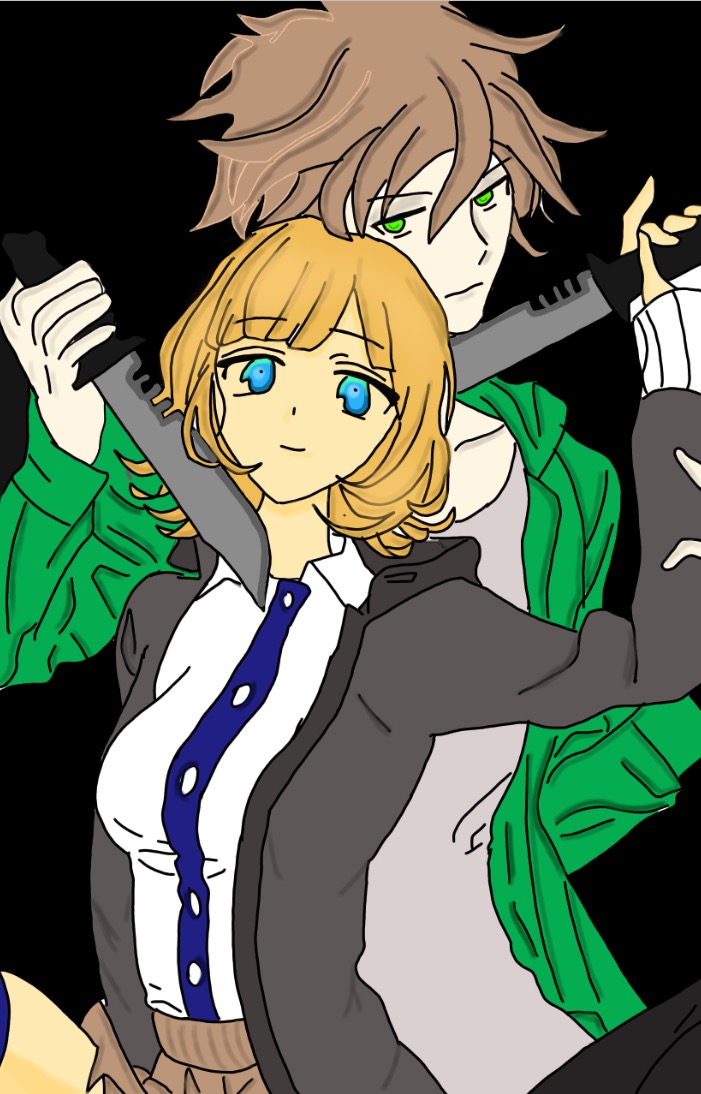
hey so i read the first prolouge, the art is not bad its pretty good just a few tips to make it look more prefessinal straight away.
I would add more shadown you have very light shadows and some panles hane no shadows on the clothes or anything at all.
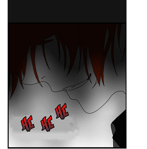
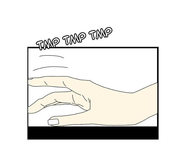
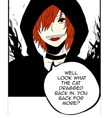
The lettering is really strange pick a diffrent font there are good ones out there such as anime ace ect.. that are used in a lot of comics, also youre font sometimes has this white box around it, maybe its the software you are using.
I allso think one or two backgrounds scenes would be nice you dont need to draw much, if you draw one then you pretty much dont have to draw anymore cause we know where they are. But for the prolouge its honestly probs fine.
The art istself is actulley fine like i said just mroe shadows and better lettering, lettring is big one and can make comics seem so unprofessinal and make a huge diffrence.