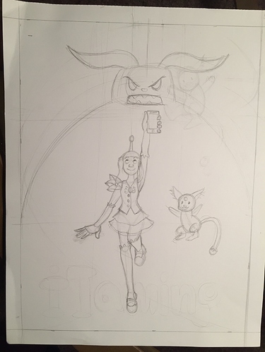
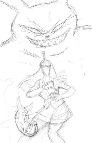
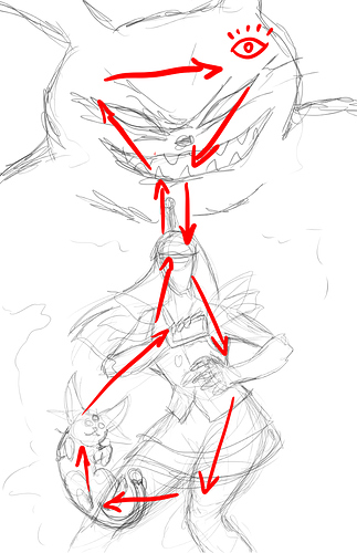
I agree with @cleo_san. Try different compositions so it doesn't look so boring. I took the liberty of making a quick sketch cover using the same characters on your original one to show you how I would have approached it.
I followed a simple law of 3s: Small, medium, large.
I tried to stay as close to your original idea by making all the characters be centered but I thought that is a boring composition unless you are making something that is completely symmetrical. I broke that line by giving the girl a more dynamic pose so your eyes are not just making an up-and-down motion.
As for the space around the figures I would use that to add lighting effects coming from the phone to show this is a magical girl and to get rid of some of that space since there's only 3 characters on the page. I would also leave that space as a form of frame for what's going on in the center and to create islands to let your eyes rest.
I would make more thumbnails before nailing down a cover but this is a good start. Personally I'd try more things with her pet because I'm still not sure about that, but take my quick sketch as a basis to go from if you want. Hope that helped you out!
Edit: I just realized I didn't leave space for a title haha oops, I'm gonna let you figure that part out!