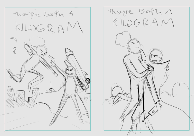
Love seeing how your typography is coming along! It's so cool that you've taken on the stuff I showed you in the banner feedback thread and you're running with it, applying your own learning and experimentation for more advanced text effects... YES! LOVE THAT!  GIVES ME LIFE! That perfectly executed cartoon 3D effect and perfectly matching the curve of the spotlight isn't easy to do, and you freakin' nailed it! Great work!
Though... maybe as one change, consider allowing a little more padding between text and the edges of the cover. I know that's rough when you have a long title. We all have little troubles we need to deal with with our titles and the space they take up, and yours is going to be that your title is a longboi. Generally, much like with speech bubbles, if you can add at least one letter's width of padding, it'll look good. Unless you're very deliberately going for a sort of... flat graphical style where the text is bleeding right to the edges (I know there's a designer on the forums who's given advice on another thread on covers who really likes that look, and it is a look that a designer can really make work, but I also feel like it's a look you really need to know a lot about design to make it work, so I tend to advice the "anyone could make this work" approach, especially on text with fancy effects like this).
A couple of things to talk about with this cover...
Meaning and Intent
There's a bit too much space here that's just a blank wall, and the character's relaxed pose doesn't really give an exciting impression. The shadow she's casting of a different character is interesting, but it's not really exciting because the cover is very dark and the shadow seems to also be just hanging out.
Another thing you might not have thought of that I'm going to bring up. If you put Superheroes in a yellow spotlight in front of a wall, a lot of people will asssume you're homaging this absolutely iconic John Byrne Days of Future Past cover:
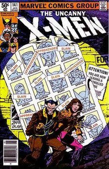
Because usually when a hero is in front of a wall in a yellow spotlight... they are referencing it!
Partially due to the cultural impact of Byrne's cover, and partially due to just... artistic shorthand, if you put a character looking fairly small inside a spotlight against a grungy brick wall, the emotional effect tends to be: "Oh damn, grim dystopia! Heroes with their backs against the wall! Heroes being hunted down with search lights! ...But then the character looks pretty chill about the whole thing and so the overall emotional effect is confusing. It's hard to tell how we're meant to feel about this comic. Yeah, she has a shadow that's doing something different, which is kind of spooky in concept... but the shadow doesn't really contrast what she's doing; it's also just chilling. It lacks a unified emotional message, or a strong and intriguing contrast.
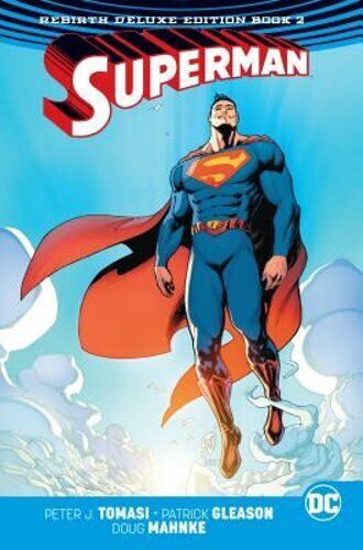
When you're thinking about a cover's content and layout, try to think about what you're trying to get across to the audience about the tone and ideas they should expect. What makes this superhero interesting and worth the audience's time? The Byrne cover was powerful because instead of showing the heroes powerful, it shows them small, hunted, weak, and their faces look afraid. By contast, a cover showing the power and freedom of a hero who can fly, might look like this:
Or one where the point is that the superhero is interesting because they're dark and menacing, not a typical heroic saviour might look like this:
Here's a good resource on composition that might help:
https://thinkinganimation.com/Handouts/StagingAndComposition/Composition-Artists-Course.pdf
In summary, a big step forward for you will be to start thinking more deliberately about where you place your characters, making choices about what environment, what angles and what distance to intentionally get across meaning and emotion.
Too much yellow.
I like the idea of the grungy, yellowish, dim streetlight, but I feel like the amount of yellow here is just too much, and it's dulling down the white and blue costume of the character, which ought to be standing out, and pushing her skintone a bit close to the wall behind her. Maybe try not having the yellow filter on her, so that her blue scheme contrasts the yellow text and yellowish wall? Alternatively, LizardLullabye's suggestion of the opposite: Blue wall, warm character can also work. I think maybe trying to have the blue and white costume pop though is important. The colours and style of a superhero's costume are important, as is showing off the design of the protagonist.