Composition is really important for cover images. If you're using a stock photo, most of this will probably be covered for you, but if you have elements that you want to move around, you want to make sure that the important ones are in a place where it catches the reader's eye. I think this post does a good job of explaining it:
Also, this is going to sound obvious, but make sure you have space for your title. I almost messed this up on mine. I was originally going to leave it at this, but I realized I have a lot to say about titles.
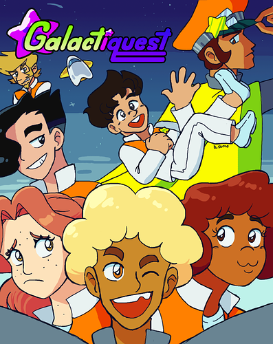
The color of your title is important. It needs to not clash with the rest of the image. My general rule of thumb for any picture is to have a color scheme of 3-5 main colors. The main colors in this picture, for instance, are blue, yellow, and orange. Purple doesn't fit in at all, and while there's some green in the rest of the picture, it's not really ideal for this title. Also, the purple on "quest" is very dark with a dark outline and a dark background, making it hard to read.
Note: Black, white, and sometimes grey are neutral colors and will work with pretty much any color scheme.
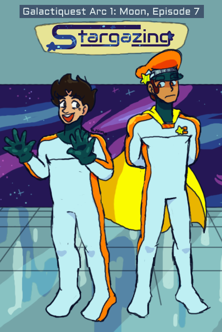
This is my previous cover and logo. The colors are mostly okay (I don't think that gold color on the stars fits with the rest that well), but it still clashes with the rest of the image. This logo is very small and not readable on a thumbnail or smaller screen. It's also very sharp and squarish compared to my current, more rounded style. It doesn't fit the vibe of the image or the story, which is an important thing to take into consideration when you're choosing a title font!
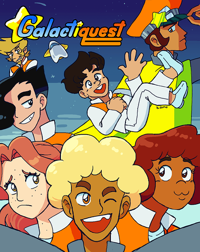
This is my current cover/logo combination for comparison. This title is hand-drawn, and I like it, but honestly, it took a lot of workshopping and there's a lot that can go wrong. Luckily, drawing a title by hand isn't the only way you can personalize it!
You can do a lot with fonts and an image editor. I personally use Photopea, a free, browser-based art program that someone already linked to above. Since Photopea is modeled after Photoshop, a lot of Photoshop tutorials work for it. Like this one, for how to edit letters in a font.
I think I referenced this video when making the title text for this. "Stargazing" was a font, but I elongated the S and the tails on the Gs, among some other little flourishes like drawing stars and stuff. You don't always have to edit a font, though. The text above "Stargazing" isn't edited at all. However, it's generally best not to use a common font like Ariel, Times New Roman, or Comic Sans. Photopea comes with a lot of fonts I've never seen before. Another reason to use it!
If you have a title color that's too light for the background and don't want to change it, adding a dark border can really help. Or vice-versa!
Photoshop/Photopea directions for a quick border around your title logo:
Click on the layer with your logo, go to the top menu bar and select Layer > Layer Style > Stroke. That should take you to a window that lets you edit the border color, size, and some other things.
I think that's about all I have to say for now. Hopefully these are some relatively quick tips that you can do without needing to know how to draw.