The art and flow is really good, I've just checked out the first five episodes.
The issues I find with it are within the lettering and tangents.
I would firstly recommend using a font that's more typical in manga or comics. SF toontime is pretty alright, but there's definitely better ones out there. Also, some speech bubbles have the text too close to the edges, it would be great to give them some breathing room.
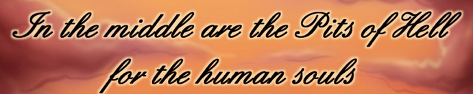
Personal opinion but I would be careful with cursive fonts like these
they can lower readability, especially if their colours don't contrast with the background.
Using curving or longer speech bubble tails and directing more to characters' mouths is also something I'd like to see more in your comic.
I'm not sure if you're familiar with the term 'tangents' in comics but this is basically when lines touch when they are better off intersecting or not touching at all, and the effect disturbs composition a little bit. I see this mainly when characters' horns are cut off by the panel edges, I think adjusting this to show the full length of their horns with enough space would be great!
Good luck with your comic! It looks like it has a lot of potential!