Hello there! First of all, I would agree with @sprite_1ww, it would be better to make text bigger. There is a text on page 22 that is almost impossible to read on phone 
Also, I'm not a fan of these transparent speech bubbles, most of the time they are hard to read, especially when there is something with line art on their background, like here
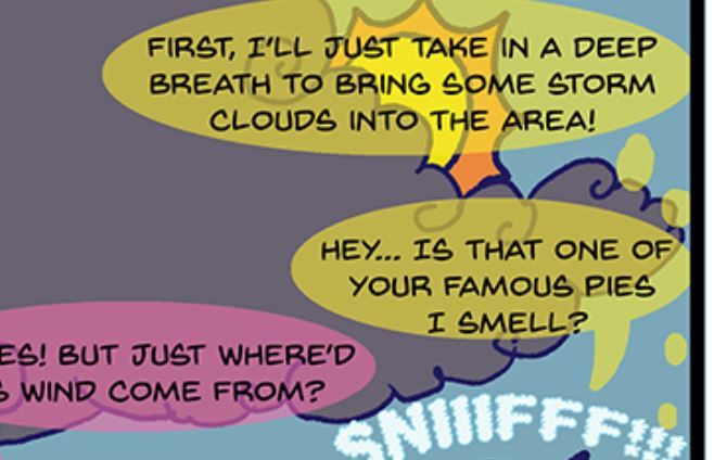
The "tails" of bubbles look unrefined and too thick!
And it would be better if you add more space between frames (or panels? how do people call them actually? I call them frames), now they look way too concentrated.
Sorry, I cannot really comment on the plot (I am just an artist), but I think with more practice you can make quite cool comics for kids or maybe some funny everyday strips or something like that =)
