Hi there!
Thanks 
What are you not 100% happy about? You did a good job already!
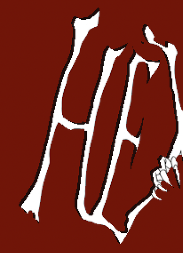
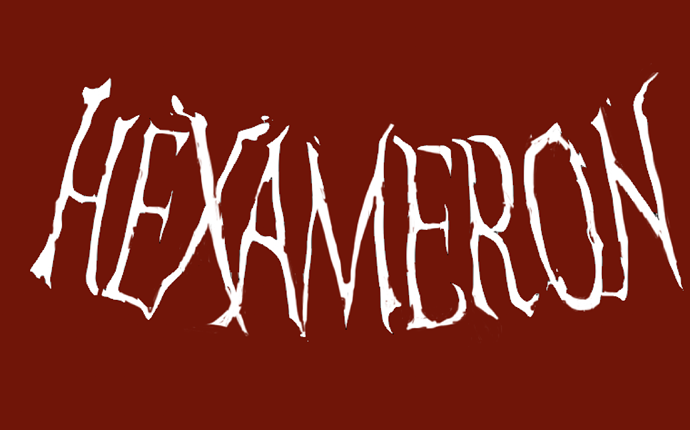
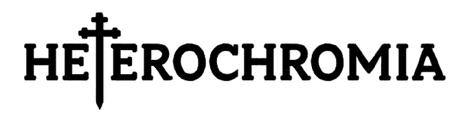
The font choice that you've made is quite friendly and contemporary because of the rounded serifs, and also it evokes a fantasy (videogame?) universe because of the serifs and the sword. Maybe I would need to see the style of drawing to be more precise.
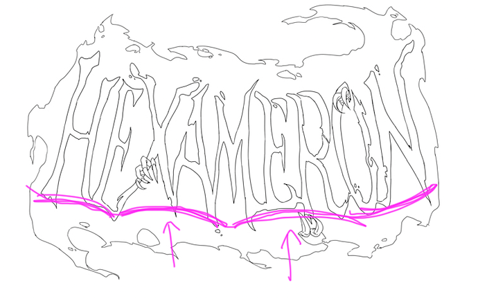
I got the thing with the T / cross / sword.
I think it works well with what you've told me about the story. I will give you an option about how to be darker below.
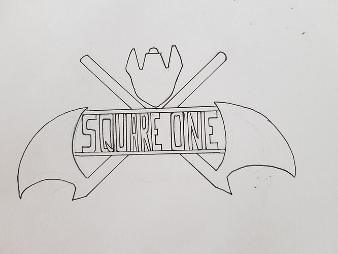
So first let's look at what we have. Honestly the drawing and silhouette are already nice and sorta clean. But I'm a typographer and we can't stop here hehe. We can perfect this!
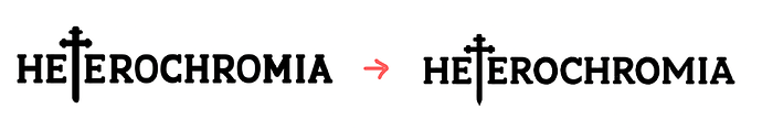
Soooo it's time for a little free lesson on optical corrections  (yeaaah technical annoying stuff)
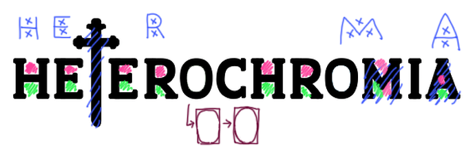
— Some letters appear too bold, because like many beginners, you struggle with their width and try to have them all the same width, and some who need space end up too narrow (M, H). A is too bold because of diagonals. Diagonals and horizontals are tricky, they appear bolder than vertical lines. Also the sword is too bold.
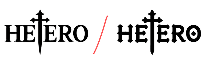
— White space needs to be placed evenly inside and outside every letter, on an optical (and NOT geometrical) point of view. For example, the counterforms of H, E, R and A are divided in two white spaces (pink and green) which need to appear the same size. In reality the pink space has to be a tiny bit smaller than the green one because the eye always sees what is on top bigger than it really is. (tip: it works with any letter made of two parts: B, S, 8, 5, 3…)
You did well with H and E but R and A are unbalanced.
— Round letters like O and C turn weirdly: we call those potato shapes 
Here is what I did:
— enlarged H, O, M, A
— modified the shape of R to balance counterforms and avoid it to look like a P with an added diagonal. Withdrew the inside serif for better looks
— made O and C look rounder
— changed the shape of C and M for better looks
— I fiddled with the shape of the sword to try to make it more similar to the letters and their serifs but that's not necessarily a fantastic outcome lol, I let you handle this
I made it more pointy at the end because it was potato-ish.
Now if you want something darker, I have two options for you:
I kept the structure the same as before.
- litterary / cemetery style, with high contrast and pointy serifs (looking freaking serious)
- or a bit friendlier by adding gothic ornaments (diamond serifs)
That's all for today