Hey you!
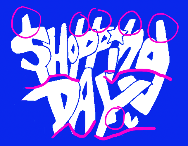
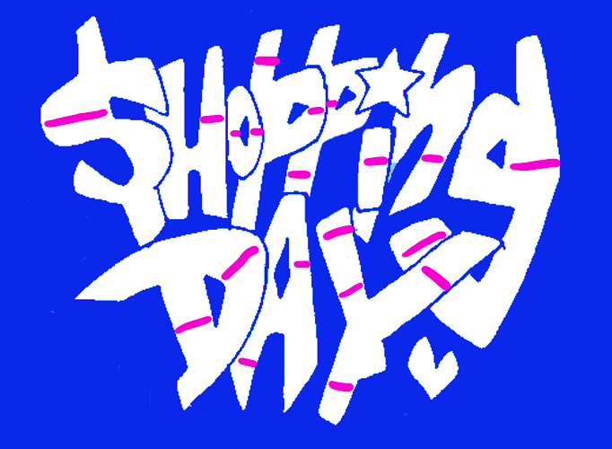
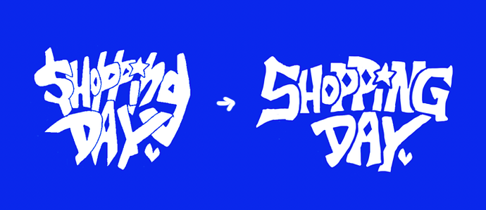
Typography is not your friend? You hate the moment you have to choose between the 12 098 775 fonts available on the internet? You always struggle to make the text fit in those darn speech bubbles? You tried drawing the title for a cover yourself but ended up turning to Comic Sans out of despair?
But you and the world KNOW your comic needs appropriate typographic choices for a quality feel, and to compliment its awesomeness.
Worry not, dear fella, for I (and others) can help!
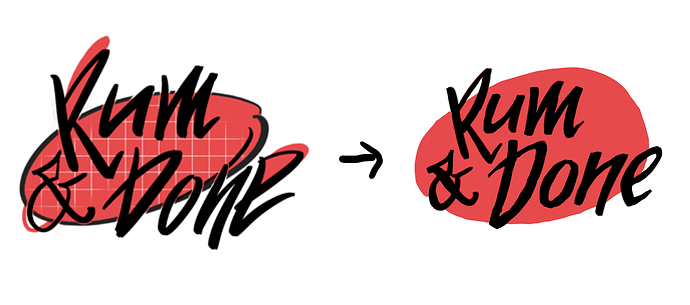
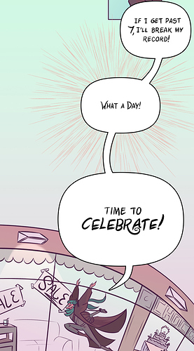
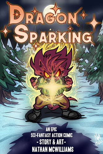
As you can't see from my own comic that has a hasty hazardous handmade lettering, I'm a typographer + graphic designer and have been teaching about typography for a few years  (so you have to take my word for it aha)
Show me your stuff and I will be happy to give any advice to help you on your quest of the perfect drawing / text combination.
Also if you have psycho questions on things like rights of use / technical format stuff / legibility / kerning / custom fonts / multiscript typefaces / why you should not use Comic Sans, I'm your dinosaur.