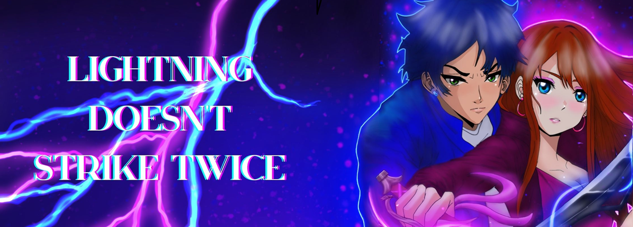
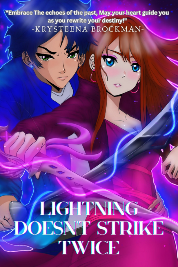
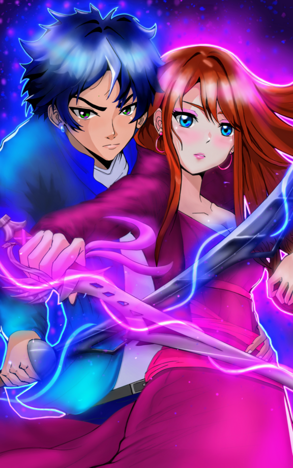
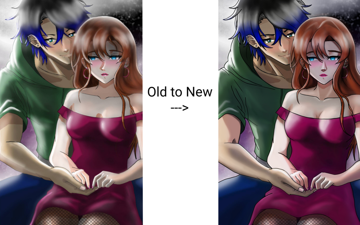
The issue isn't Croppy, I use it for Tapas and Webtoon and the quality diffference is barely noticeable. Here's a comparison of the 3 versions of one of my panels.

I think what people mean with the comic looking stretched is the blurriness of your images, this isn't the issue with Croppy, the problem seems to be in the raw image itself.
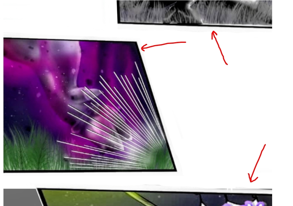
Looking through the panels there's different degrees of blurriness between them, not all are the same. This tells me that when you imported the image, they were much smaller than the 1600 pixel canvas you created and you scaled it larger depending on how you wanted the composition to look. It is mostly obvious here.

The border in the red circle is more blurry and thicker than the one in the green circle, which looks relatively sharp. This means that the image of the trees was orignally much smaller and you just scaled it up while the image of the girl in shadow is relatively untouched.

The grey background with the white cracks you seem to have drawn straight into Clip Studio Paint with no scaling, so it is nice and sharp, compare it with the panel with the flower and the text which is quite blurry.
Your "Stretched" issue seems to be the imported images are too small, scaling small images larger will always result in blurry images. It's recommended that the images be twice the size of your comic canvas and then scaled smaller to avoid this issue. My image panels are originally 4000pixels wide that I scale down to a 940 pixel wide canvas.
If the canvas for your comic is 1600, your images should be at least 3000.
Oh, one more thing I noticed, your panels have terrible compression, because of the blurriness and artifacts around the lines, this means your images have been saved in a very low quality JPEG. You want to save your images in as high quality as possible, so TIFF or PNG are better options.