1 / 6
Jan 30

I've been in the art world for a couple of decades and recently I wanted to try a much more stylized and free approach to design. In particular, I tend to make webcomics, usually more like this style:

And the style I want to try is more this style (this is sans shading and all that but you get the idea):

I've tried to get feedback from what sources I can but literally nobody has responded, and it makes me feel like that in itself is a bad sign. I just need actual genuine feedback. I've looked everywhere and literally made an account here to ask about this.

The comic I'd use this style for is very much a fantasy adventure with dark humor, a bit of romance to round it out, and is aimed largely toward 20-30 year old range.

Also while I appreciate that it's totally fine to draw for yourself or what 'you love to draw' or whatever, this is how I make an income, so for me it's a bit more than just drawing for a hobby. It's important to me that it's marketable.

  • created

    Jan 29
  • last reply

    Jan 30
  • 5

    replies

  • 173

    views

  • 1

    user

  • 8

    likes

It's tough to make a living from webcomics in general. There's nothing at all wrong with doing a more graphic style - having a consistent and unique style gives you a visual trademark and sets you apart from those cookie-cutter manhwas and AI drivel.

This style could work, although I feel like it's not quite there. It seems inspired by Hazbin Hotel, which could be both a blessing and a curse - Hazbin Hotel is very recognizable, but I felt its character design was one of its weakest aspects.

There are a couple changes I'd recommend that might make these work better. First, I think these would probably look better with a heavier inking style. Thick, expressive outlines and some sketchiness could really help you push the shape language more. Second, think a bit more about the group and how the characters work together in a scene. All of these have similar shape language - very thin waist, elongated limbs, sharp facial features. Even though their outfits are radically different and their palettes are different, I get the impression that they all have the same vibe and personality (that was a problem in Hazbin Hotel, too). If all the characters would react pretty much the same to the same situations, they should be developed more.

The characters read to me as Hazbin's Alastor (on St. Patrick's day), Annoying imp, Mean Vixen, and Disney's Hades (at a rave). Is that what you were going for? What if the imp was fat (or not even humanoid)? What if Alastor was a middle-aged guy instead of a teenager?

One thing I'd like to see is a test page where you can see these characters interacting together. I did a few for my comic, going back to the drafting board several times. One of those ended up being by far the most successful thing I'd done to that point, so I knew it was the way to go.

I hate to be such a downer on these! By themselves, each one is a just fine OC, and your art skills are very good. I like the vixen the most - I'm a sucker for fox characters (if you couldn't tell from my comic). She'd be a great antagonist to someone who was very naive and pure. The imp looks insufferable. Rave Hades seems like the stereotypical bad boyfriend that some nerd thinks he's competing against.

Getting a cast together can be a real challenge! I applaud you for working to get feedback before you're halfway through your first chapter - it shows professional wisdom and experience.

Your artistic skills are quite good. I'm not sure if I can give you useful feedback.

Perhaps one important reason why there isn't much feedback is because most people are unable rather than unwilling to provide it.

If I have to give some feedback, I think for that kind of flat style without shading, perhaps using thicker lines in the linework would help make things stand out more?

That's all good feedback, thank you. I haven't seen Hazbin Hotel but the style I'm sure is probably similar, I think I've seen stuff from it before on pinterest. I'm very inspired by the likes of Tim Burton and some of the old Nickelodeon cartoons (like 'Him' from Power Puff girls).

These characters aren't really anyone, it's more just me playing with the style and getting a feel of what I want to do with portions and stuff. I'm a huge nerd for shit-eating grins and so I probably played too heavily with that, lol.

Thicker lines though I think is a good idea. I think that'd help.

That sounds like a blessing and a curse, lol. I don't think I'm that great though, but thank you anyhow. I agree with thicker lines, I think it'll pop more. I admit I didn't bother shading these but I'd probably just go with typical cell shading anyhow.

I think the reason you haven't gotten much feedback is because you're at that awkward stage in artistic development, where you're actually starting to know what you're doing...so most artists (i.e. beginners) have no idea what to tell you, and the few that are left who DO have an idea of a criticism may have a hard time figuring out how to articulate it. The problems are there, but they're not obvious...they're indicative of the more complex aspects of character illustration.

I agree with @jwabeasley; this new style is definitely giving Hazbin Hotel...but unlike those characters, yours aren't really leaning very hard into the 'cartoon' vibe. You mentioned Tim Burton and the PPG-- have you actually studied those art styles? Because their hallmarks are dark, bold lines, simple body construction, and high contrast colors.

Meanwhile you have these thin, uncertain lines that randomly switch between realistic body definition and no body definition, with soft analogous colors that don't draw your eye towards anything in particular. It gives the impression that you're trying very hard to stylize without really knowing what stylization means, outside of thinner bodies and bigger heads.

The keys to stylization, at least in my experience, are simplification, geometricization, and emphasis.
You want to find the easiest way to draw things: try not to use two lines to define a form when one line will do. You want to lean on simple shapes instead of complex forms: circles, squares, triangles, or all of the above, connected by straight lines and smooth curves.
And most importantly of all, you want to make concrete decisions about what the design should emphasize. What color, what body part, what emotion is the most important in the design? You should have simple, immediate answers to those questions. If you can't come up with a singular answer for even ONE of those questions, you're not stylizing hard enough!

I'm gonna try to (relatively) quickly show what I mean by further stylizing one of your characters:
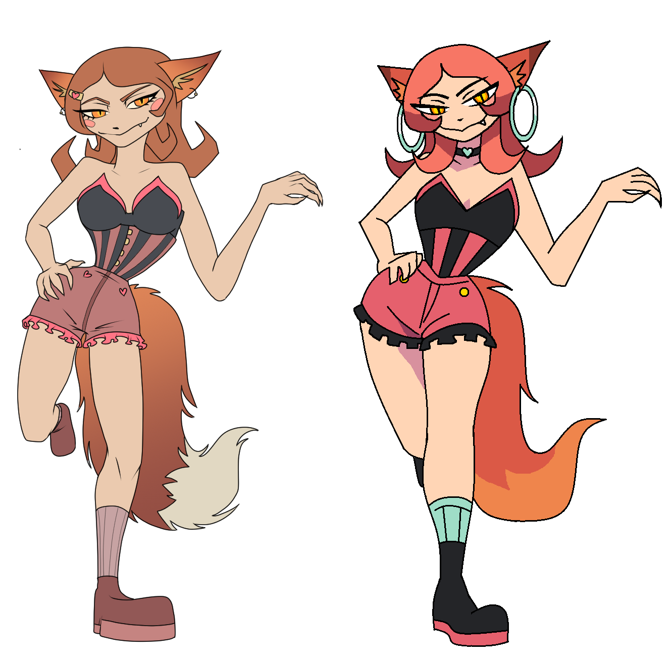
Notes:
-Made her pose more front-facing and more symmetrical. Symmetry jumps out at the viewer as something both unnatural AND easy to understand-- two important elements of stylized art. It never hurts to add some where you can: place limbs at similar angles, make strands of hair and accessories mirror each other.

-Greatly increased the contrast and simplified the color scheme: instead of three muddy shades of pink we have one shade of hot pink. Pink (my answer to the question "what color is most important") is also added to the oranges and browns in the design, making the color palette more cohesive. And yet, the black, bright yellow and pale cyan sections break up all these pinkish warm colors, adding contrast and directing the viewers eye to certain parts of her body, particularly her (now much more rounded) hips and chest ("emphasis"!).

-Added a bit of shading here and there: when you're working with simple shapes, cel shading (or even clever placement of dark colors) can do a lot to help define the form without you needing to add more lines. The weight of her hair around her face and the depth of her pose (where her hind leg is relative to the rest of her body) is made clear through shading, despite the much simpler construction.

-Took the time to "balance" her pose correctly...when all the body parts are bent like that in such a casual pose, it makes the character look unbalanced, like she lacks any believable weight. You should either push the pose to a greater extreme, so the viewer can clearly see whatever motion is happening, or pull everything back towards her center of gravity (what I chose to do), so it's clear that there's no motion.

You could use any one of ^these potential corrections; or you could use all of them, or you could use totally different ones to stylize the drawing in a different direction ('Tim Burton' style, for instance, would require a very different strategy with the colors and linework). This is just the result of me goofing around for an hour with my pen mouse; even I might do different things if I were to actually sit down with a pencil and paper and redraft the character. I just hope this example showed off what I mean, and that it was at least a little helpful. ^^;