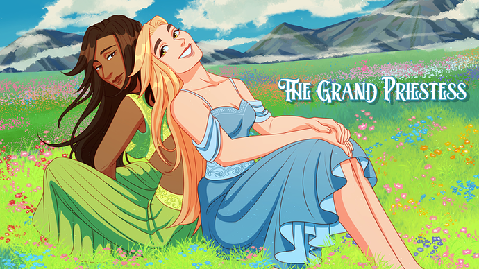
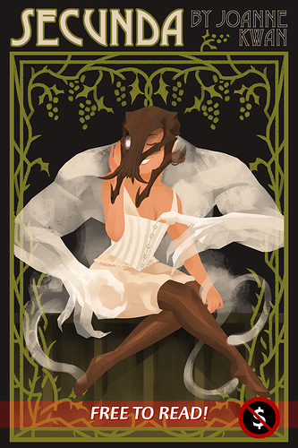
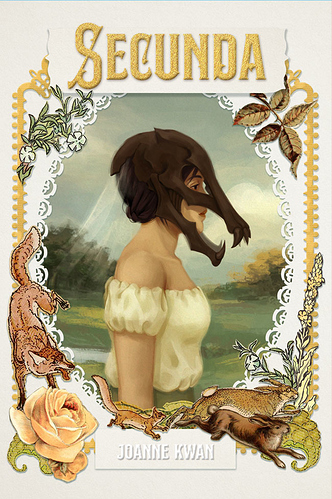
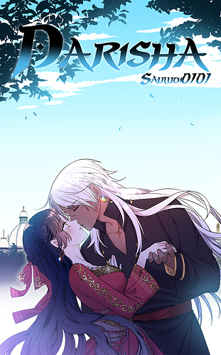
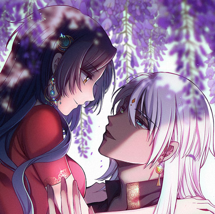
Both are interesting! I really like the painterly vibes of the second cover. Really reminiscent of old-school paintings. I've always liked that aesthetic.
The first one has a neat emphasis on shapes and form, and I think that's a strong point of that piece. Both give me an idea of the relative time period, so I think you got it right!
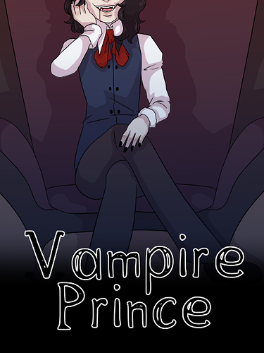
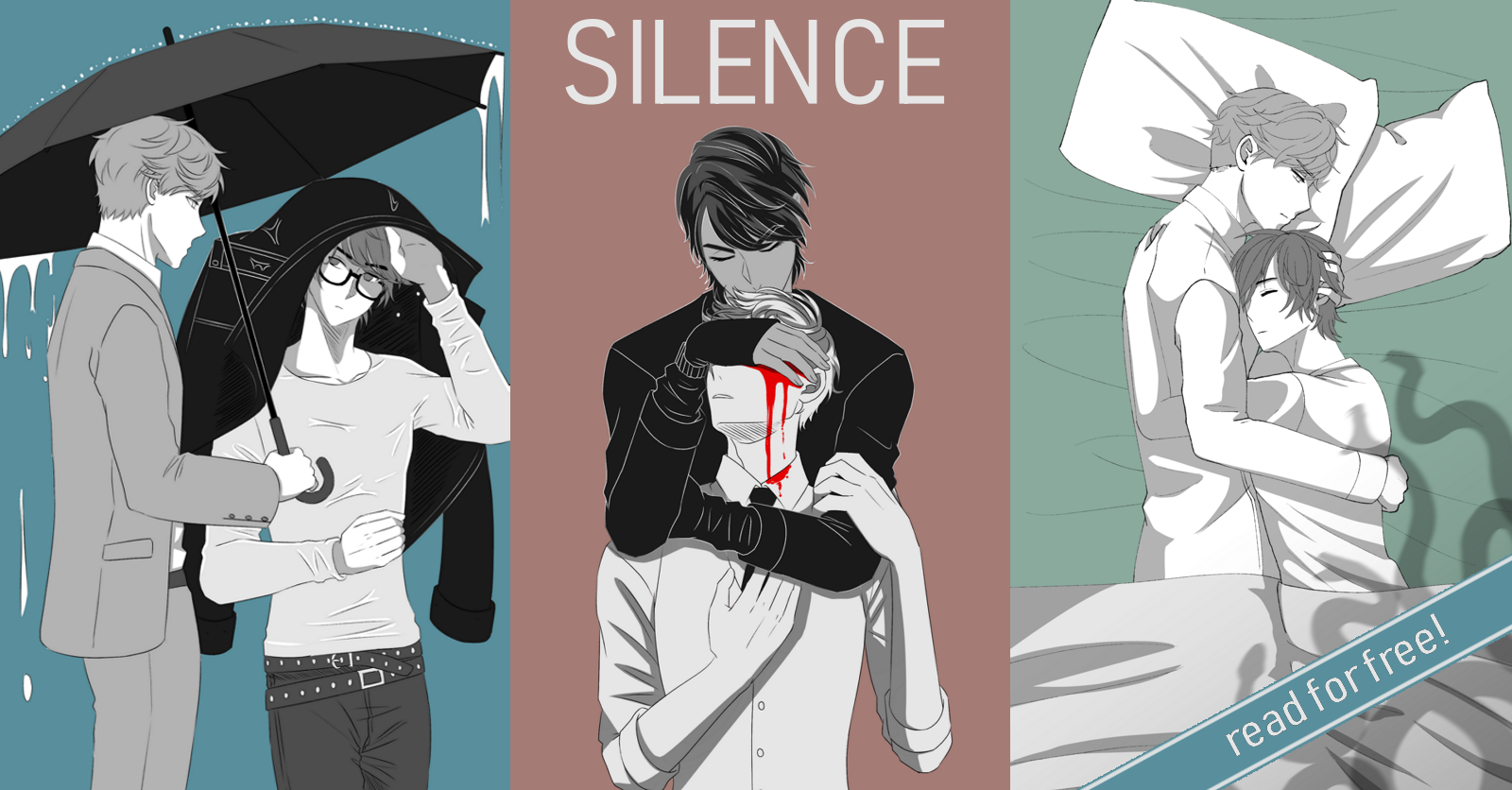
The current project I'm working on is a Victorian-era inspired comic with thriller and supernatural elements. I'll have to think of a way to show off the aesthetic for the cover.