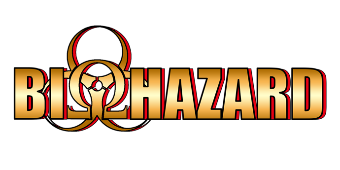
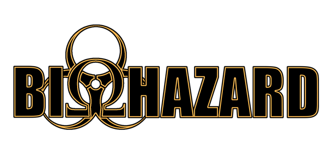
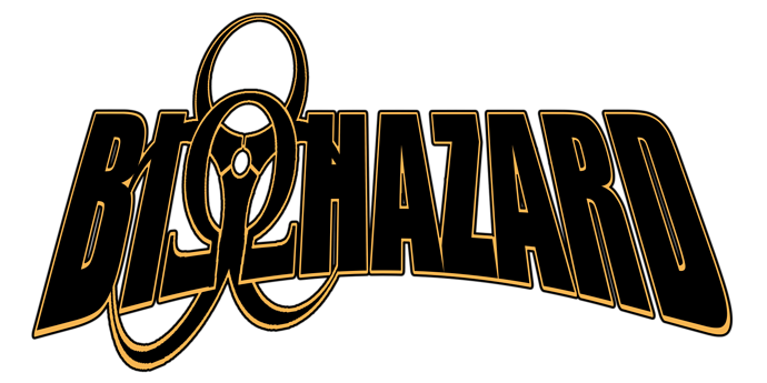
So I just made these new logos for my comic and I wanted some feedback on them or if you would do something differently. My main concern is that they might not be readable, so, are they readable?
Gimme your thoughts!
I love the first and second one! They're all readable too!
I like the 2nd one...the 1st & 3rd seem a little too "superhero-ey" to me.
I like the second one the most. Maybe try adding a background to them to make them look more interesting, I guess.
I like the second one best! I'm not a fan of the gradient on the first one and the third one is a little hard to read.
The second one is really clear and professional looking.
All are perfectly readable. I personally like the second one. The first one reminds me of Ironman and the third one reminds me of Blizzard.
Aye. Nobody wants to play Blizzard games anymore, after all the nerfs done to Overwatch...
Seccond one is the best IMHO. The gradient on #1 feels dated, the warping on #3 is distracting. #2 is very striking.
I also agree that the 2nd is best!
Thanks everyone for the input!!! I also liked the second one best but I couldn't bring myself to throw out the other two haha
@Kayke could you please close this thread? Thanks!
Sure thing!