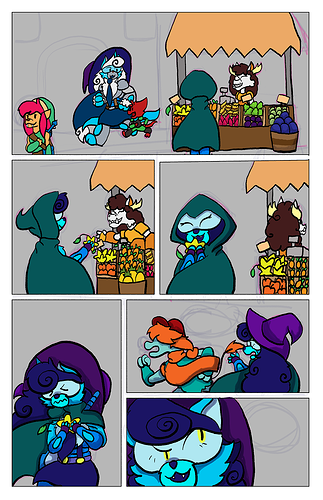
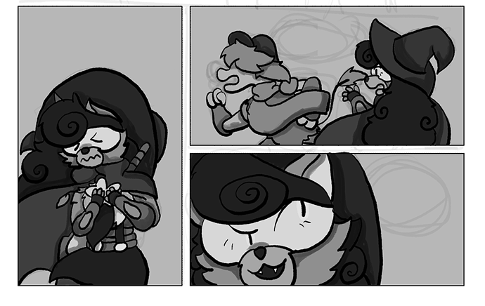
I just focused on the bottom half of the page. But the first thing is contrast. I always throw an adjustment layer on top of everything in Photoshop (or flood with black and set to "color" or "Saturation.") This lets you see what your colors are doing:
This shows a few areas that could use some adjustment: the hat against the hair, the scar of the running critter against their body, even the muzzle against the rest of the face. And so:
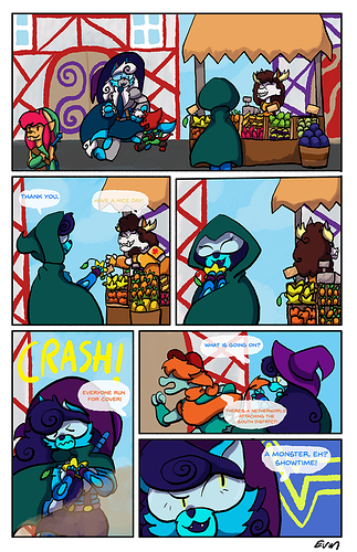
I also tweaked the overall saturation down a smidge and unified the colors a bit. One thing I didn't touch was the yellow eye color in the last panel. It kind of flattens out with the color around it, but I wasn't sure of your intent there.
You DO already have a good sense of unified palettes within a character, though. Like relying mainly on cooler tones for your the one character, with the gold as a pop. So you're definitely headed in the right direction. At this stage it's more minor details. Stuff that I'm still struggling with, myself.