Strap in, pack your hand sanitiser and try to avoid the police, everyone, it's time to go on a Treasure Hunt... ah wait, I mean a TreasureHUNT!
This one is going to be a really interesting one to review and talk about potential improvements for because it reminds me of my own work from my early twenties when I was using a very similar sort of pipeline in terms of media (but to be clear, I think TreasureHunt! is more polished than my early work linked there and has way better visual storytelling, It was mostly reminiscent to me in media pipeline).
Art:
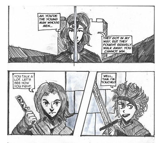
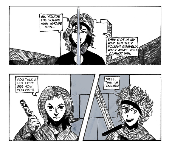
This comic has strong visual storytelling, it's always really clear to follow the sequence of what's happening, but sometimes the slightly scruffy line art and the slightly too high contrast makes the panels feel a bit "muddy" and "heavy".
I'm assuming that the comic is made with traditional inking, scanned in and coloured, since that would explain the slightly "scruffy" look, especially on the panel borders. I used to make my work with similar methods before switching to digital inking because it was easier to get a neater result. I feel like if you wanted to raise the polish of the comic to a more professional looking level, you have a few options, like scanning at a larger size and scaling down, trying to find a pen that gives a crisper, smoother finish, working on something like Bristol board or a similar smoother paper and doing panel borders digitally even if the contents are drawn traditionally.
At times, the shadows are too dark. Here's a little bit of science! Did you know that humans are able to discern much smaller differences in tone in lighter colours than in dark ones? That's why when picking colours at the dark end of the colour square in programs like photoshop, everything close to black looks pretty much black, while even a tiny nudge at the light side of the square feels very obvious. I think the shadows could be a little less dark generally, and that maybe even the overall value level of the comic could be raised, or the heavy prevalence of slightly grungy midtone colours could be lightened a bit to alleviate that very heavy, muddy feeling a bit. It'd probably be a little easier on the eyes and look a bit more modern.
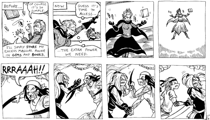
The drawing is decently proportioned, but sometimes feels a bit "floppy", and the characters lack a really solid sense of depth. I can see you're going for the kind of sharp, exaggerated creases on clothing like the artstyle of things like The World Ends With You, which is a very bold artistic choice. The thing about that kind of style though is your underlying understanding of the volumes of the characters needs to be really confident; you need to be very sure that those creases are in the right places to exaggerate them. I feel like you're sometimes drawing the characters as though the sleeves are the outer shell of the arm, rather than a thing that is soft wrapping around a more solid arm inside, or as though the hoodie is the torso, rather than there being a body with ribs and pectorals and abdominals and things creating volume underneath. I'd say the best area to focus your study would be volumes of the body. It'd really bring up the quality of the art.
Here are some excellent Etherington Brothers tutorials on the subject that I hope will help you out! 
Design and Presentation:
A very immediate thing that leaps out to me here is that the hand-drawn panels, with dots where the gutters haven't been properly cleaned, overhanging lines at corners, panels not always perfectly lined up and lines that could do with being a little thicker to separate them from the art, looks a bit amateurish and doesn't need to; it's not a big effort to tidy that stuff a bit, and it'd immediately make the comic look more professional. If you could use a thicker pen on those borders, be a little more careful when drawing them and neaten up the scan by just trimming areas where the lines overhang and those little dark spots, it'd be a small change for a more polished finish.
The speech bubbles are hand drawn, but look decent, with neat writing that's easy to read and good font spacing and breathing room, so unlike a lot of hand-drawn and written comics, they're not bringing down the quality. There would be some advantages to digital bubbles and text, such as being a little neater and easier to translate down the line, but I wouldn't call it a change that's absolutely necessary.
I've touched on this with other comics in the thread, but I'm personally really not into comics with short updates (similar to a single print page) with big banners underneath urging people to follow on social media etc. Because of the frequency when you're reading through the story, it feels like a constant and rather desperate interruption. I'd personally at least make the banner smaller and less obtrusive (like make the background white or black rather than green, remove the big self-portrait and the series logo, just put the social media links) OR if you like the big one, keep it down to every few pages or at the end of chapters. If the updates were multiple pages, this would also fix the issue, but I know that'd be a big change.
Story:
One thing that keeps popping up as an issue is that if often feels like there's a high ratio of people talking about using magic to using magic. It's true that in shounen manga, people often talk extensively about techniques, but it's usually when they're currently using them in a way relevant to that discussion. The discussion is supplementary info to the narrative showing us those techniques in use. There's a bit too much telling going on, especially for something as basic and easy to follow as "I can't draw on my water powers well because there isn't much water here", which gets hammered in a lot.
My big advice is the old chestnut of "show, don't tell", or to elaborate, "If you can infer something through either visuals or how people talk about it, rather than directly expositing like you're explaining it to the audience, it's usually more compelling." It's not always possible and sometimes exposition is necessary, but try to be creative about how you get info across.
For example, it might have been helpful if in the first sequence in the comic, fighting in the volcano, after struggling to summon his water magic and being useless, our protagonist gets knocked back towards a precipice! Oh no! He's doomed! Then a drop of water falls on his face... He looks up and there's a small hole in the roof of the cave above him with roots or moss dangling through, and through which the sky can be seen, and he says, "...It's raining outside?" Then he smiles and goes "I'll teach you to underestimate water mages!" He draws on the water mana and BOOM! Does this awesomely powerful spell.
A sequence like this would get across that water magic is badass, but you need a source of water to draw on (and presumably it needs to be natural water or a lot of it because he's not carrying a canteen around like Katara in Avatar?) and establish the hero as a guy who isn't useless, he's actually quite powerful, but he's literally out of his element. It'd also add a nice rising tension and climax to the fight and more of a sense of stakes.
My other main thing with this story is Panda. This is an odd thing to pick on, but hear me out okay...
I think Panda makes this comic feel less professional because he doesn't feel like a character with a purpose in the story, he feels like he was put in there as somebody's "pet character". If you told me he was one or more out of: Based on a friend of yours / Somebody's Gaia Online avatar / An old OC from Tumblr or forum RP / A self-insert, I'd completely believe it because his whole thing is just... he's a pretty chill guy who goes along with things and wears a panda kigu but nobody seems bothered or amused by this in the slightest.
He also points to a bigger problem with the characters in general, which is the lack of any particular contrast or conflict of opinion in the main cast. When there's a build up and a reveal at the end of the first arc that the protagonists friends are giving him money to go to magic school, it falls flat, because I never had any reason to feel like they wouldn't do anything to support him. They've been nothing but encouraging to him this entire time, they never really seemed against him going to magic school in the first place. They've never even called him out for being kind of whiny and self-pitying all the time, which I as a reader, was getting a bit frustrated with, so I kind of felt like at least somebody in the comic, even if it was the snarky villain girl, would at least rib him a bit for being so mopey when his lack of power is purely due to their location.
I get the feeling you're a very conflict-averse person. Like me, you perhaps find writing characters arguing or being mean to each other uncomfortable. The problem is... you can't get the payoff when the characters come through for each other or develop without starting them out in a bad place. If the character has to work to be a good person while stressful situations bring out the worst in them, it feels so much more satisfying when they are good.
I like the new rival character. He's cool. He could do with being a bit more cold and standoffish and criticising the hero a bit more, to really push the hero to develop and to create interesting conflict between the cast. I'd recommend bringing in something with Panda that adds a darker dynamic to him. Some sort of tragedy or flaw which he's been metaphorically hiding away from in his cute panda costume and peppy attitude. Fabulous guy is good, but GO BIGGER, make him MORE fabulous! Make his vanity a real character flaw that costs them money or gets them into trouble or something. Think about interesting scenarios you can build from everyone's character flaws. If your whole cast are young men, you need to bring in stronger differences between them to make each member of the cast feel distinctive and like they have a reason for being in the comic, otherwise it's like... well... couldn't Panda have been swapped out for a female character or an old guy or something? Was it that essential to have another young male character?
Overall, this isn't a bad comic. It just needs bit of thought into the character and narrative arcs and some art polish to move it up a gear from "decent" to "great".
All right... one more review and then slots will open up again.