Sorry for the delay to this one. I actually wrote out practically a whole review but the forum ate it so I took a break because I was like "aaaaaagh no I have to write all that again!" 
So, appropriately in conjunction with me playing the remake of the first Final Fantasy I ever played, here's First Fantasy.
The first really big major thing I have to say about this comic is that it's presented like it's some sort of Final Fantasy homage or spin-off, with the name, the title font and even the cover with FF style sprites all evoking Final Fantasy; it really looks like it'll be some sort of fan comic, pastiche or parody of my favourite game series... but it isn't. It's actually a completely original Fantasy comic that happens to have a few elements that are sort of inspired by FF tropes, like four heroes are on a quest, there are crystals etc.
Personally, I feel like this comic doesn't actually need to present itself like an FF spinoff. It stands alone perfectly well, and in some ways, I feel like linking it so strongly to an existing franchise might put off more people than it attracts. This leads us into:
Design:
So the first big thing I'd suggest to draw in readers would be to change the cover. The cover with the sprites and the FF font totally misrepresents what your comic is about. This isn't a gaming comic or an FF parody, it's a solid, well-written original story that happens to have a similar vibe to the FF series. Look at covers from Fantasy and Adventure type comics on the site and make something that features your characters, maybe put them in a cool pose in some big, fantastic landscape or something. There are more people on Tapas interested in reading character-based Fantasy comics than gaming comics, so making your comic look like a gaming comic won't help you gain readers.
I'd also like to see some bigger speech bubbles with more padding for the text, and neater shapes. If you want to keep doing them by hand, that's fine, but maybe get one of those oval/elipse stencils? (They only cost about £1-5 or so) to make them a bit cleaner.
The panels are better later on that at the start of the comic, in that they're less wonky looking. The vertical gutters could probably be a little smaller. Generally you'll notice in comics, the vertical gutters tend to be thinner than the horisontal ones. It tends to add a bit of polish.
As I advised with Treasure Hunt earlier in the thread, if you're going to panel by hand, I won't tell you not to because I know what it's like to be stuck with cheaper materials or to lack training/experience/confidence or just the money to use digital tools for them, but if you do work like that, you need to put the work into cleaning them up. If your lines overhang, if there are ink splodges or dust marks etc. you gotta clean that stuff up if you want the comic to look polished. That's why so many people panel digitally; it's less work to get a polished look.
This is an issue that leads us into the art section.
Art:
This is not a badly drawn comic. At all. The actual drawing is pretty good in terms of things like proportion, pose and expressions.
But the presentation is extremely messy and unpolished and it's doing these good drawings no favours.
This comic could look so good if you were a little neater and did more cleanup after scanning before you upload. There are two main areas I feel could be fairly easily fixed to immediately make the comic look cleaner:
Overhanging hatched lines: I don't dislike hatching, but here there's a lot of problems with the hatching being done too quickly and messily. There are frequently stray hatching lines clawing their way onto the characters faces. I'd advise some combination of: Slowing down and being more careful with the hatching, replacing some of the dark hatched areas with instead using a brush and a pot of ink to create a neater, more solid black filled area, putting a piece of paper over areas you don't want to accidentally hatch, or cleaning up the hatching digitally afterwards.
Smudgy grey pages: Use the "levels" tool in your graphics software of choice after scanning to try to get the gutters and the areas of the page you want to be white to be clean and white. It'll look so much more professional. Also to avoid smudging pencil with your hand, I recommend either fingerless drawing gloves OR putting a piece of smooth paper or plastic under your hand while drawing.
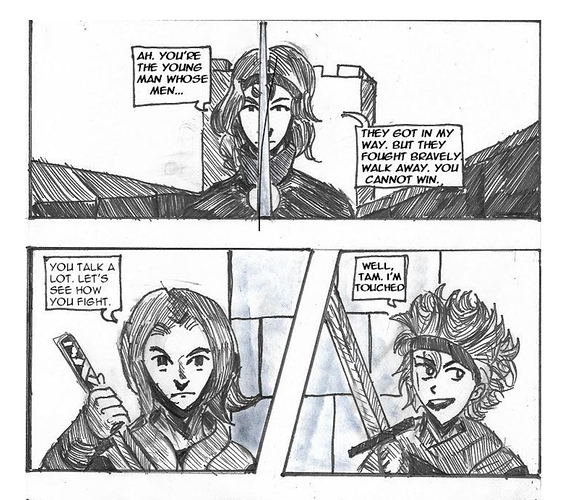
As an example, here's what the comic currently looks like:
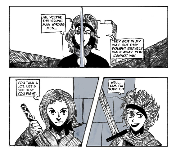
And here's what it'd look like if you tweaked the levels, cleaned up overhanging lines, neatened up the panel borders a bit, used black ink rather than dense hatching for the darkest areas and used a more consistent flat grey with something like a marker or soft pencil on grey areas (I also cleaned off what looks like a hair? on the scan):
No changes to the art, just a bit more time spent on polish. It can really make a big difference to how finished and professional a comic looks. An awful lot of comic artists whose work looks professional aren't necessarily all that amazing at drawing things like anatomy, faces etc. but are good at making it look neat and confident. Your figure drawing and faces are pretty good, so I'd advise just putting a bit more care into your inking and cleanup.
Story/Writing:
A thing that really stood out about this comic was that the prose quality is really good. I was caught by surprise because with a name like "First Fantasy", I was expecting very anime-esque writing, but the dialogue has this lovely poetic quality to it, with people busting out lines like:
"I'm the one who runs from a hundred foregone fates!"
Damn  that's a line.
In many ways, with the British English, the poetic sort of tone and the mice people with swords, I got a bit of a "Redwall" vibe. The writing has a really distinctive voice and I dig it.
The story is a sort of episodic "quest" where the characters are on a journey and keep coming across new challenges. It's decent enough. I think maybe a little more downtime of just the characters stopping between set-pieces to talk about themselves and their motivation would help endear them to the audience and give the energetic action sequences more emotional punch.
The political scenes are some of the strongest in the story, and that Final Fantasy esque balance of "these wacky kids are on an adventure fighting humanoid rats and giant eggs" and "meanwhile this council are discussing the fate of a nation in the face of an impending war" was well executed. It's something a lot of FF-influenced comics and games fail to quite get.
One thing I would call out for future improvement (on other works, not necessarily this one) is that I felt like there wasn't really a strong connection early on between what our heroes are doing and the political stuff going on somewhere else. This is the reason so many FF games tend to start with our heroic young man bumping into a heroine who directly ties into the political plot, usually rescuing her and then getting entangled with what she's doing (I think a reason a lot of people struggle with FF13 is that Lightning is already tied to the political plot and doesn't talk about it. We never get to see the moment where she chooses to involve herself). Political plots can be great, but to get into them, the audience tends to need an emotional anchor of some sort, and for the stakes to directly impact the characters we care about.
Overall, I think this is an underrated comic that tends to get overlooked because it's a bit rough looking around the edges and presents itself as if it's a spinoff or fan series. A bit more polish and being more confident in its unique identity as an original comic could really help people see it as a solid Fantasy story in its own right.
Okay, peeps. I'm probably going to do a post that's a roundup of some of the lessons we've learned in this thread (like a "ways to get readers" checklist) and then probably for future reviews start a new one, because this is getting a bit overwhelming in length (apparently average predicted reading time over an hour...) and the rules need updating but the opening post is too old to edit now. Thanks so much for taking part!