Burnout? Big mood. I got a bit burned out and had to take a little break.  Anyway, It's time to review Alchemist Burnouts!
First off, just some general thoughts. This is a really unique comic. It's trying stuff, it's adventurous with its layouts and composition, it has great characters who are really well realised, probably some of the most professional writing I've encountered in this thread and yet... not a lot of readers.
I have to admit, I looked at it in the past and didn't get past the first page, and having read it, I regret that because I enjoyed it. So let's see what we can do to make this potentially great comic as good as it deserves to be.
There is one overall problem with this comic, and it's that's readability. There is relatively little wrong with the content, but the presentation is just exhausting and my eyes got tired getting through it all. There are too many words per page, the words are too small, the characters are hard to read because of the inking style and lack of tone variation or light/dark balance. As you mentioned in the opening post, you're pretty much aware of many of these problems and particularly how they affect a mobile version, so at least some of the content of this review will confirm things you already know (which is often the easiest criticism to deal with because you're expecting it).
Oh no, this review is long. Burnout is the operative word here...
Art Talk:
Putting this first, because there's a specific issue that put me off reading this when I tried in the past before I even really started. It's the inking. It's done in a very "gappy" style that makes the characters really hard to read against the backgrounds, which often have similar line weights to the characters, and sometimes due to use of some sort of 3D or pre-made elements in places (which is not inherently bad in and of itself) they can have more complete lines than the characters. My eyes and brain had to work really hard at filling in the gaps and interpreting these loosely connected lines into characters.
It is definitely possible to make "gappy" lines work, but you need to be tighter with them, to make the gaps feel intentional, like the line is actually there, it just got so light it vanished but you can still "feel" the line. If they're not tight, they'll look like you didn't have the confidence or care to properly describe the volume of the character or object with your lines, but instead quickly sketched in a few lines, leaning on digital line smoothing as a crutch, and didn't join them up because drawing corners is hard and making all the angles match and things to describe a complex shape in space is hard.
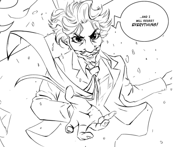
But I know that when you concentrate and bring the heat, you can DRAW! I hit this panel and it BLEW MY FREAKING MIND because it's like you just did the drawing equivalent of hulking out:
HOT DAMN, THAT IS SOME GOOD DRAWING RIGHT THERE.
In this panel, the gaps work, because they are tight, they line up, there's really nice flow to it. There are nice areas of thicker inks that help really define the volume of the character too. It reminds me of the inking in one of my absolute fave manga in art terms, Tsubasa Reservoir Chronicle, by Clamp, which uses gappy lines with subtlety combined with killer line weight variation, daring black fills and sparing screentones:
...But then we go back to "The characters are vanishing into a cloud of mist, helpppp....
I get that a comic artist needs to hit a balance of speed and quality, but a bit more care and a bit more light-dark balance would really help make the characters readable. You're using some nice black fills on the eyes and eyebrows, so why not try putting one on a character's clothing or hair? Or on some backgrounds? It'd immediately help make characters easier to tell apart and give the comic more presence and visual variety. Or maybe if the conversations were cut down a bit, with less verbose discussion, you could reduce panels per page or overall page count, and instead do fewer pages drawn with more care and detail?
Later on, screentones creep into the comic, and at first I was like "yay! Some tone variation! This will help!"... But I found that the excecution of the tones didn't quite work for me. There are too many fancy, patterned tones. They're fighting against the simple art and loose, rushed inking and the sheer number of different patterned tones per page looks busy. It reminds me of when I was a teenager and first got a computones CD and went wild with fun patterned tones on everything. There are some key rules with screentones I'd recommend keeping in mind:
- Make sure all your dot tones are at the same DPI and avoid resizing them so you don't get "moire"
- Only use a fancy tone if the fanciness is in some way emphasising the specific mood of a panel. Stick to mostly just nice flat grey fills and the occasional noise or gradient if they're just being used for depth and tone balance.
- Stronger line work and well-placed black fills will often do the job better.
- Screen tones used to add definition to the characters and make them pop are generally more effective than tones to make the backgrounds recede.
Dammit, this review is really making me reveal just what absolute manga trash I am, but here we go. Here's a page of legit one of my fave manga that makes me go gooey inside... Ouran High School Host Club:
(I bloody love this stupid shoujo manga dammit aaagh). So we can see here the strongest screentones are used, in conjunction with some nice subtle black fills and line weight used to create occlusive shadows, are on the characters, and the backgrounds are very light, which gives the comic a really bright, light, airy tone while still enough tone variation to make the characters pop! Some fancy patterns like big dots and roses are used, but they're lighter than the tones on the characters, and they emphasise the tone of the panel. The big dots are fun and have a childlike innocence that enhances a super-deformed panel of everyone acting childish, and the roses are so fancy they're a bit comedic, used to funny effect by way of irony.
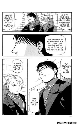
But even if we look at something with overall a really dark tone to the art, like Fullmetal Alchemist, even when the lines are done in a gappy way and the backgrounds are very light, you get the dark tones used on the characters along with confident blackfills to bring them forward.
If the general look of your comic on the page is light, then the thing the reader will look at the post is anything dark, so you want to make your characters dark rather than the backgrounds.
But my main advice here is that you can't use screentones as a bandage to patch up lack of careful inking. The time spent on the tones would be better spent making those inks tighter. To me, that's your biggest "bang for buck" in terms of how much it'd help readability.
Design Talk:
This comic is a lot easier to read on my laptop than my phone. There's often quite a lot of writing to read at quite a small size to a page, often it's smaller than it really needs to be given the amount of space.
Bigger text, please... but you know that already.
I'm not sure how much you thought about page size when making this comic, but when I look at the pages with my "print comic brain", I feel like they'd need to be printed at quite a large A4+ sort of size to be comfortable to read. There are so many panels per page and the text is so small, it put me in mind of the sort of really big hardback coffee table book graphic novels that Self Made Hero produces. The result is a bit intimidating as a webcomic, and I'd suggest maybe fewer, larger panels per page, even if you don't embrace a long scroll format.
Writing Talk:
The prose immediately made an impression. It's written with a very literary tone and shows a rich and broad vocabulary that actually caught me by surprise because it's so rare on Tapas to see English being used with such art and playfulness.
There is one simple improvement I'd suggest for the writing: Break it up more. Instead of putting a huge bunch of text into single bubbles, try breaking it up into multiple bubbles. Oh and, as mentioned in the design segment, make your text bigger and let the larger text size be your new best friend. Yes, it will almost certainly mean you have to write fewer words, but treat that as a GOOD thing. You know how I'm really verbose on the forum to the point it's pretty much a joke how long my posts are? But my comic isn't like that! People enjoy reading my writing in two places: Comics and Twitter. My prose is insufferably wordy, but when you make me tell my stories in big text so I can't use loads of words, it forces me to get to the point more efficiently and to rely more on visual storytelling and cut out long, rambly sequences where my characters talk about soup or something, and that's good. I think it'll be good for you too. You're a bloody good writer; you just need to learn to trim it down to the punchiest and most useful lines. Let the limited space teach you to edit yourself.
Another change I'd suggest: Try to use your drawings to tell the story more. You're leaning really hard on your writing and it gets really obvious in places. At times I felt like I wasn't reading a comic so much as a graphic novel adaptation of a prose story where the person adapting it wasn't 100% sure about this comic book malarkey.
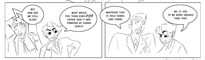
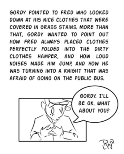
There are sometimes panels like this, and I'm not a fan of them:
You just described, in text, a physical action that happened in the room after spending a big bunch of panels in that room with the characters just sitting on beds talking to each other. The content of this narration box is important! It describes, though actions and environment, Fred's personality so much more efficiently than the big rambly conversation we've just sat through. It's not a backstory aside; it's something happening in the room right now. This should have been in the comic, drawn with panels showing this very telling interaction, and some of the other rambly stuff should have been cut.
Whenever there's something we need to know about the world or the characters, before you have the characters sit down and just talk to each other about it, first stop and think. "Is there a way I can show this?" Sometimes there isn't. I'm not one of those people who will just parrot "show don't tell! Show don't tell! Squawk!" without admitting that there are just some things that'd take too long to show, but the advice isn't without merit, and in a lot of cases, it's better. The fewer, more impactful interactions you can use to get across the relationship between two characters and the fewer words you need to describe it (especially ones from omniscient narrators) the better. Try to think of the images less as a supplement to the words and more like another language you can use that's actually better for describing some things than the words are.
Overall, this is a comic with probably some of the best prose on Tapas, a really unique art style and an ambitiously complex plot spanning a lot of really fleshed out characters. It's the kind of comic you could call a "Graphic Novel" because it's definitely got that literary feel. It's just a bit overwhelming and hard to read right now, so my main advice would be to slow down and to make the panels work smarter rather than harder. Try to edit and thumbnail carefully before you start drawing a scene to really tighten up the visual narrative to fewer, more carefully drawn and impactful panels with less text and more told through the art. There is a really good comic in here and it really just needs pruning down so that we can see the story and important characters more clearly.