I think the cover potential is there to be even greater!
First, I gotta say the logo is fancy but very hard to read with its many thin lines, kinda like death metal band logos.
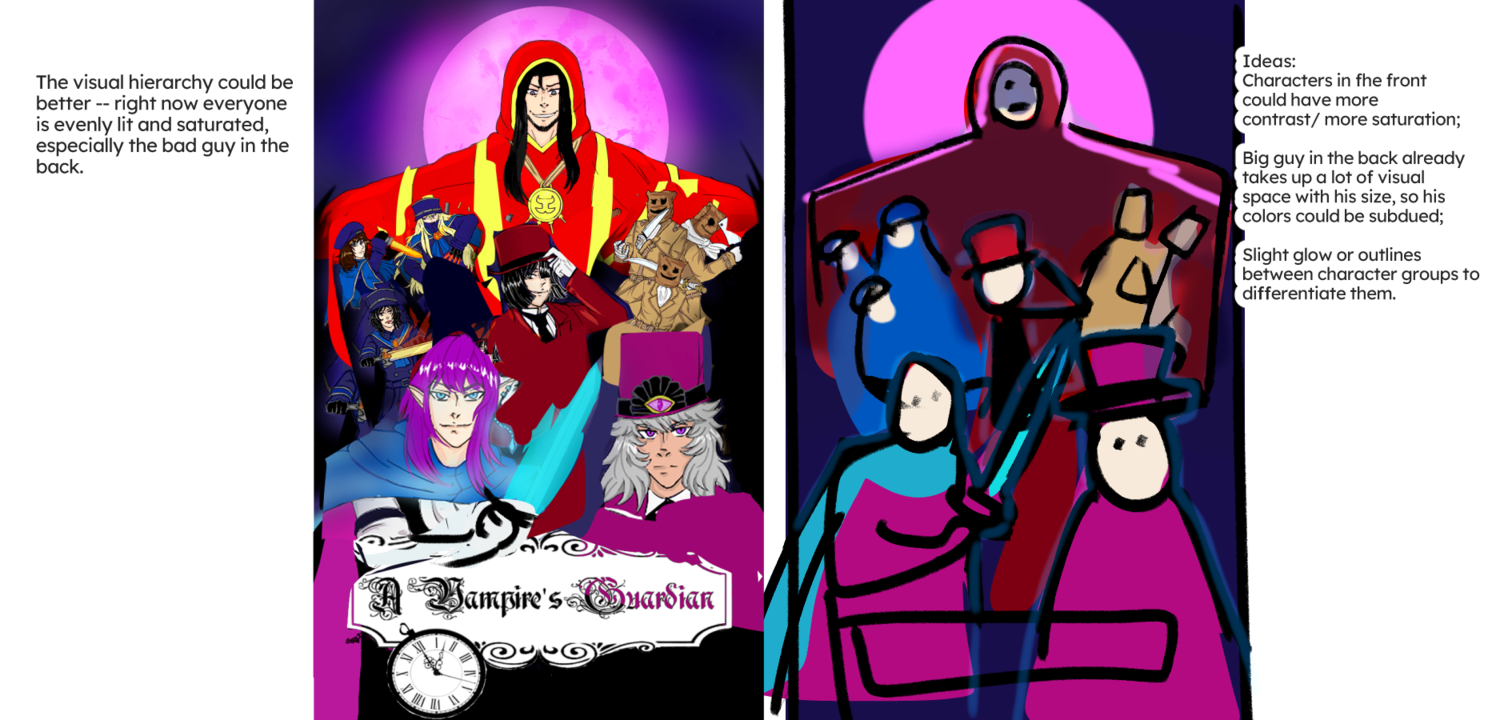
Second, the current visual hierarchy has me focusing on the big red guy in the back, but only him. Everyone else blends in with each other.
My suggestion would be to change the sizes of a few characters:
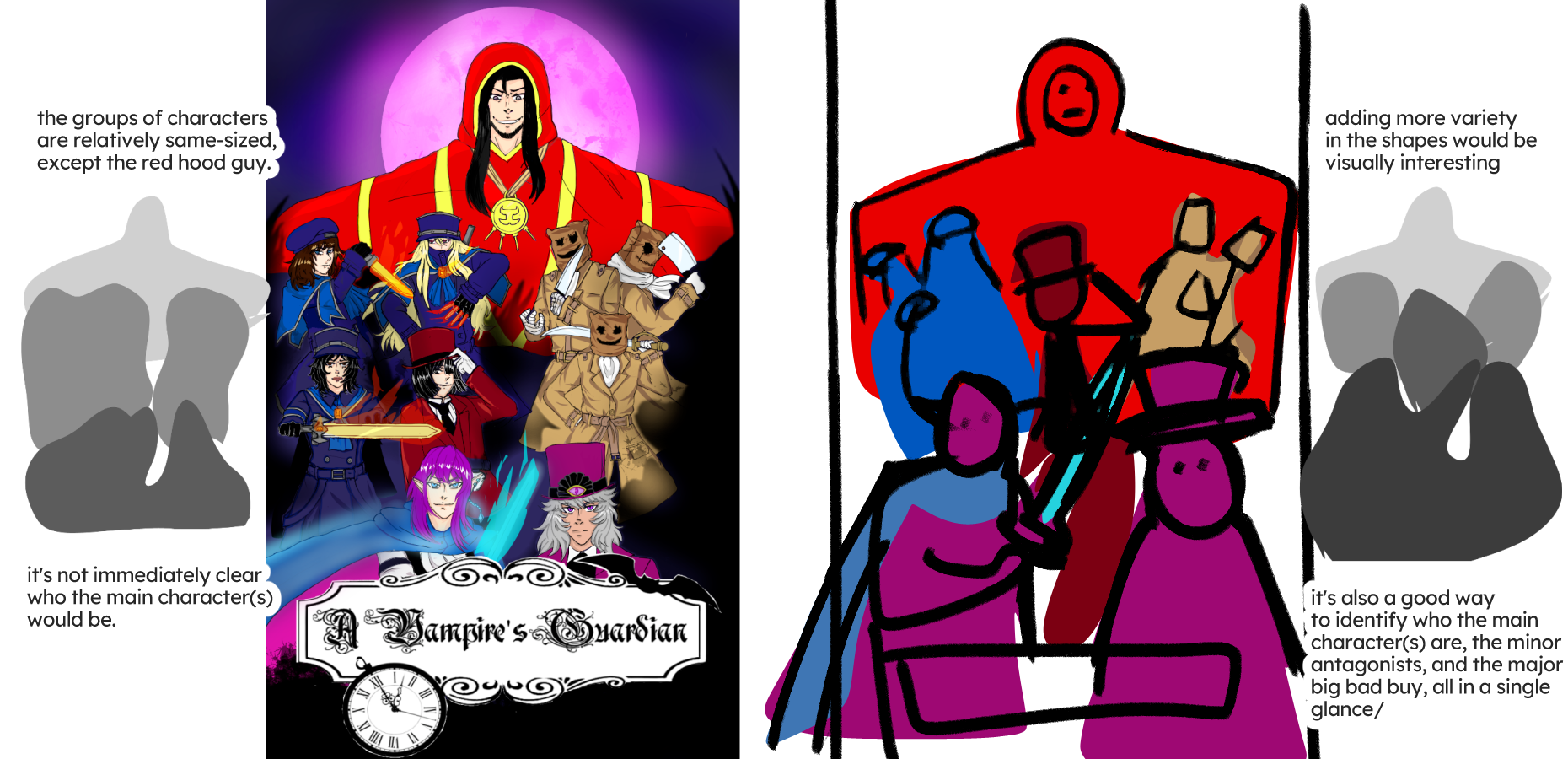
And if you want to push the hierarchy even further: