And.. yours has to be the most disturbing comment of the thread for me  But still it's good. Lot of things to ponder on.
Lettering, ok, will be corrected even in first chapter as I'm about to update with edited English (thinking of that, I'm pretty surprised no one complained about the bad English and typos!), so change can be done on the same occasion.
Fabric not behaving like fabric, yes, totally okay with that, I certainly need to work on that. I'm too focused on the details (patterns) and not enough on simply having a fabric that looks like something soft and fluid and not a piece of clay.
Shading, anatomy, ok. In my priorities now.
Now with the difficult part:
I completely understand what you mean, and I think you are right. And that's what is difficult here.
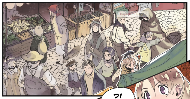
Because I actually don't like the last pages at all, and after a few pages I reverted to the previous style. I do see how these last pages are better on several aspects, but that is not what I want my comic to look like. I'm not comfortable at all with the more muted colors (actually I love these colors, but they don't fit what I have in mind for this comic); and I don't like the fact there is less disconnection between characters and background. I think the issue is that I don't have the tools (as, expertise) to show clearly what I am going for. I spoke about paper dolls, but I could also say diorama, old-fashioned theater decors, or these aquariums with a real life pictures in the back. That's this kind of disconnection characters/background that I'm aiming for, but obviously, despite this voluntary disconnection, I still need harmony.. and that's what I'm not sure how to obtain. Or if I can at all, with my limited abilities of today.