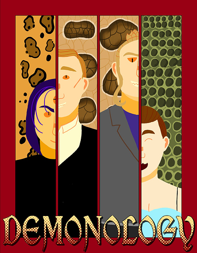
Here’s my newest cover for Demonology!
I really like how you've laid this comic out! All of the details on the top lead my eyes down to the characters so nicely! I also like how I can get a feel for the characters through their design and body language!
That's a really good tip! I also used to have issues with font in the comic pages themselves because at times it would get too small! I do love the detail you have on this cover! The font is a little hard to read, but nothing an outline or difference in shading couldn't fix!
I like the contrast each character has in their background and expressions! It makes me intrigued as to why each background is a different animal texture!
honestly taking a break from working 24/7 on a buffer to make a cover was my favourite part of making my webcomic so far.. for once, i'm actually satisfied with it :))
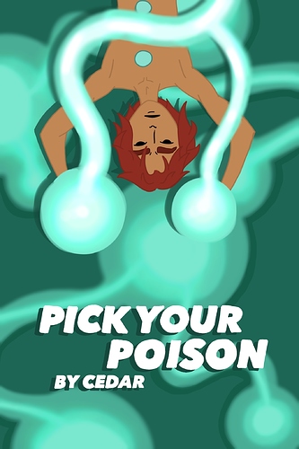
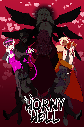
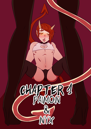
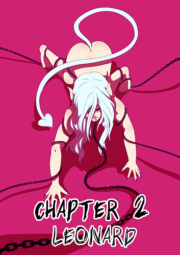
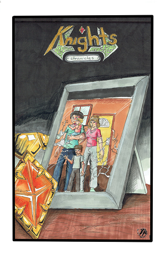
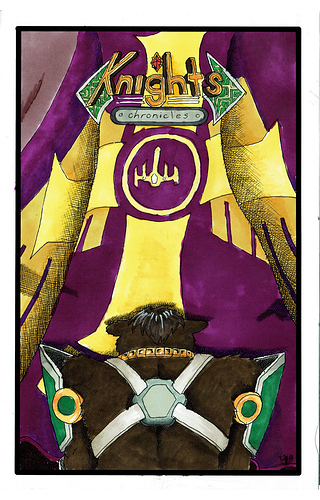
Here are my series covers
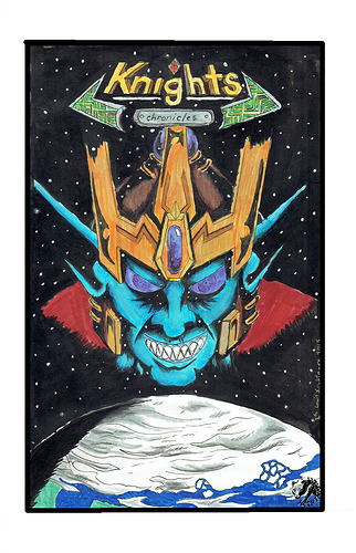
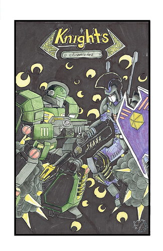
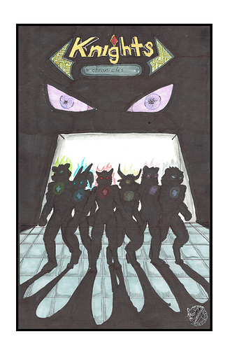
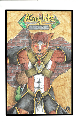
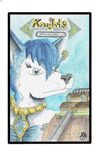
here is each chapters cover art for my sci fi fantasy epic
ahhh thank you so much!!!
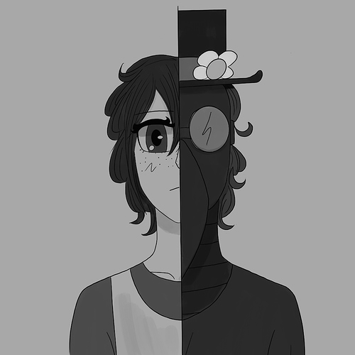
I don't have a cover per se (yet) but here's my thumbnail, I guess that counts right?
Buffering with other art can be so relaxing after working on a bunch of pages! I like to write out scenes as my buffer. And this cover is so bright and vibrant, my eyes immediately went to it! That'll definitely help to draw people in!
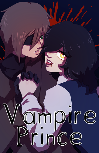
This is the cover for my webcomic. I'll change it when I go to the next season or part.
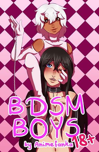
I love the simplicity of these! The colors and posing really helps the viewer get drawn into the sensuality of these covers! Each one really pops, especially with all those bright pinks and reds!
This is my cover. I plan on updating it to the volume 2 cover someday... when I get the time to draw it.
I'm impressed that these are all done traditionally! Each cover reminds me of the old sci-fi books my dad used to read. They definitely capture that epic fantasy vibe you're going for!
Thumbnails are still super important! The use of grey scale makes this easy on the eyes and contrasts a lot from the colorful thumbnails people use, which definitely makes yours stand out! The use of a half and half portrait also makes me intrigued to know what's going on with the character.
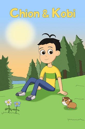
This cover is so sweet and cute! I love the flat cell shading and round features, it feels like I'm looking at a scene from a cartoon! I also love the anthro features you gave to Kobi, he looks so cute!
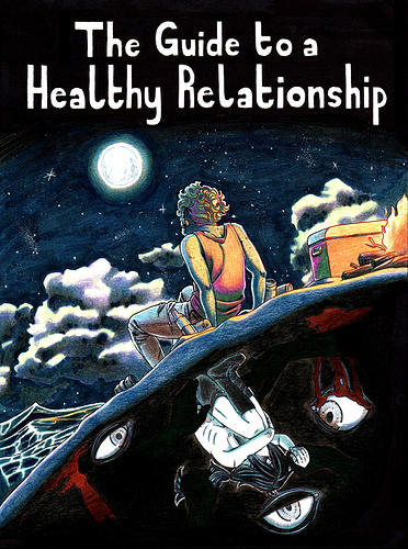
The contrast you have going on between the cool blue tones and warm orange really makes this stand out! I also respect that you went traditional with your cover! Those are always tricky to do as a traditional format is less forgiving when making mistakes. Awesome work!
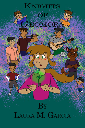
I love how you were able to convey the personality of all your characters so well! Each one looks really vibrant and interesting!
Here's mine!