Wish you best of luck, and keep up the hard work!
Work at your comfort but as you asked for thoughts,
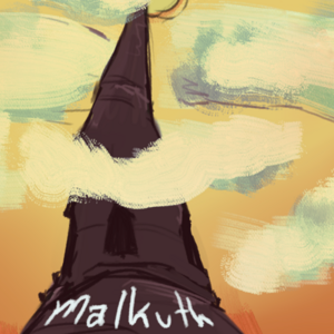
At the moment, both the foreground and background mountains are saturated, causing the colors to clash and lose a sense of depth. You can probably google images of landscapes. Would suggest searching color theory videos on YT, cool colors vs warm colors and how to paint landscapes.
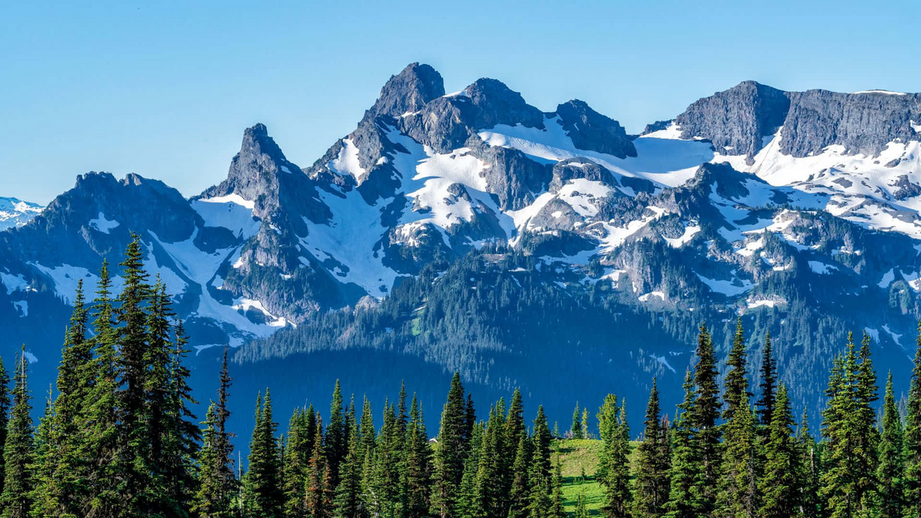
eg. In these shots (taken from google) notice the mountain has a cool color (low saturation), while the trees and foreground are more vibrant and pop out to create depth:
almost similar here, but the whiteness of the fog also helps those dark pine trees pop against the mountains

This ones the reverse, creating the impression that the sunlight or fog is illuminating the distant mountains, the trees being darkest and possibly covered by the first row of mountains. While simplistic they manage to create depth with the contrasting colors:

Hope these make sense and come in handy 

And here's my series on here, likewise, its been fun but also a learning journey with each episode, researching & finding new methods to improve along the way:
It's an actin horror comic about two brothers who are super spreaders of a virus, anyone they infect will instantly become monsters and the bros unwillingly start an outbreak. Side effects allow the bros to manipulate states of matter and grants them a fighting chance!