1 / 8
Nov 2019

Hi everyone! Just a quick small question!
I've been trying out a small new thing regarding backgrounds! Instead of coloring the lines for the background, i just do coloring which makes it look more soft in my opinion.

Not that i'll necessarely take in the results, just curious to see what you guys think :smiley:

  • Soft background:
  • Lined background:

45voters

Votes are public.

  • created

    Nov '19
  • last reply

    Nov '19
  • 7

    replies

  • 957

    views

  • 6

    users

  • 13

    likes

I voted soft since it makes it easier to focus on the characters. You could used colored lines and thinner lines (possibly of different weight for depth) ~Just a suggestion :smile:

True, the whole reason i'm leaning towards the soft backgrounds is that it makes the character pop out more.
I used my thinnest inking pen (0.05 mm) for the lined backgrounds. Perhaps today on black friday might be a good opportunity to look for some new tools :smiley:

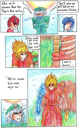
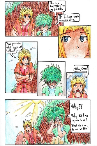
Yeah, the soft works better here. Your line style is quite fine (looks like a technical pen or fineliner) and because you're using pencil crayons, which tend to give a pretty limited palette of colours and already have a textured look that makes images quite busy compared to paint, markers or digital, the outline is doing the heavy lifting in helping characters pop from backgrounds.
There are a few ways you can make characters stand out from background, and they tend to be:
- Line weight (pretty much always heavier on the characters) or line vs no line (which gives a look that evokes animation)
- Saturation (Characters are more saturated than their surroundings)
- Tone (Usually characters are lighter than their surroundings, but they could be darker, the main thing is that there's a difference)
- Definition (similar to line weight, but often backgrounds may be softer, more scribbly, less defined compared to characters)
The important thing is to find one that works for the look you want from your comic and that you feel confident you can do efficiently on lots of pages.

If you're thinking of buying tools, I'd say consider your overall style and pipeline. Ways you could go are:
- Get something a bit chunkier for inking your foreground elements and characters (or I guess something super fine for inking backgrounds, but with a shounen art style, I'd typically say go chunkier).
- Get more colours so that you can use stronger colours for foreground elements and more muted ones for backgrounds.
- Invest in stuff for making digital art (Clip Studio is on sale!)

Thanks for all the tips and advice!
I'll try to implement some of these, though knowing myself i'll probably do it one step at a time... :sweat_smile:
Thanks again!

I say soft. With lined it looks a bit too much and it makes it hard to focus on the scene at hand.

In a traditional medium, soft is better. Thick lines make it too easy to create tangents and conflict with the foreground or the characters, so unless they're directly interacting with something, either get an extremely tiny pencil size just to lay out the borders between things, or just stick to the example in soft.

In your case soft backgrounds are better. Reason for that, you draw traditionally and can’t knock back the BG by making the lines lighter. By not drawing outlines, your bg won’t mix up with the foreground which gives a better overall appearance.
If you want to use outlines for bgs, try to draw/color it lighter to the characters or leave a halo around them to separate them from the bg :slight_smile: