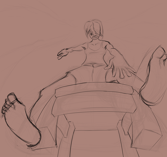
K so I ended up messing with it quite a bit since this is challenging and good practice for me as well haha, but hopefully this helps some. I think the changes you made definitely helped communicate the anatomy, like the knees and the size of the hands are good.
Though the hands and feet could be more detailed and less flat, especially in warped perspective. But yeah I sort of tried to show the pose with some changes and added details. Also, with composition, try to play around with silhouettes, and avoid tangents. In yours, the butt is aligned horizontally too close to the front of the chair, and the feet are closely aligned with the chair legs (which are too wide btw). And a way to have better compositions is don't crop your canvas until the very end. It's always better to work with too much space than too little. Because our brains have this weird habit where you start to cram everything together when you reach the edge of the canvas, it leads to mistakes in proportions.
Speaking of perspective haha, I used your original pose to try and show you how I think about warped perspective. Perspective can always come down to a 3d cube in space it seems. This can help, for example the revised one you showed me, the back of the chair actually shouldn't be visible behind the character. Though of course perspective doesn't have to be super accurate, but it's one of those things that sells a drawing soo much more.