ALSO apologies for text wall, but got exited talking about the technical stuff haha! and hopefully someone learns from my mistakes?
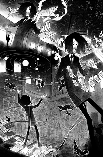
I do something funny here, I do pages with very little panel, I'm not going to show you my pages for advertisement, but rather to show you what I do from a technical stand point, and it's pretty much a hybrid of both ideas.
I have bigger panels for easy online reading, but I also plan to print this one eventually.
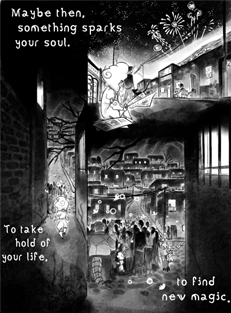
Also I try to approach page design with amore illustration type of mindset I try to have the least amount "semi panels" because I don't actually use the typical shapes to frame the picture, but rather use shapes of the environment, the bodies of the characters and the darkness itself. This though it's more dependent on what type of story you are telling.
These are my first experiments on this method.
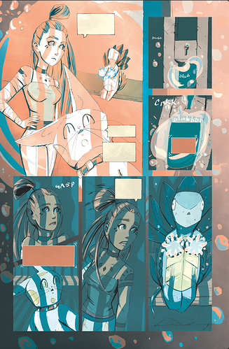
My first attemps of these are not as easy to read and this is something I'm actually planning to fix and re-draw (and also the fact that I wasn't too sure on character silhouette unlike now) Also I had to keep in mind you had to read from top to bottom, so ordering is not that easy. For me having to find a proper balance between this experimental framing and mixing top to bottom and traditional comic layouts.
One thing to have in mind in the first chapter I did not have an actual format for pages so as you can see both have different sizes, and that is not that good for printing, I picked up the Webtoon minimum size, made some calculations and made it bigger so as to have a somewhat universal
(sorry for inconsistant sizes, that's a tapas thing n.n')
In here I started to have both the bottom of the page surrounded by black so as to start connecting pages, But I also realized one thing, There were too many goddamn elements on the page, I decided to keep those more simple and this where I started to think on a more illustration type of storytelling, less pictures more information.
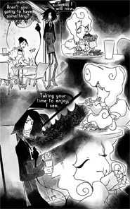
I had actually done these interconnected panels before, and sometimes is a bit hard to resize them for both Tapas and Webtoon, because I also post these on other websites, man the extra pixels are my friends haha.
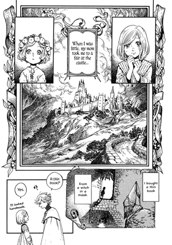
but in here I feel I'm more confortable, it take a bit more work because I have to encompass more of the characters, and I actually apply more of the logic of classic book illustration, where you saw characters actions from the foreground and background.
Also to stop talking about my comic and whatever weird ass journey I had with it so far.
I also like to talk about "witch hat atelier" which I wish I had found sooner, because it uses more vintage illustration and also how creative it is with it's illustrations.
The work from this artist is something to get inspired by to mix techniques, and also one of the occasions where I can say "this is meant to experience as a comic" because of how it tells it's story haha. So pretty and unique

!! Of course this is for a japanese comic format, and not a tapas/webtoon one.
So I'd say, why not experiment? it could lead to very interesting alleyways! and besides new ways of telling stories could start to pop up :3