Hi 
I just read your comic.
You just started, so I can’t say much to the story. But it have potential.
first the prologue : For me, you don't need the explanation. You should describe part after part while you tell the story. A lot of people would stop the comic when the fist tapas-episode so only explanation. The people will also forget a lot, so it easier and more memorable when you do it in the situation and not in the beginning. But the animal is really cute and really good expressions
I think generally that you are really good at drawing animals. The small guide-animal and also the bird in the first episode looks really good. They are both sooo cute 
In the first episode you write a year and then switch to another year. For me it was a bit confusing, because I can’t memorize the first year, because it was soooo long. When you use such long years, don't write another year but a time difference lie: 20 years ago...
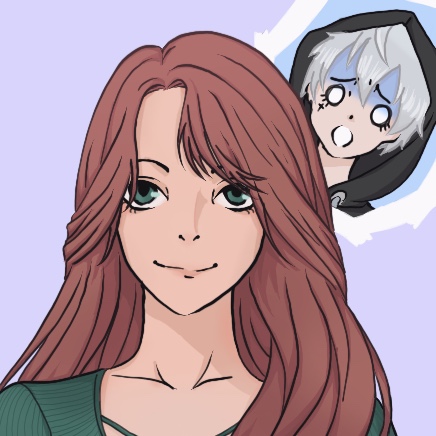
Now to your character drawing: The front side of your people looks good. You can improve a little bit the anatomy sometimes, but its ok.
But from the side, it looks a bit unnatural. In the first episode, where the group under the shield run, the legs of the group looks really natural and good. But the arms and the faces looks wrong. The faces are a bit too long. Especially because they aren’t soo long when you draw them from the front. For the arms I recomment to use a 3d model or a physic model or photos of you posing like this, so you can get more used to draw them in other positions. Especially the girl looks like it should hurt by running with this arms.
I really love the style of your two characters Imelly and Leady. They look so cool and unique. For me, you could do a comic just in this style. It looks sooo good  and also I love that your character looks so different from the style. Its really refreshing
The color from the characters looks also good. Maybe you can use a bit more shadow, but the color choice is really harmonic. Especially good is, that you change the color with the surrounding, like in the dark and that the door light reflect on the characters. Thats really good
You should also try to add more shadows in your backgrounds. It looks really flat. The village looks a bit strange, because it’s so flat. You add light under the teleportation bubble but no shadow behind/around the tree.
The last panel in the second episode are a bit confusing. Maybe you can describe them better
That is all I hope it helps I also let you a sub there. I am excited which way it will continue
And I think you can also review a comic that is already reviewed. Because a review has always also personal taste in it. So every review is a bit different and its good the see different opinions