You asked for it so here is my roast:
So.. right off the bat your banner is a big turn off:
It's pixelated - the text is cut off and I'm assuming that's a person in the corner?
Now I was a bit thrown by the first episode being a 'Happy Halloween' episode but I ran with it.I actually really liked the art style so I was getting excited...
The second Halloween episode looked like it should be part of a completely different series and I am wondering why we're not actually starting the comic at this point...
The prologue seems like a weird acid trip out of Windows Paint - but I'm talking Paint from Windows 95. I kinda dig it - but I am also very confused of where this comic is going at this point.
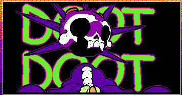
Now this is a personal preference thing - but I am not a big fan of single page updates on these platforms (unless it's slice of life). So I wish that each chapter was grouped together as one episode. I'm really digging the skulls! Especially this guy:
Now it is natural to go through lulls, but one thing that you might have going against you is your style is very niche. I can see how it might be interesting for some readers at first but the novelty will wear off and they will loose interest...especially because it takes awhile for your comic to get going. Besides sound effects you literally don't have any dialogue until part 11 of the prologue. You might want to examine your pacing and decide if all of those pages are necessary to make your point.
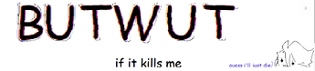
The text is really hard to read for your cover page - honestly I thought it was just randomly placed shapes until I saw the 'kills me' on the bottom. I would recommend a more legible font and different placement.
CHP1 P1 and P2 should really be combined into one episode. Also again let me but in with my personal preference but I am not a big fan of solid backgrounds with lots of text in comics. This is a visual medium - you should show not tell.
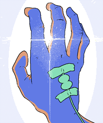
I do enjoy how you use complimentary colors for your shading/ highlighting like the hand here:
Also do you have something against capital i's? Because you never seem to capitalize them and it drives me crazy!
Actually capitalization in general seems to be lacking.
I do enjoy the gif panels! They bring a lot of life to your comic!
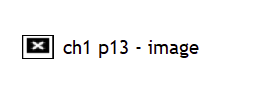
CHP 1 Part 13 appears to be broken.. this is all I see:
That's my 3 cents for now!