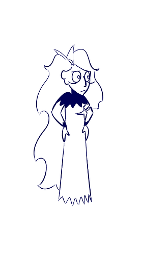
Not bad for a first attempt! Three big things to keep in mind when shading are these:
Direction the light is coming from
Shape of the object the light is hitting
Value.
Your shadows here are minimal, which is fine, you have a very clean, minimalist style, and you seem to have handled #1 just fine. Your light source seems to be to the left, since most of your shadows are falling to the right, so that's good.
The way you use shadows to imply the shape of the character is simple but effective on the body, but gets lost a little bit in a few spots in the hair. Hair is a complicated thing to shade, it's made up of lots of random shapes, but you seem to be handling it pretty well in most places, treating the 'sections' of hair like individual shapes with mass, which is what I would have suggested anyway. You may just need to extend that technique to some of the smaller sections.
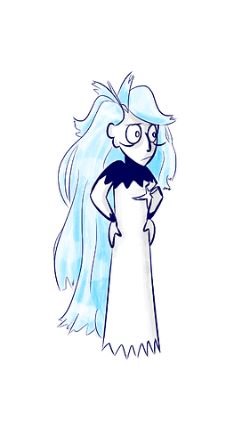
Value is where I think you need to lean in a little more. You have shadows, they're consistently placed and make sense for the shape of the character...... but when I squint, I can barely see them. Try it. Squint at your character, and you can see her outline, the dark shape of her collar... but the shadows on her hair are barely visible, and the shadows on her body disappear entirely. I'm not saying you need to make them as dark as the linework, but maybe darken them a LITTLE bit so you can easily tell they're there. Like maybe 30% as dark as the collar/linework. Right now it's about 5-10% as dark.
Pretty good for a first attempt, though! And I like the contrast of the brushy watercolor effect with the clean linework.