Hello, I really liked the ellipses in the most recent episode, that was a neat little trick. It's a cute comic overall, still in its early stages but I can see its potential.
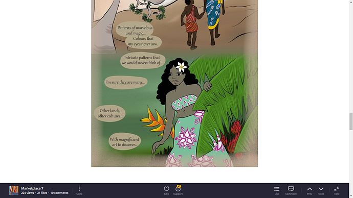
My immediate first thought when I saw the comic is that there's a whole lot of unused space. I feel whitespace is useful when blending the pages together, but in excessive amounts I feel like it makes the comic harder to focus on. To that end, i would suggest making your whitespace a bit smaller in proportion to the panels and having the panels be a bit more detailed.
I also noticed that an image was flipped to the side in the first episode. Not sure if you wanted it that way.
As for your backgrounds, I do feel like they could be more detailed. They don't have to be hard lines with every grain of grass visible, but it's important to know how each object is supposed to look. My backgrounds aren't the best, though I try to get an idea of what is supposed to be in every shot and map the scene out in my head. Another thing I would suggest is to go out and try to draw a landscape you see irl. It can be anything: your room, a local cafe/store, the great outdoors, anything really. You don't need every detail correct, you just need to see how you can interpret the objects you see around you. I think you understand the general idea of how backgrounds look, you just need to spend more time on them. Hope this was helpful!
Anyway, my comic, The Middle, is about 3 high school girls in a rock band hanging out. It's rough in the beginning, but I think the general storytelling and art improves as the chapters go on. That's not to say it's perfect, god no, I feel like there's a bunch of things that need to be improved from character focus to make the story flow efficiently. Any tips for these or anything else will be useful, thank you!