Nice topic! 

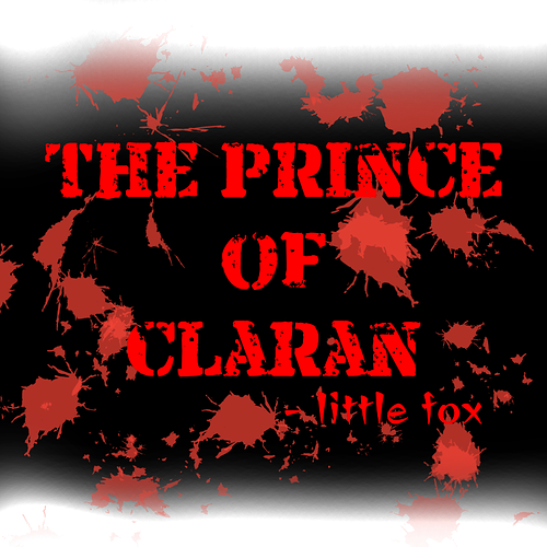
(* the drop shadow is for aesthetic, not part of the logo design)
Here's why the design is like that
The font is self designed & hand drawn, rounded but not too much, keep it fairly "in-expressive" to represent the series more-inwardy story and also protagonist's fairly 'ordinary' nature. (even though there's extraordinary parts & dramas)
The color red to light red is to mirror the protagonist fur which is coral red/orange. (and also the series color theme)
The gradient highlights on the top of the letter is like cherry on top, otherwise it's too bland. That can also be interpreted as 'light'.
I don't want to use computer to draw the outlines because it's too smooth and perfect. The slight wavy, uneven outlines are intentional, also gives a bit organic vibe.
And this is the chinese counterpart. (i also have a chinese version)

My series: