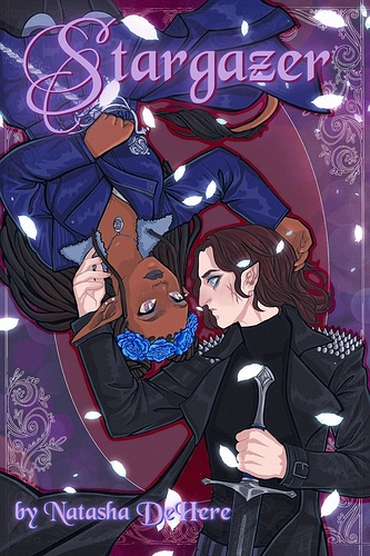
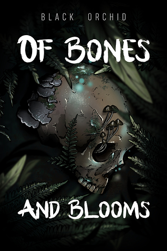
OH BOY! There is a lot going on in my cover! Let's start with...well the cover itself:
So I first took a lot of notes and beats from Art Nouveau because...I love Art Nouveau art. I love the patterns and layouts and floral, nature elements. I also find Art Nouveau However, art nouveau has soft colors, more muted than primary and since this is a very dark novel, I used primarily darker, bold primary colors to sell that. So the Art Nouveau elements represent the romance at the core...while the colors show just how toxic and dark the romance is.
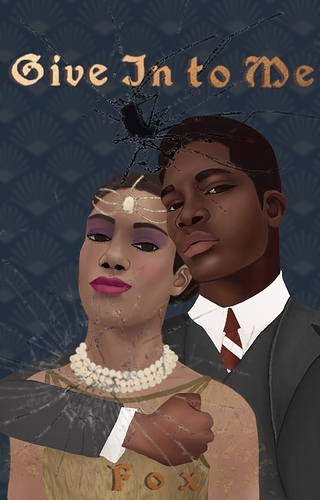
We have the main characters from and center: Ira, in red, representing her sin of Wrath and Tristan, in blue, representing what will be his sin. Ira is the devil with Satanic horns (Satan representing Wrath) and is tearing at his wrings while holding him passionately yet posessively. She is gazing at the reader with a small smile (that she reserves in story for Tristan) and yet looks at the reader with confident dismissal. Tristan is also looking at the reader and if you think Ira looks dimissive, Tristan is even more distant, while also seductive in his glance.
Tristan in story is described as angelic, especially by Ira. She is ripping his wings because she kickstarts his fall. However, his calm look is the acceptance of the corruption; he has some desires as well and maybe, just maybe, he's getting more than just agony from it.
I wanted the danger and toxicity of the relationship front and center, but I also wanted both the characters to dare the reader to judge them about it. Thus why they have those condescending, dismissive glances too.