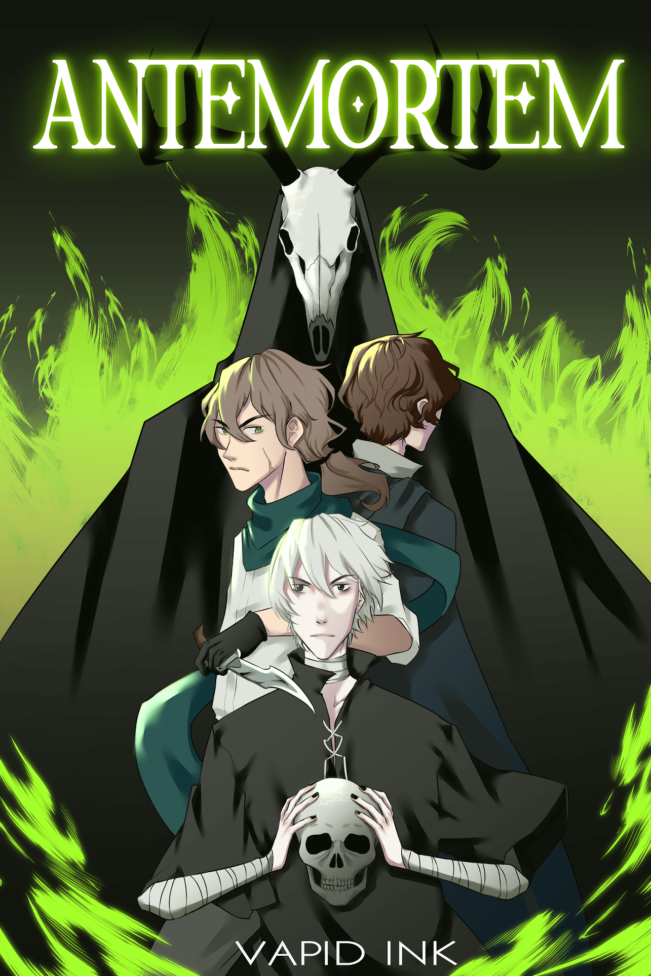
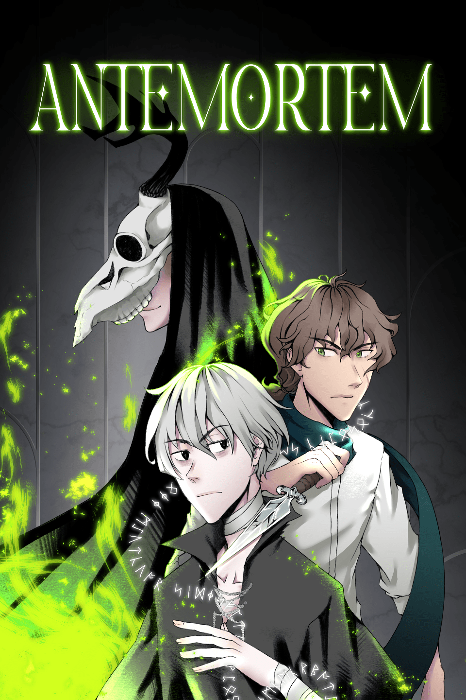
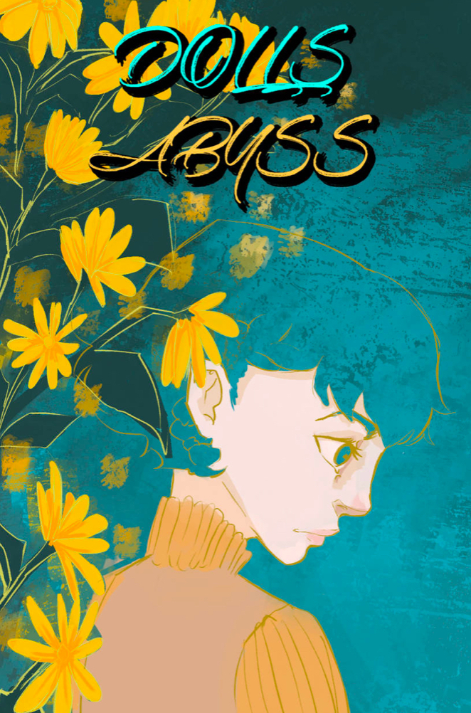
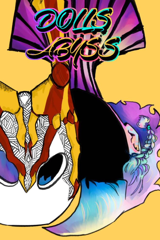
Hi everyone!! I was planning on making a new cover art for my comic and just wanted to compare my very first cover to my current one to see how I could improve more!!
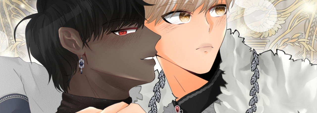
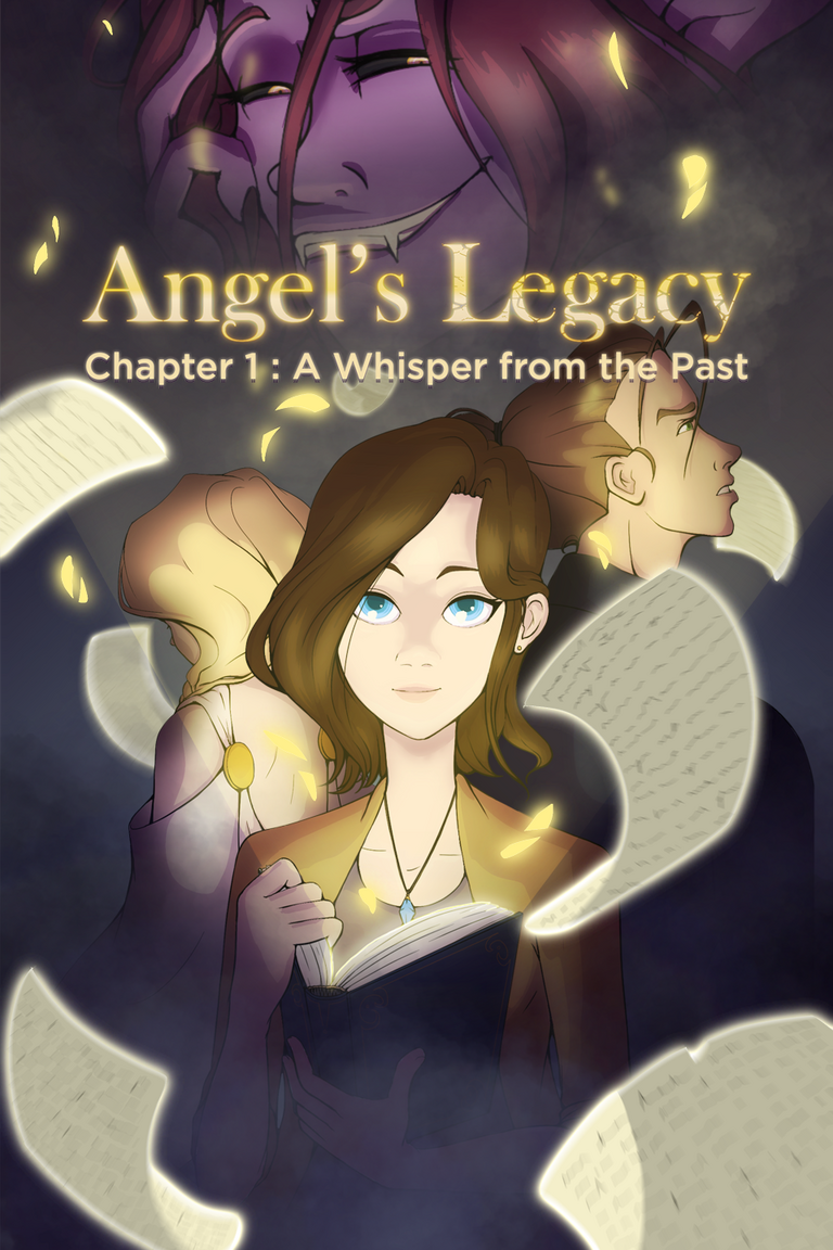
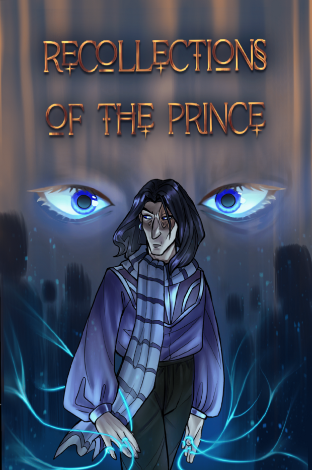
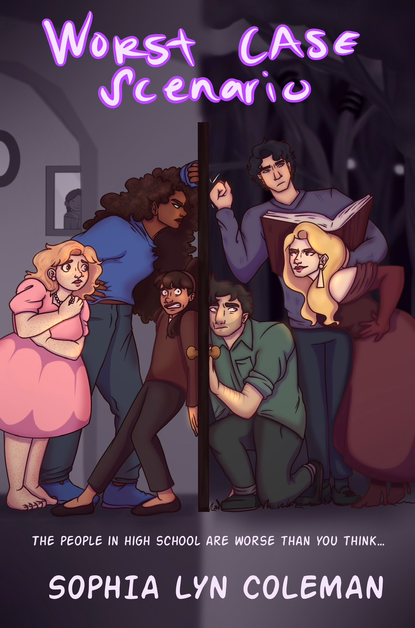
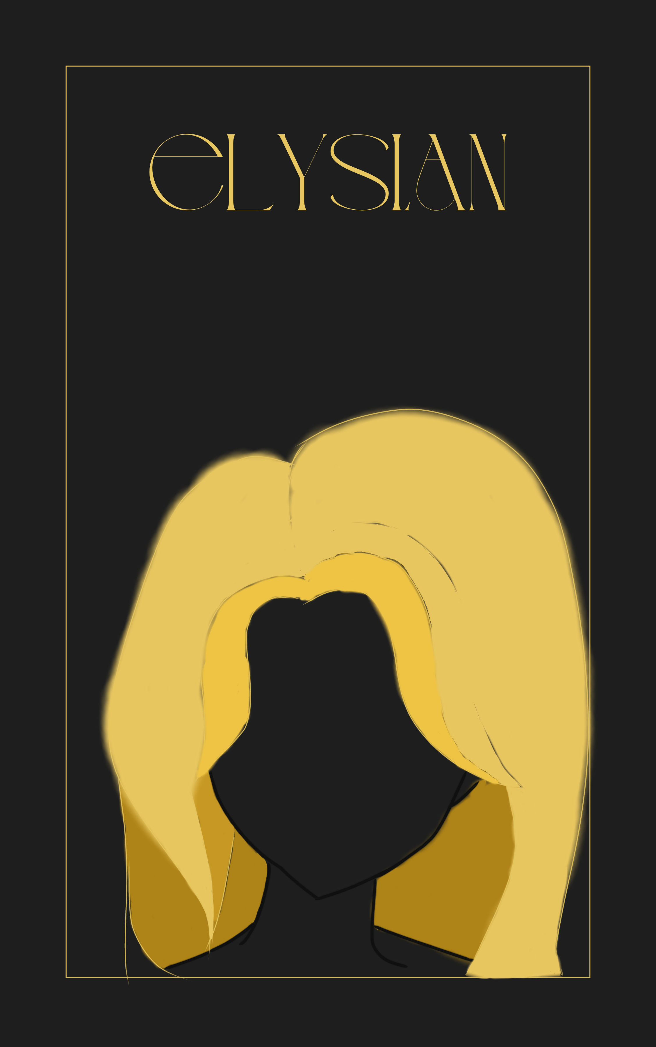
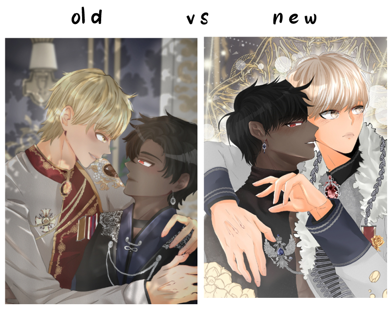
This here is the side to side comparison! The old one is definetly too dull and the anatomy looks a bit weird! Something I know from my own work is that I have absolutley no sense of lighting/shadows! I'm open to your advice on how to improve that maybe!
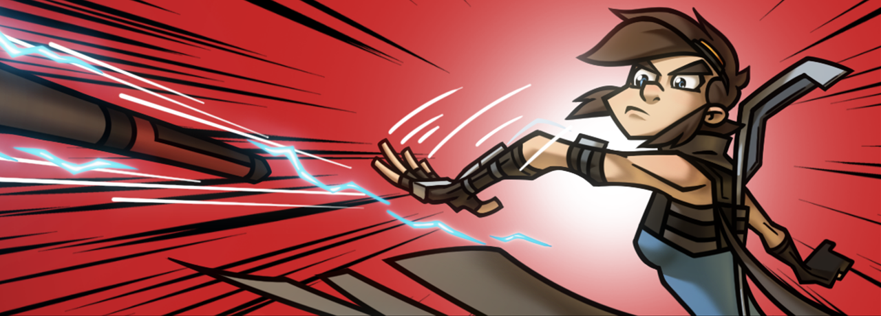
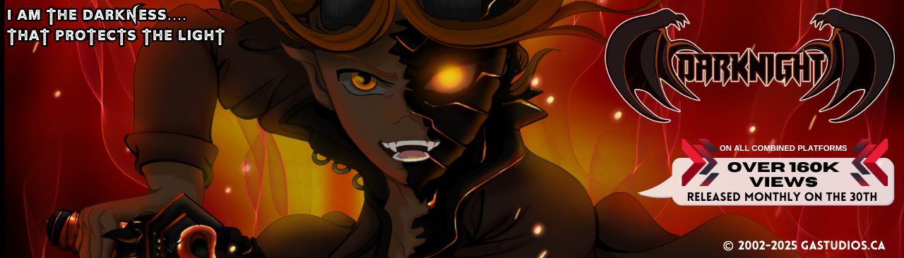
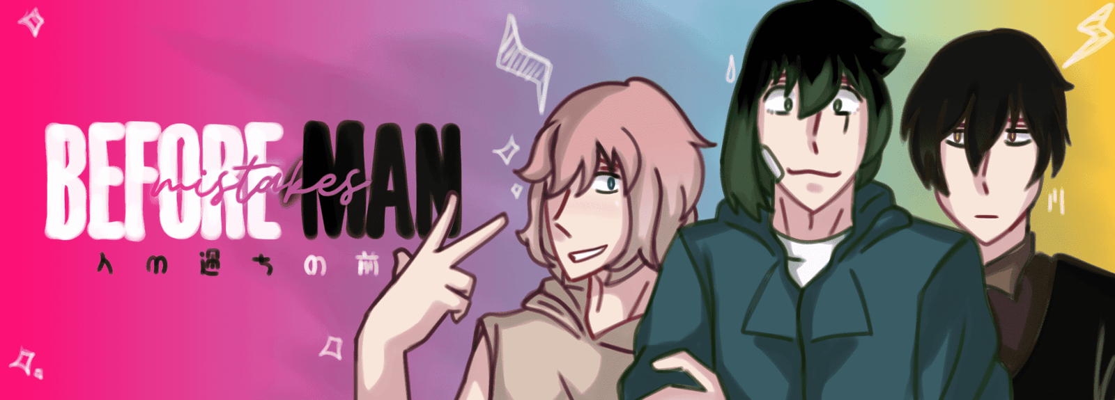
I would love to see your covers too!  Share your covers so we can all appreciate them, old or new or both!!