I looked at your comic a bit, but stopped looking at it because I'm straight and felt uncomfortable. I like the font you use and I like the neat lines.
Here's mine. It's a gag comic following multiple characters doing stuff that may make you laugh.
I just wanted to say that I loved the off shoulder top he's wearing while reading Wuthering Heights!
Well I've read all of it (all the parts that are available now). I get you probably use a mouse to draw it which I think has quite the impact on the overall quality of the drawing (correct me if I'm wrong <3)It looks like a story with potential, the premise gives off some My Hero Academia vibes which I am totally into.If you'd like some advice, try drawing your comic on paper and then scan it or take a picture of it, then you'll be able to import it into some drawing program (it you're looking for free ones I would advise MediBang or FireAlpaca which are very good) to make the dark lineart a level on its own so you can colour it using digital tecniques! I think this will make the process much more easier and also will have a positive impact on the quality of the art <3Overall keep up the good work, improvement comes with time and practice ^^
You are correct, I do use a mouse. And (from what I can tell) I'm glad you think it has potential.
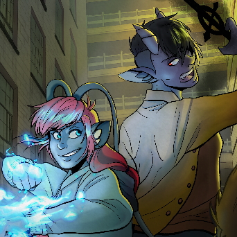
Oh well I've had already found your comic in another tapas forum topic and read it but didn't actually leave any comments so here it is:I really like the simplistic style, I think it's what really serves at delivering the jokes (others make the mistake of attempting at humor with this super polished hyper realistic art and that could be really distractive ) keeping in mind that I am not a native english speaker so sometimes I don't get the jokes at first but it really isn't you fault, I find it pretty funny, the kind I could binge read on the couch while it's pouring outside if you get the vibe c':For the critique part: I do find that sometimes the lineart it's not consistent: the width of the lineart of the eyes and the mouth has nothing to do with, let's say, the body... dunno if you tried it already but there's three tecniques I usually find solve this problem in a simple but dare I say elegant way: 1) using only one size brush for every line, 2) use a wider line exclusivelu for the outline of the figure and then a narrower one for any detail or part inside of it, 3) keep the difference between but make it less noticeable? Say one or two "pixels" difference.Granted, this last part is solely based on my personal taste so you can take it or leave it: ultimately... you're very good ^^<3
Why then you post here?
I don't care if it is BL, GL, Horror, Fantasy or whatever. The story must be good. I will take a look.Here is my graphic novel:
Because this thread isn't only for BL, I only wanted to share my comic. (Watch this dissolve into a petty argument that does nothing but waste everyone's time)
Good job. I hope to reach at least 30 or more on this site.
So here is my little side project I do every Sunday. It's funny and filled with gags.
I'll go to dinner and then read it
That's fine, I don't like you either but not everyone is gonna like me or you. I'm done speaking in this thread now. I would suggest you do not reply to this.
Congrats on 200 subs on Silver Lining! I just gave it a read and made sure to leave some likes! I like the character designs, the simplistic palette, and the flow of the story so far/how easy it is to read. I do wish the episodes were a little longer though(I personally prefer bigger chunks of story at once, but that's nothing against your series). Keep it up!
I'd love to know what you think of mine. I just started at the beginning of August so it's not super long(4 episodes in)
I personally don't like boys love so I hope my bias doesn't affect my criticism.
I think you did well in the art area. The actions are pretty clear and I like the backgrounds in your art. The color really accents the mood you aimed for in the scene while the other background shots are just really well drawn. The color scheme you aimed for really creates a romance feel for the story. Personally, in my opinion, I'm not drawn to stories with abusive relationships but I know there is a definite appeal out there for it. All in all, I think your stories works for your targeted audience and I think you are doing a good job. It may not appeal to me but I know there is a definite audience for what you're making.
My story is a bit on the opposite end of the spectrum from yours. It's a lot more light hearted and more focused on making people laugh and smile. No romance involved at all. https://tapas.io/episode/1871279
My story works better in manga form though so you can read that version here if you like: https://globalcomix.com/a/alin-laphel/comics
Okay I was frightened by the horror tag but then gave it a shot and it's pretty amusing! The art is very interesting to look at and I wonder if you're using any shortcut tecnique such as those photo editors because if not, it's really impressive to say the least! The story overall is interesting and since I am a fan of science fiction I enjoyed it a lot.The only thing I found pretty confusing is the story telling which sometimes doesen't feel really cohesive (?) But maybe it's just me since, yet again, english is not my first language so it might be my problem after all ahaha
Okay well, I really enjoyed reading it!!! The skits made me crack a smile and most of them I can confidently say are pretty clever! My advise for you is the same I gave to CommanderMarty: try drawing on paper and scan it or take a picture and then colour it in a drawing program (again MediBang and a FireAlpaca are free and really good options) to get higher quality
All my work is based on layers, but it is true, I 'm using a lot of tools, some are AI based. For some pictures I use up to 20 programs. The context is there, you just have to watch the episodes, let the pictures work on you. The more episodes you watch, the clearer the context becomes. But that is the secret of success of every series. Thanks for your assessment!
Omg it's... amazing! The art is really good and polished, the story keeps you wanting to read more and that is one of the most important things when it comes to writing comics or anything in general. There is one mistake you have did tho I think should be fair to point out: you had three chapters ready and you posted them all the same day, then waited 20 days to post the third and now I am assuming you're working on the fifth. With the complicated art style and probably long story, at this rate you'll end up overworking yourself (this is why for now I decided to go with publishing consistently two/three pages every week).My advice is: for now don't mind webtoon, try to """start anew""" on tapas this way: (this is advice I've actually read on this forum by one of the most famous creators and it worked really good) pulish the fist chapter, then, schedule the other three, ten days or two weeks apart from one another. This way your fourth chapter will publish itself at the end of october and for that time you'll already have completed the fifth and maybe sixth ones etc... this way you'll build a buffer which will allow you to relax and "catch your breath" if you need to and also maybe cover some time you won't be able to draw for whatever reason. Being consistent plays a foundamental role in finding an audience because it makes people know when will the next chapter will be and gives a sense of anticipation.Another quick note I should have put before: I love the way you portray action... that is something really difficult to do and you nail it!!Can't wait for the next updates
Thanks. I'll be sure to take that into consideration.
Thank you very much for your feedback (and thanks to all the others even though I forgot to mention it I'm terrible T^T)I LOVE the grayscale design and the look of an original old fashioned manga! I still don't know how you do it but you're amazing at it. I also noticed every panel it's very detailed and honestly that's really good. So, don't have much to say, it doesen't look like you miss any of the essentials for good comic making if not for the fact that the story in and for itself it's not my preferred genre so, as you said for my comic, there is a target audience for pretty much everything but I fear that cute slice of life you've chosen may not blow up as quicky as other, more popular, ones.Anyway don't be discouraged if it takes longer to get attention, the style and story are sound so you'll surely make it
Thank you so much, I'm so glad you like it and are excited about reading more! It took A LOT of experimenting with camera angles, blurs, and linework to figure out how to do draw action in a way that would look good/make sense.
Uploading 3 episodes at launch was actually very intentional and will be the only time I upload that much at once. On Webtoon specifically, if a reader views 3 episodes, a pop up generates asking if they want to subscribe. Statistically speaking, it reminds more people to sub at launch that otherwise might have forgotten and was a tactic encouraged by the creators of Webtoon. The plan all along was to launch 3 at the start then switch to a consistent 1 episode every 3 weeks from episode 4 and on. Also, thank you so much for your concern about me getting burnt out but no worries, I have already planned for this as well. I actually have been working on the series for over a year and am working on finishing up chapter 3 currently(meaning I have uploads all the way up to January of next year ready to go). I know these pages take a long ass time and wanted to have plenty of buffer so that I could put a consistent schedule first and foremost. ^-^' I do want to upload on Tapas eventually as well, but I'd like to experiment with a more frequent upload schedule(maybe once every week or once every two weeks) so I need to wait until even more of it is done before I can try that.