@jensrichard77 Can you send me a link to the episodes you screengrabbed, that had the logo in the background? I need to test something. Thank you!!
Hello!
I got back to see the changes are back like good old endless scrolling, banners and other stuffs which are very good 
However, when scheduling or uploading the episodes now :
I am not able to see how the episodes will be viewed in desktop or mobile version (episode preview). It's it a temporary glitch?
It is a major step forward from the previous update. Thank you for listening to the huge wave of user feedback you received.
These are the suggestions I have as an ex(? now independent, I guess) web developer:
Make it so that the top and bottom bars on Tapas are smaller. Right now they're enormous and take up an insane amount of screen space and detract from the reading experience. Frankly I don't even see why the bottom bar is necessary at all, and the top bar is 2.5-3x as large as it needs to be. It makes comics very hard to read, even on a 1080p screen and even in fullscreen mode. The bottom bar should disappear while scrolling down at the very least; it is a distraction and a visual blockage.
Having the episode list on the left would be preferable to having it on the right. Most comics are read left to right, so having the list in a position where your eyes are consistently shifting forward to is distracting. Maybe make this able to be toggled, as users who read more right to left comics may have a different preference. (There is a reason, visually, though, why most navigation menus are on the left-hand side)
Since you are scrolling down, it makes sense to have the episodes in the navigation menu increase going down rather than going up. As is I can't tell how many episodes I have to read because they are going in the opposite direction than I am scrolling.
The like button should ALWAYS be clickable while scrolling through episodes and should be placed with the episode description at the end. It should not be off at the bottom on a separate bar, as this breaks the reading experience and heavily discourages users who are catching up on comics to like the episodes.
Likewise, comments deserve more visibility than only the top or one two being shown (and with no threads). A big part of Tapas is community, and by giving visibility to only a select few and minimizing the comment section to a point that it's so easily missed is going to take that away (especially on smaller comics with less viewers). The sidebar is also far too small to play this role and has no business being a comment box, so please move comments back onto the main scroll area.
I still don't quite understand why Tapas made the move to make 99% of their site a Webtoon clone and overhaul the site only to have to bring features back (in a far less than ideal way). It would still make far more sense from a user and usability standpoint to simply revert Tapas to its old design from before the update earlier this year. It's just a thought, but honestly I still can't see what this new design has brought except for headaches for everyone and an annoying series description page. That being said, finally seeing some glimpse of what made Tapas' desktop site worthwhile is nice. It'll be a whole lot nicer when a whole lot more keeps getting done to it though.
Possible bug (sorry if already mentioned).
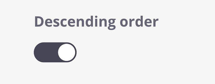
The Ascending/Descending Order doesn't work. While visiting a comic without being logged in takes you to the very first episode. This is not ideal for comic strips with many many many episodes.
"New readers will start from your most recent episode." Just reverses the order of the episodes at the moment.
Thank you but unfortunately, it is enabled.
(For another series, not the one my account is linked to)
All it does is reverse the order of the list instead of starting you on the most recent episode. Maybe that's the way the behaviour is supposed to be but it's not helpful in anyway way with a lot of episodes. New readers (or anyone who comes across it as a link) would have to scroll for awhile to reach the newest episode.
Again, not ideal for Comic strips.
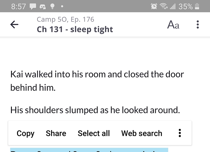
Hello! I know some updates were made to the app as well as the site (for android at least) and I recently realized that with this new update readers can now copy and past from the story! Im not sure if that's been mentioned or not yet!
This wasn't allowed before (I remember because I would always need to keep scrolling back and forth when quoting something from the story in a comment) and just wanted to let yall know in case you werent aware! I attached a photo of me doing it with my story but I can select any text from any story!
Also, two more things about the tapas app update (not as big a deal as the copy paste thing but something I also feel is worth mentioning)
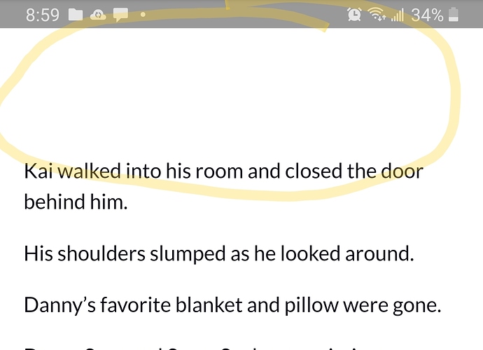
Now theres always this huge chunk of blank space at the top of every chapter, and it's not a big deal but it just kinda looks weird 
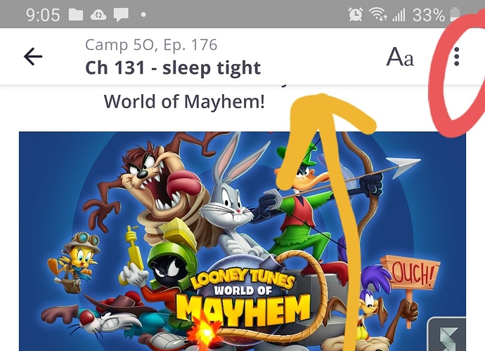
And before the update I feel like a reader would be able to click on the creators profile pic or name at the bottom of the chapter and it used to take you to the creators page and show you their other work, but now pressing it just toggles the top and bottom bar. This was usually how I would go the creators page and check out their other works, and it's a habit to press it when reading stories and comics. It took me a second to realize that now the only way to do that was to press the three buttons on top and then click the go to creator button. Again, not that big of a deal, but it does feel a bit more cumbersome and it might make readers not go through the extra steps.
So, last two arent that urgent, about 90% of my reader base have let me know they use the mobile app to read, so that's why I'm just being hyper aware of what its like to use the app and nitpicking it from the stance of a reader. The first one I feel like might be a security thing and in the past copy and pasting want an option and while it does make quoting a line from the story easier, I think most writers might appreciate that getting looked into!
My phone is a samsung galaxy s9, android version 10 (amd I'm still not sure what the software version is  but I sent that screenshot of my phone details in the topic about the italics appearing big on the app!)


