To me it makes sense for novels, especially the ones with longer chapters, because sometimes as you read you really want to say something, but when you finally reach the bottom of the page you forgot, or it doesn't feel relevant anymore.
In that context it would be cool if there was some sort of marker for where the reader was when they wrote the comment, like Soundcloud has.
Definitely agree with this!
EDIT: In addition, I think people would be more likely to use the sidebar to comment when binge-reading if the sidebar can be pulled up in fullscreen mode? Right now to comment in fullscreen mode, it exits to regular mode to take you to the sidebar and that's pretty inconvenient.
Not really a fan of the update. A lot of my issues with it feel like they could be mitigate by having the options to toggle stuff on/off For example I preferred the comments at the bottom. Since I can toggle them off/on at the side it's not that big of deal until I want to comment and the box is then relegated to the right corner of the screen which seems weird to me. I guess I'd prefer at the very least if the comment box would move to the bottom if you commented at the end of a chapter but stays on the side if you comment during. I also preferred how each comic/novel had a landing page, I think that's what it's called. But now when you click on comic/novel you are direct straight to the first episode.
I know the info for the series is now on the list but I like having the landing page with the episodes and then the option if I was interest to see the description from there I would see if I wanted to check out the first episode or not. Going directly into the first episode bugs me a little. I think for one I am not used to it and then there's the fact that it feels like I am losing the option of deciding if I want to sample or try the series and I am just being pushed into sampling. I also feel like being moved to the first episode kinda skews the views slightly. If the description doesn't interest me then I don't read the first episode. This isn't so much a problem when it comes to finding something from a list. Since the description is right there. But it is sort of an issue when it comes to anything being showcased by its cover.
With the way the series info is now set up when you go to an episodes it's either constantly there which is unwelcome in my opinion or you toggle it off. While there will be people who go to the first episode and read the description before reading the episode first. There will also be people who look at the cover, click, start reading it and might realize that their first impression was wrong and that leaves a bad impression of the series. I understand that, that is a very specific scenario though.
Also having the list with multiply pages on the landing page of a series seemed simpler for me then infinite scroll. This is one of the areas were I see a lot of people applauding infinite scroll while a small group of people aren't so thrilled. Here is definitely were I would appreciate the option to choose whether I want infinite scroll or not. I don't really know if there's a way to have the site ask if you want to have it as one or the other. But asking can't hurt.
In summary I be looking out for things I like or dislike and with try to edit this later with more details.
Edit: Landing page still exist its regular form on mobile and the app. Just so I'm clear infinite scroll was always on mobile and the app right? Because it makes sense there, I'm just not a fan of it on desktop since scroll is a lot different.
If this happens, I think we would all riot again so I would strongly recommend that Tapas doesn't do that. In fact, something like this would probably be the "last straw" for me. >_>
Why do people keep bringing this up? Come ooooon. Spend two seconds to just click the "list" icon. I'm not exactly the smartest or most common sense person around here and even I was able to figure this out quickly enough.
Hi! It's me again with complaints, sorry
I don't recall this happening yesterday, but today when I click on a comic it takes me to the very first episode. This even happens for comics that I'm in the process of reading, including a super long one that has about 600 episodes! How am I supposed to remember where I left off!! Give us a bookmark at least. Or have it as before, where clicking on the comic would take us to the last page we read.
It also happens that comics that are organized to show newest episode first, when I click to open the comic it still takes me to the very first episode.
And a side note, the UI is really clumsy on my work computer, which has a smaller screen. Comments bar overlaps over the pages but there is so much extra space on the left side of the page, and the list of episodes is useless because if I scroll over it it goes past several episodes, but it only shows me one (red arrow).
I don't want to imagine how this looks on an even smaller laptop.
Edit: I know the zoom in and out browser option is a way to solve the episode list size, but it also reduces the page size and therefore the legibility. And I don't think you should have to use the zooming options in a well designed page.
Just wanted to pop in and say yay for the updates!! And also ask a question, since I don't see it in the long list of replies to this...
Multi-genre is now on which is a GREAT help, but is there any way to search or filter by multiple genres? For example: If I wanted to read something that was both Fantasy and Romance (or both Gaming and Comedy, or something like that) would I be able to do that? On the desktop when I click through the different genres it filters by only that genre.
Just asking. Seems like it would make this new feature more awesome.
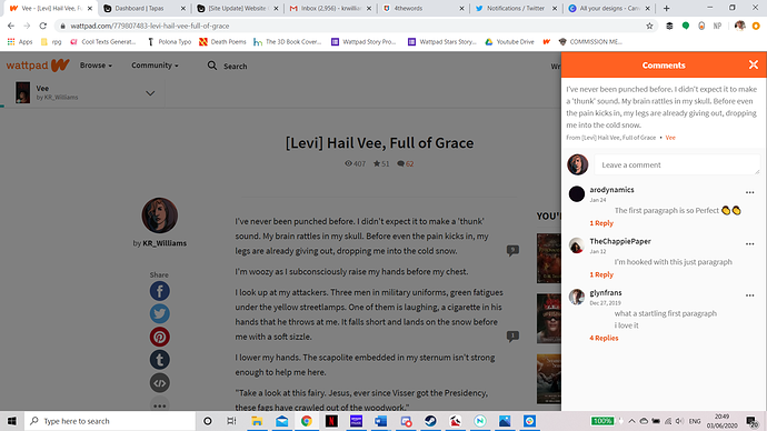
Hope that the devs are well fed during all the work! Infinite scroll reading is very appreciated, always something that is nice! Also very happy to know that we will be able to see series banners (never don't want to be able to see Heart of Keol's series banner)
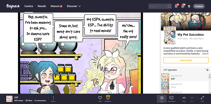
I do have a couple of critiques though, along with feature requests. The current slide out menu for chapter selection, comments, etc. does not seem to be capable of re-scaling the rest of the UI when visible. If you only ever have the Tapas window taking up the full width of your display this does not seem to present an issue so long as you have a sufficiently wide monitor with enough resolution. However, even with secondary window being made as small as possible when snapped to one side of my screen so that the comic window has maximum space, the menu covers up portions of the comic itself.
Why not make it so that when the menu is opened, the comic slides to the left so that it is still completely visible. (Before it is asked, no this is not due to low resolution of my display, it is a 3000x2000 display on the 1st gen surface book). Without a feature like this, the current UI is less functional and more intrusive than the older UI, as I cannot access many features unless I want to make the comic unreadable.
In addition, while I greatly appreciate being able to read comments at any moment, the current design makes longer comments very cumbersome to read. Such a strict width could make longer comments take up the entire vertical height of your display. Maybe the comments section could make the menu pull out even further so that more room was provided?
As a general feature request, I would appreciate the ability to access the menu while in fullscreen mode. It is very confusing to be knocked out of fullscreen every time you attempt to like a page, make a comment, or relocate to a different chapter that isn't the next one.
This last thing doesn't really relate to the UI, but UX for Tapas in general. More recently I've noticed that image loading seems to be less aggressive, but not in a good way. Rather than upcoming panels always being loaded in before I scroll to them to provide a seamless reading experience, I constantly see empty background before the image suddenly pops into existence to fill the void. If your servers simply couldn't handle the more seamless loading, I understand, but if it's possible I would like to see this fixed.
Have a great day dev team, and good luck!
I use the mobile website on Tapas, and I'm glad to see that "Continue From Chapter X" button was just reinstated. Thanks Devs!
One big thing I've noticed on the new mobile website though is that when reading a comics chapter, tapping the screen toggles the upper toolbar on and off, but the lower toolbar (with the favorite, comment, support, and previous/next chapter buttons) stays visible no matter what, taking up a lot of screen space. I'd love to see the functionality from prior mobile website versions return, where I could tap the screen and toggle both toolbars for a fullscreen view. This would definitely be nice for comics with a vertical scroll format.
@ratique Hello! I love all the new features. I also had a question/suggestion. Are in-line comments something the staff is interested in introducing to the site?
Love the infinite scroll being back, btw.
The current page design is really bad, the previous was much better. my screen is a 720p(768px) screen, and with the browser own bars taking up space, I don't have a lot of viewing space. Now with the permanent nav bar, and the footer, I have even less viewing space. and they don't even auto hide. the episode list style is just them moving from left in the classic tapas to right, so that doesn't bother me, but that footer and nav bar that doesn't hide on scroll doesn't do it for me.
and example
I think I saw someone mention this regarding the descending toggle for creators a while back and noticed that it's still doing the following:
I have my series marked to appear in descending order with the newest ep showing first, but for desktop(Chrome) and app(android), if you click on the series it goes to the first episode.
For mobile it works correctly and goes from descending order.