200 / 282
May 2020

Nope. This is a loooooong issue and perhaps something to to with Google (If that is your login?)

I would be extremely saddened if this leads to comments getting shorter...

Yep, Google.
Again, I wasn't sure if it was an issue with Tapas that they could fix, but I still felt I should let them know.

Eh I dunno that that's the reasoning. The dev team makes their decisions based on finding best solutions for readers, not advertisers.

For now, we will stick with the current solution and review the data once we have it.

Did you randomly click a middle episode and then click the link?

Because in Crome that will take me to last viewed and not latest episode.
Also as @mmmmat is saying. This is when you are signed out and have no account the issue is.

I guess the best way to use this site, is to have an account :wink:

My experience of over a decade of web development is that Firefox is Firefox is Firefox. The platform it's running on doesn't matter, but thanks for passing it on. For what it's worth I just checked and I get the exact same problem in both Chrome and Opera as well.

The thing is, it's not really a browser issue, the page is rendering just fine, it's your server that's delivering the wrong stuff. Your default behaviour is wrong regardless of what browser I'm using.

Thanks. That gives me the slightly less broken behaviour the site managed to present until a few days ago. Ideally I just want the most recent episode to load when I hit my bookmark but that for some reason seems to be a feature nobody at tapas towers has thought users might like.

Would it be so tricky to have a https://tapas.io/series/[blah]/latest url available for each [blah] on the site?

Well. Now that you have an account. Please stay and enjoy all the good thing that comes. Some creators really like it when you give them a ”like” and leave a nice comment.
It helps them to know what you like.
Also. Some other readers might share some of your thoughts

And you get a notification when there is a new update

What??? But we need the $$$

I really hope comments don't get shorter or discouraged. Interacting with readers is one of the most rewarding parts of sharing my work here, way more than numbers and subs :cry:

I believe that if people have something to say. They will say it.

Just like @mmmmat that made an account just to tell us about the user experience.

Communication is key. And unlike Webtoons, Tapas is doing this part so much better. You do not even get a notification as a creator that someone has left a comment for you over there. How lame is that?

Tapas is the best place for me to call home.

IMO this is much more likely for complaints than it is for compliments...

Not really, I asked several people to check the page and they all found the comments box weird if not annoying, because if you have a computer with a smaller screen the comments box overlaps with the pages and you have to manually activate it to comment, which interrupts the reading flow, and then hide it again to continue reading. It was much more convenient to just: read page -> type comment below -> move on. Also, less clicks.

Psst @mmmmat wanna prove this wrong?

Exceptions don't prove it wrong if they are, well, exceptions.

Besides, people generally accept that the majority of your active subs are silent readers enjoying the comic without ever commenting. If that's true, then it's also true that people are unlikely to say anything. We really did not need to introduce a new factor deterring people from leaving thoughtful comments... We should be encouraging people to talk more.

I know. And I have also said that the comments do not belong in a jumpy sidebar.

If the comments start out minimized, and you click to expand them, the ads are still right there to begin with.

Respectfully, I don't understand why this would be a "solution" when there was no problem beforehand. I understand the idea of letting people comment while still reading or while scrolling back, but it doesn't have to be all or nothing. There can just be a place to click to expand the comments as well as a place to click to pop them up in the sidebar. Flexibility won't hurt.

As is, it's just not taking advantage of available space. If you can use the full space for browsing and reading comments, which is certainly possible as it's the way it was, why force it to only be visible in squished format that makes it impossible to have as much comment material on the screen at a time?

Per the comment situation:
I think a possible solution would be to make it flexible and utilize the space under an episode and the side bar.
Like you could click 'See All' in the space under an episode to expand and open all the comments there below the episode. Leave the side bar comments for readers who do like it?

Hey!
Something else here.
I just want to thank the team for making this little pr-loading logo.
I was so ignored when reading and I thought that the comic just had some white space and I needed to scroll some more to read. Then the white space was just image loading and I miss the previous image.
Now whit this little logo I know something is loading.

Thank you

Seems logic. Now that the ads insnt the reason to not do it.
Only reason to only have the the comments in the bar is??????

You know. Before we go conspiration again. Let’s just all pretend that we all are beta tester and the dev want to see what happens with different stuff.

To me it makes sense for novels, especially the ones with longer chapters, because sometimes as you read you really want to say something, but when you finally reach the bottom of the page you forgot, or it doesn't feel relevant anymore.
In that context it would be cool if there was some sort of marker for where the reader was when they wrote the comment, like Soundcloud has.

Oh, I do think it makes sense to have an option to have the comments in a sidebar. That would be a very nice feature if it weren't the only way to see the comments. I just find it inconvenient to lose the bottom comments.

Can we just talk about the new reading format? (on the website) I personally hate it. The fact that the top bar and bottom bar take up so much space and that you cant minimize the episode menu! I hope Tapas changes it soon.

I think you can minimize the episode list now. Just double click on 'list' or double click on 'comment' on the bottom bar and it should disappear. I noticed that change today.

One thing that I don't think was mentioned that would be nice is, in the sidebar, if it was possible to collapse the comic/novel info, so it'd be easier to see all the episodes. Even when it's just a short description, only two to three episodes are visible at any one time

Definitely agree with this!

EDIT: In addition, I think people would be more likely to use the sidebar to comment when binge-reading if the sidebar can be pulled up in fullscreen mode? Right now to comment in fullscreen mode, it exits to regular mode to take you to the sidebar and that's pretty inconvenient.

Not really a fan of the update. A lot of my issues with it feel like they could be mitigate by having the options to toggle stuff on/off For example I preferred the comments at the bottom. Since I can toggle them off/on at the side it's not that big of deal until I want to comment and the box is then relegated to the right corner of the screen which seems weird to me. I guess I'd prefer at the very least if the comment box would move to the bottom if you commented at the end of a chapter but stays on the side if you comment during. I also preferred how each comic/novel had a landing page, I think that's what it's called. But now when you click on comic/novel you are direct straight to the first episode.

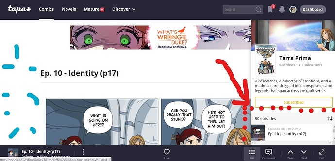
I know the info for the series is now on the list but I like having the landing page with the episodes and then the option if I was interest to see the description from there I would see if I wanted to check out the first episode or not. Going directly into the first episode bugs me a little. I think for one I am not used to it and then there's the fact that it feels like I am losing the option of deciding if I want to sample or try the series and I am just being pushed into sampling. I also feel like being moved to the first episode kinda skews the views slightly. If the description doesn't interest me then I don't read the first episode. This isn't so much a problem when it comes to finding something from a list. Since the description is right there. But it is sort of an issue when it comes to anything being showcased by its cover.

With the way the series info is now set up when you go to an episodes it's either constantly there which is unwelcome in my opinion or you toggle it off. While there will be people who go to the first episode and read the description before reading the episode first. There will also be people who look at the cover, click, start reading it and might realize that their first impression was wrong and that leaves a bad impression of the series. I understand that, that is a very specific scenario though.

Also having the list with multiply pages on the landing page of a series seemed simpler for me then infinite scroll. This is one of the areas were I see a lot of people applauding infinite scroll while a small group of people aren't so thrilled. Here is definitely were I would appreciate the option to choose whether I want infinite scroll or not. I don't really know if there's a way to have the site ask if you want to have it as one or the other. But asking can't hurt.

In summary I be looking out for things I like or dislike and with try to edit this later with more details.

Edit: Landing page still exist its regular form on mobile and the app. Just so I'm clear infinite scroll was always on mobile and the app right? Because it makes sense there, I'm just not a fan of it on desktop since scroll is a lot different.

If this happens, I think we would all riot again so I would strongly recommend that Tapas doesn't do that. In fact, something like this would probably be the "last straw" for me. >_>

Why do people keep bringing this up? Come ooooon. Spend two seconds to just click the "list" icon. I'm not exactly the smartest or most common sense person around here and even I was able to figure this out quickly enough. :frowning:

Hi! It's me again with complaints, sorry :cry_01:

I don't recall this happening yesterday, but today when I click on a comic it takes me to the very first episode. This even happens for comics that I'm in the process of reading, including a super long one that has about 600 episodes! How am I supposed to remember where I left off!! :cry_02: Give us a bookmark at least. Or have it as before, where clicking on the comic would take us to the last page we read.
It also happens that comics that are organized to show newest episode first, when I click to open the comic it still takes me to the very first episode.

And a side note, the UI is really clumsy on my work computer, which has a smaller screen. Comments bar overlaps over the pages but there is so much extra space on the left side of the page, and the list of episodes is useless because if I scroll over it it goes past several episodes, but it only shows me one (red arrow).

I don't want to imagine how this looks on an even smaller laptop.

Edit: I know the zoom in and out browser option is a way to solve the episode list size, but it also reduces the page size and therefore the legibility. And I don't think you should have to use the zooming options in a well designed page.

Just wanted to pop in and say yay for the updates!! And also ask a question, since I don't see it in the long list of replies to this...

Multi-genre is now on which is a GREAT help, but is there any way to search or filter by multiple genres? For example: If I wanted to read something that was both Fantasy and Romance (or both Gaming and Comedy, or something like that) would I be able to do that? On the desktop when I click through the different genres it filters by only that genre.

Just asking. :smile_01: Seems like it would make this new feature more awesome.

from another thread:

I think that happened overnight, since it worked well yesterday. I left a note with the team.

Sorry if someone mentioned this before I just quickly skimmed through this forum. When looking at comics from my phone on Safari, ALL comics have a white border. It didn't exist before this change and it makes all comics...much smaller. Any chance to remove the white border?

cries in no space left on my phone to download apps ;-; thanks for the help tho!

It is going to be fixed eventually though, right?
Cause I can’t get the app, I gotta use the mobile website.