9 / 12
Oct 2018

Do you think a horror comic would be creepier in black and white or desaturation? Black and white sounds more impactful and desaturation seems eerier. Just curious to see what you think.

Shank u! ʕ •ᴥ•ʔ

  • created

    Oct '18
  • last reply

    Oct '18
  • 11

    replies

  • 1.7k

    views

  • 12

    users

  • 14

    likes

  • 2

    links

I personally don't really like black and ehite, and I think desaturation makes it spookier imo.

i like both! But, when it's black and white, I think it's more effective if you're quite good with hatching and texturizing with lines. Many horror manga are effective because they're good with those things. Desaturated colors might work best if ink work is not your strong suit.

I'm personally partial to high contrast black and white but this really depends on the specific art style you're using and the specific story.

Why not both?

Using a variety of visual techniques could play to the strength of your story.

I realize it's not one of the options proposed, but hey, vivid colours can actually be used to great effect in horror too! Especially when they come across as "venomous" or "sickly" tones. On that note, here's a collection of old horror film posters, many of which serve as a good example of colour palettes that leave the viewer with a sense of "unease"- https://wellmedicated.com/100-illustrated-horror-film-posters-part-1/6

On a personal note, I also love the impact of high contrast black and white- but I think there is a danger of it feeling overused and losing that punch when it's every other panel.

Any colors can be spooky. It depends on how you use them that makes them spooky.
You could do a comic entirely in pastels and it could still be frightening.

I don't know about color palettes, black and white usually does the trick for me if you're aiming for more of a creepy/subtler atmosphere. Desaturated colors, neutral colors..
Take a look at The Shining:


the hotel is for the majority, brown, white and gray. And some more intense colors (blood red, green, blue) are added to throw off the "organic" feeling that comes with neutral colors.

If you want to go for a more chaotic look, high contrast works, which usually lays in the lineart. This is kind of a specific example, but that one panel from Prisoner from Hell Planet that always gets me every time:

TERRIFYING!! High contrast - hard shadows and pure white highlights can do the trick if used correctly.

It depends. Are you going for a lost footage creepy? Desaturation. Old movie creepy? Black and white

It's a cop out, but it depends on what's better for your story.
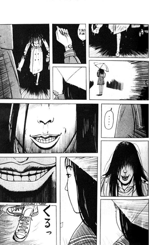
Some of the best horror comics I've read are manga, so I dig black and white a lot. But I also read one of two color comics that are the shit. Have you ever read ''Wytches''? It has this awesome color pallet, desaturated colors with spots of really shiny stuff.

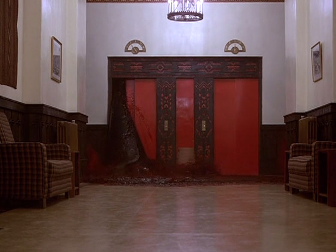
Dawg had a great point with her post. The Shining is a great example. But I'll add that, although desaturating is more normal, really bright colors can be creepy too.
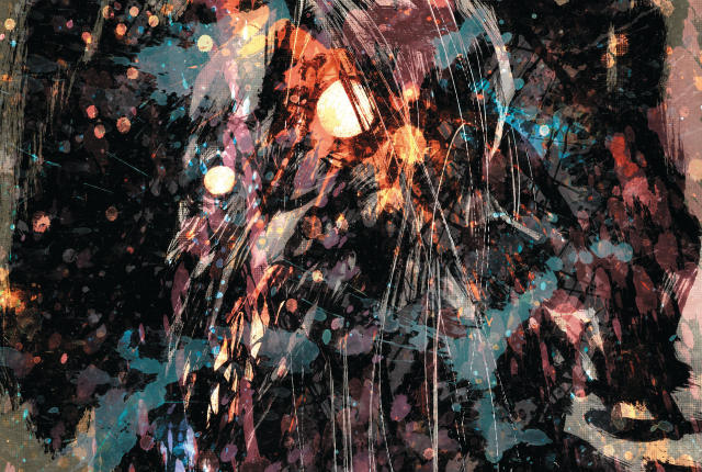
''Cries and Whispers'', by Ingmar Bergman, while not a horror movie, is one of the most uncomfortable, creepy movies I've ever seen, and he works with this hot overwhelming red.


It's great stuff.
It's all tools, it's about how you apply them.

As a bonus: Have you guys read Zashiki Onna?
Hot damn it's the creepiest shit!!!

Black and white forever! It's just perfect for quiet moods be they unsettling moods or moods that create awe.

Black and White are like jazz and blues. Can't do better.