Hello fellow creators!
I have a question for all of you
For our thumbnail we have a more abstract thumbnail, but I see that almost everyone have a picture of their characters in some way.
I want to hear, what would make you more likely to click on our comic:
The icon we have now:
Or something more like this:
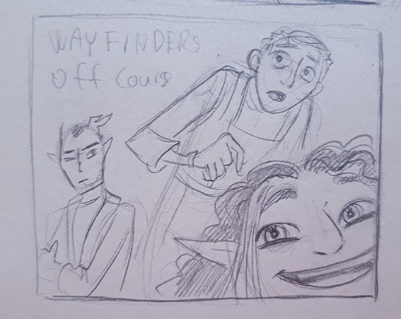
This would of course be colored, in the style that match the comic.
I already know the pros and cons with both:
The first stand more out, but does not tell a lot about the comic
The second you get a feel of what the style of the comic is, and can see the characters and if you like them.
Thank you so much for your help!
Best regards Heidi from the Snackbag team
(you can check out the comic here: https://tapas.io/series/WayfindersOffCourse)


