Basically, this phenomenon**:
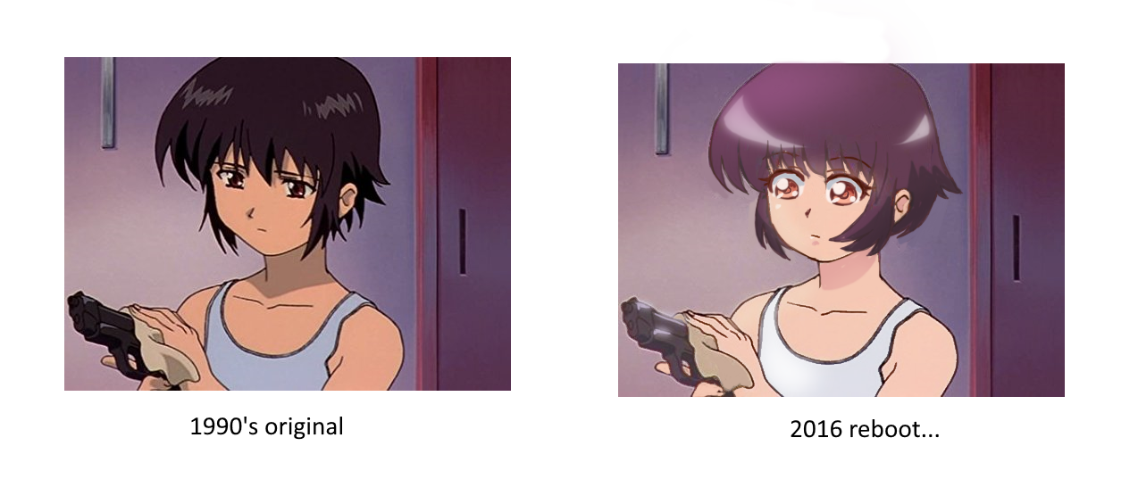
They sand off all the edges, remove all the contrast, and add 15 layers of airbrushing and compositing effects to make up for it. And it DISGUSTS me.
It also makes me wonder who this is for? o_O Why would older fans enjoy seeing their favorite series (most likely, the ones that 'got them into anime') visually destroyed like this? Why would new fans be interested in anime that looks as generic as humanly possible when their generation got MHA and Demon Slayer??
Additionally, why would animation directors give the greenlight to art styles that suck up valuable time and energy only to make the end result look worse??
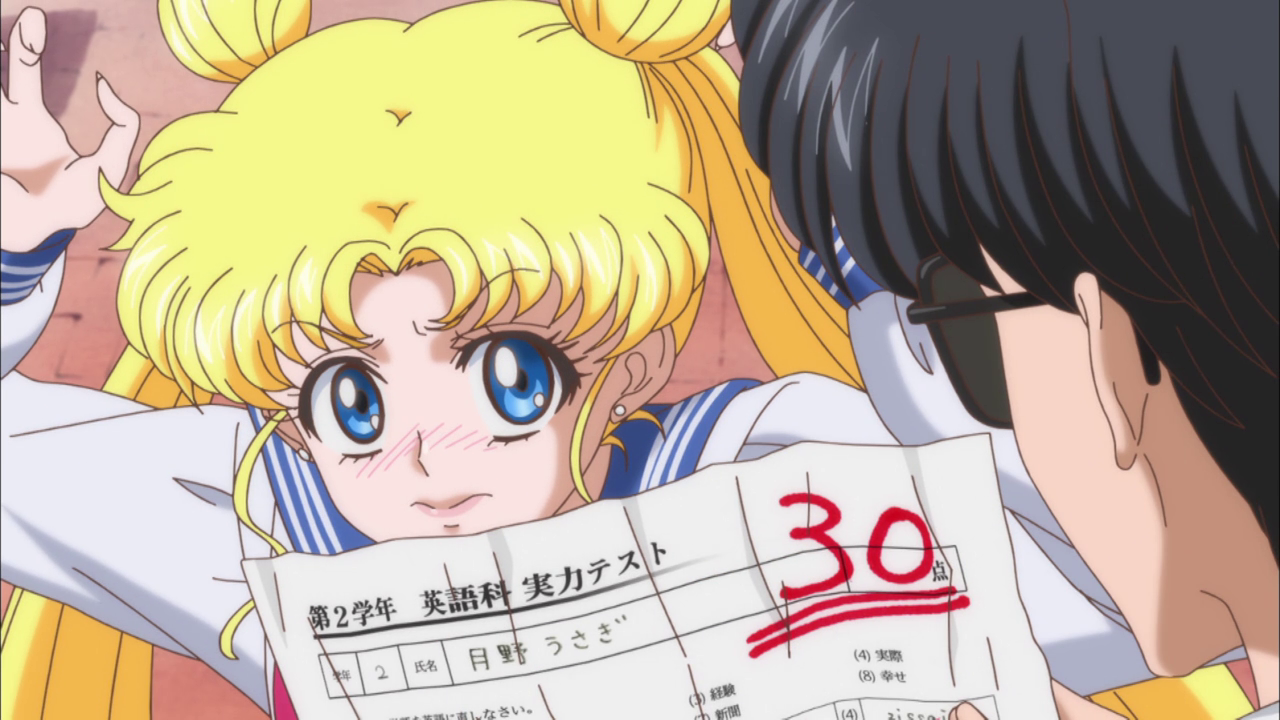
Like, I'm sure glad we forced multiple people to draw, shade, and render all 58 annoying little details on this frame where I can't even tell what emotion Usagi is expressing...
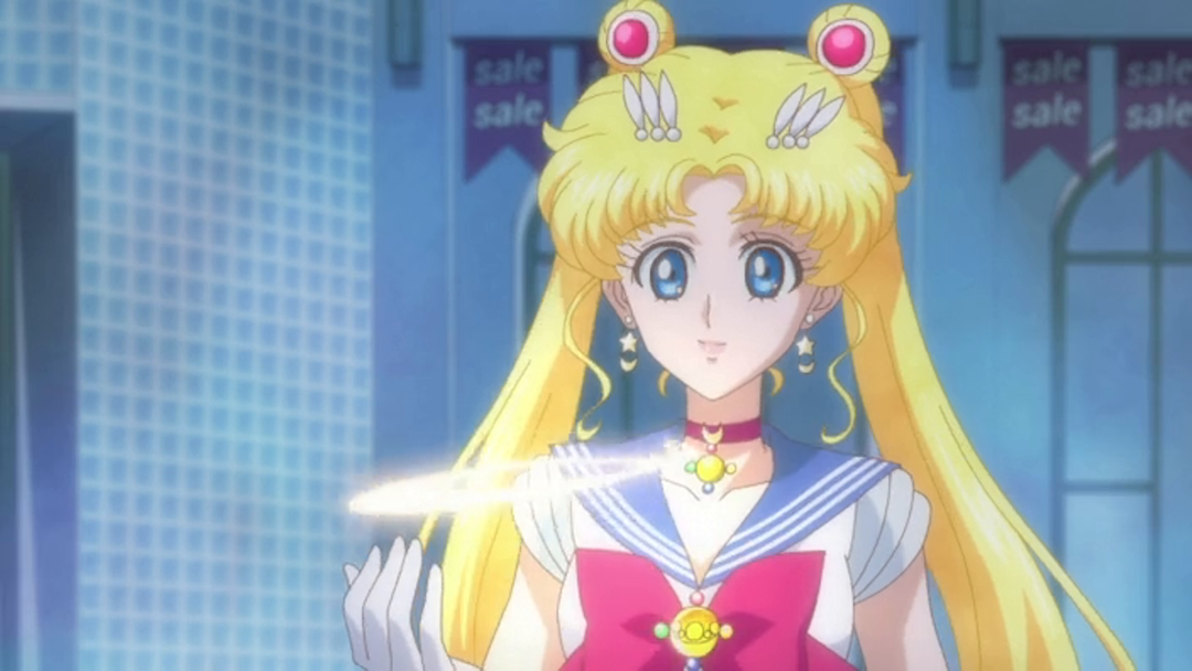
Her face is the focus of the composition, and yet there's nothing behind those eyes. She looks like a lifeless doll...
Anyway, maybe some of you can tell me why you think this keeps happening...OR, you can tell me why this type of art direction is genuinely appealing to people and reads as a clear improvement (???). I've been wanting to start talking about more visual art-related stuff, and I think this'll be a good topic to start with.
The main anime I've noticed that have fallen victim to this are Sailor Moon Crystal, Tokyo Mew Mew New, and Cardcaptor Sakura: Clear Card...I'm only gonna talk about the first two, though. I think CCSCC also looks boring compared to the original art direction, but it at least looks somewhat decent in its own right.
Meanwhile, I genuinely think Sailor Moon Crystal, at least in Seasons 1-2, looks like a mean parody of the 90's anime. And at first I thought this was because it was trying to be more faithful to the manga art style-- well, surprise, surprise; turns out that the manga doesn't even look like that, so if that's what they were trying to do they failed.
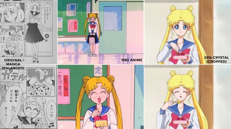
The manga has an airy, free-flowing style that makes the characters look delicate and graceful, letting the linework do most of the talking. The 90's anime translates that to the more grounded animation style of the time period, while focusing on open, readable shapes and expressions to help everyone, animators and viewers alike, instantly understand and enjoy the visuals.
And then Crystal came along and said "you know how people are always making fun of the 'yaoi hands' art style, with the 7-foot spider-limbs and the tiny faces? What if we did that, but like, 100% seriously?" and just made something up that was both uglier to look at and 10x harder to draw.
As an animator trying to learn this art style, what do you even focus on?? What do you latch onto in these drawings; what parts will just instinctively flow from your pencil? Usagi's TWENTY ONE bangs, piled so high on her head that the part in her hair is marked THREE times?? The two ugly blonde meatballs sitting on top of this mountain of garbage like an afterthought? Or the complete lack of energy in her limp wrist as she swivels her chopsticks up to her mouth?? It's just awful...I cannot imagine seeing this taking shape in pre-production and not immediately dashing out of the office to find a new concept artist.
I have a feeling that this may be connected to Crystal's troubled production (it looks like the Blu-Ray release was essentially reanimated shot-for-shot...please tell me that's not real, because the implications are nightmarish) and possibly to the new less-insane art style introduced in Season 3.
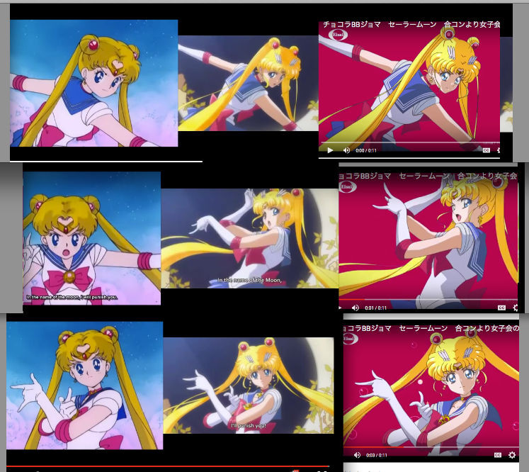
It's obvious how much stronger S3 looks, just from the expressiveness of the drawings. It still clearly has anime-reboot-itis compared to the original, but here I can actually believe that someone might see it as an improvement. It retains the friendly charm of Sailor Moon; she looks like a cute teenage girl and not a glittering alien. Plus, it adds bolder shading and highlights and clearer detail-- from this isolated sequence, I would pick it as the best-looking one.
Now, I don't think the S1-2 artstyle is necessarily bad in and of itself-- it's not the kind of thing I like, but it IS possible to make it look good:
But it's obvious that the studio couldn't put that effort in consistently, and the fact remains that this artstyle is not tailored to the personality of the main character, which is a HUGE red flag. The girlish, silly side of Usagi is difficult to portray in a style that is so overly-polished and static looking; they should have realized that previous styles went in a more cartoony direction for a reason and rejected this nonsense on Day 1.
So that's Sailor Moon...annoying, yes, but at least its flaws are clear for everyone to see. The issues with Mew Mew New are a lot more subtle, which makes them much more infuriating to me.
I have one question for whoever decided to do this: did shape language kill your grandma?? And was basic character design philosophy an accomplice to the crime???
In terms of basic production, the anime looks professional and appealing. If I had never heard of Tokyo Mew Mew before, I might be tempted to check this out. But as someone who grew up with the bold millennial style of the original anime, I'm sorry, but no. The more I look at this the worse it gets; please kill it with fire. =_=
I could talk about the problems with these designs all day; maybe I'll take this half of the rant and make it a video in the future. But to try and keep my fury to a minimum, I'm just gonna briefly describe the problems going character by character.
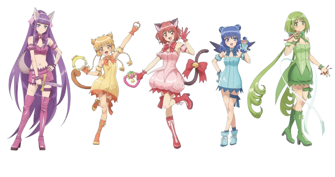
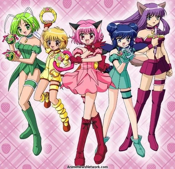
So first, here are the original designs, for comparison:
Now, for my issues with the rebooted versions:
Ichigo (pink)
She got off easy; her new design just looks garden-variety dull. I kinda like how they added contrast by changing her hair back to its natural color, but I feel like this was less of a purposeful creative choice and more of a necessity, due to how aggressively they bleached the pink out of her outfit. If they made her hair match, or if they kept it neon pink, she would look too weird.
The new dress is a much more boring shape, the boots are hideous, and her special weapon clashes severely with the whole design. A downgrade, at best.
Mint (blue)
They only made a few changes, but they all suck. Her original form-fitting dress made her look sleek, this noncommittal bell shape ruins that. She used to be the only girl with her hair pulled up, giving her a controlled and polished look fitting her personality-- they decided to give her mermaid waves instead, ruining that, making her upper body look way too busy, and destroying her facial silhouette all in one go.
They also gave her ugly unnecessary socks and tied ugly unnecessary bows on her shoes, ruining the simplicity of her legs that drew your attention and reminded you that she's a dancer. Great job, 10/10; I've never seen a design so efficiently destroyed.
Lettuce (green)
A complete failure. Lettuce used to be one of my favorite designs, I liked how mysterious, innocent, and provocative she looked all at once...despite the fact that you can barely tell she's supposed to resemble a porpoise (I think?). ^^;
Rather than improving on that, this design did its very best to remove everything that made the original interesting. No more 'antennae', now she just has random ribbons attached to her back, plus atrocious-looking twin pigtails that obliterate her silhouette and leave her head area completely devoid of interest. The pencil skirt is hideous; the high-heeled boots do not fit her personality. Just horrid.
Pudding (yellow)
When I was a kid, Pudding was my #1 favorite; this version of her is an insult. The poofy leotard and leg warmers hinted at her acrobatic skills and her energetic, childish personality, and they decided to replace that with a gigantic bell skirt and basic stockings with ribbons on them. Pure insanity that I can't wrap my head around...maybe they wanted to make her dress look like a pudding cup. If so, it didn't work.
The hair is so over-designed it looks pathetic; four long braids AND two pigtails is just desperate compared to her original simple bob with tiny braids. And again, it ruins the inherent athleticism of her original design...but they think they can make up for that by letting her keep the fingerless gloves. Please. T_T
Zakuro (purple)
...Seeing this done to my original anime crush is nothing short of a nightmare. The ears are way too big and attention grabbing; they look like a costume headband. I'll give them props for trying something bold with the double shorts, but the end result is, unfortunately, very stupid-looking. The hair is a formless mess that's clearly trying to make up for it by being unnecessarily big and long, and the random pink ribbon on her head is the killing blow.
Not to mention, the aggressive same-face they force onto her in these promotional images makes her feel lobotomized. Where is her personality?! o_O Why does she only get to look cool and mature when she's making a specific expression in the anime; just draw her that way all the time!!
...Okay, I'm done. Although I wish the original author of TMM was still alive so I could ask her what the hell happened here. IIRC, she assisted with the production of Mew Mew New-- do I take that to mean that she approved of these redesigns, or possibly came up with them herself?? WHY??!!!?!!
In conclusion: I really need this to stop, like yesterday. Hopefully other people are starting to agree...I don't watch Panty and Stocking, but it was nice to see that it got a revival that fully adhered to the "if it ain't broke DON'T FIX IT" philosophy and still looks awesome. And Sugar Sugar Rune got a PV hinting at a possible new animation style that is a GORGEOUS 2D/3D hybrid, something the original could never have pulled off back when it was made. <--That is what I want. It's not the rebooting that's the problem (yet...), it's the refusal to appreciate and invest in style.
***P.S. the anime in my 'example pic' is Noir...and if anyone ever reboots the anime like that I WILL jump off a bridge. They can take El Cazador; they can take Madlax; I don't care. But if they dare desecrate Noir, the OG of the Bee Train 'girls with guns' trilogy, one way or another I'm leaving the planet. >_<


