20 / 87
Nov 2017

Lol I can empathize with that, there's been a few times I've tried to achieve a certain look only to screw up my anatomy. Getting back to the basics is always the hardest part.

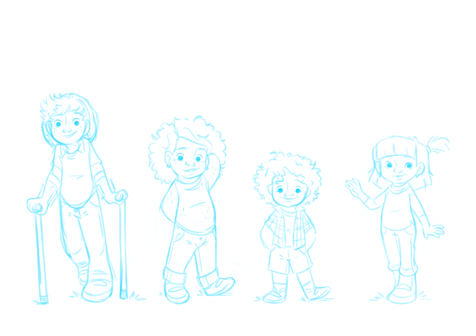
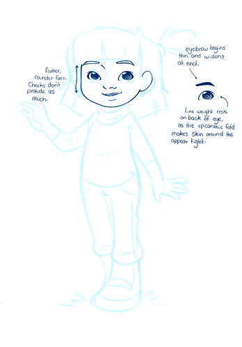
The new drawing looks much better compared to the previous ones you showed! If it helps, the nose bridge of a child is usually less pronounced than an adults. The younger the child, the less developed it is.

I have to say, finding your own style is probably one of the hardest things to do as an artist. You can be completely proficient in anatomy, and drawing realism, but learning how to exaggerate features and such to where they still look like a (not completely deformed) human is a challenge.
If I can make another suggestion. This sounds bad, but if you ever get free time to goof around you can always do some tracing studies of other artist's styles. For many people that's a good method for training your hand, and expanding your horizon. Like, pick a few illustrations from an artist your really like, do a few studies, try to draw that style blind, then experiment by using your new knowledge to change up your own style. When I was a kid (not saying you're a kid) eyeballing an artist's style really helped teach my hand to do new thing.

Yeah, your own readers are pretty much useless when it comes to delivering feedback. Some of mine are pretty good about it, but I bother them all about feedback regularly, I'm sure some do it to shut my pie hole. If you ever want to get really good feedback, the forum on Concept Art3 is a pretty amazing place. The whole site is focused on artistic improvement.

I'll have to come back to backgrounds later, but here's something else I wanted to pick on besides what LordVincent already said about consistent direction.

She looks like, unless I'm wrong, that she's meant to have her head titled upwards ever so slightly. In this case, don't miss out on drawing the part of skin under the chin (attached to he neck) that the angle exposes. Even if slightly, it's what gives it depth. Anime has tricks they use, usually they just colour it in as a heavy cast shadow. It's typically inked in full black if it's a B+W comic. You an pretty much get away with colouring it in as a deep shadow because not much light really hits that area unless the angle of lighting is from underneath. You can soften the curve of the chin to be more rounded, which is what occurs as the jaw tilts upwards. A trick anime also uses is to curve the neck so that it bows out where it meets the head in these perspectives, because the necks are otherwise extremely thin in this abstracted style and look funky when you try to connect them. Bowing them out helps create the illusion of perspective, even though it's not necessarily what occurs in real life, at least nowhere near that degree.

(Also forgive my ugly old genesis models. They're just the free ones that come from DAZ. )

As far as backgrounds go, what are you trying to achieve? One thing I can already say is they mostly lack texture. But there's a billion different ways to go about it. You might want to find some stylistic inspiration you like.

/in which I expose my precious character designs. sobs

These are the main four of my webcomic-in-progress. You can critique me on whatever stands out to you the most. I'm interested to hear what you think! :slight_smile:

My main issue as far as self-improvement is staying true to ethnic details while keeping my style loose and cartoony. For example, the last three characters are PoC (biracial & Asian). I feel like, despite using dozens of reference images and several tutorials, that I'm not hitting the mark with my Asian character's facial features, specifically with the eyes. I've tried drawing them thinner, but then I can't get the eyes to looked focused (they always looked sleepy/hypnotized), so, any tips/advice on that would be appreciated.

:no_mouth: * waits *

I came back to this post just because I felt like red lining something!
In this piece I feel like the anatomy of the face is off.Like the cheek bones are not quite even. When red lining I a,so noticed that one eye was larger than the other. Another anatomy issue I noticed was the position of the neck. The neck is usually centered beneath the jaw. So the placement of the shoulders would also shift some.
Anatomy aside, this piece looks kind of bland, like there could be more variation in line weight and more gradual shading instead of blocks of a darker hue on the same color. The crappy wavy lines I drew in the background were to indicate that this piece could also use more detail in the background. For example, an ocean usually does not look like a huge block of blue, so I would add more waves and depth of color back there.
However, I love the hair so much I couldn't touch it. And the base color pallete looks really poppin'. There is a lot of energy in the color of the piece and the movement of the hair. So overall it is good work!

aaah thank you :grin:

The issue I seem to have though is balancing the sharpness so that the character doesn't look like a villain. She looks a lot more devious with sharper eyes... but thank you! I'll keep trying :slight_smile:

Oh that is good info to have! Thank you, I like how it looks with that shadow and how much it really softened her gaze to have everything tilting upwards! That is definitely more of the look I was trying to go for.

As for backgrounds, I'm just not very comfortable drawing them. Before drawing this one chapter of my comic i completely avoided drawing backgrounds as much as possible. One issue I have run into is that my character's angle doesn't match the angle of the background so the characters begin to look pasted on and not involved in the environment, although LordVincent touched on the pasted on part with adding shadows beneath objects. Since you. Mentioned texture, is there a way to add texture without it taking 1000 years to color? Part of my issue with comic pages is the amount of time they take to do correctly.

I'm not an expert in animations but I think this animation needs more in-betweens cause it looks a bit too choppy also I think a bit of the timing is wrong, this is a fairly quick promo so try making it in ones instead of twos since ones are better for quick movements

that's just me though and I'm really not an animator(done one shitty animation on flash)

Most people drawing comics (or illustrations for that matter) don't add textures in the most complicated and manual way they can. Traditional artists use sponges, stamps, fabrics, etc with their paint to create a texture fast and expressively. Digital artists use brushes and patterns. This goes for things like grass, ashphalt texture, stars in the sky, etc. Sometimes using something so simple as a soft-dotting brush at a low opacity in a slightly different color to give highlights is enough for texture. With glass for example, "texture" would be reflections to create a feeling of glass. People don't stare much at details though, especially not in comics. Hell, overdetailing can create a messy look (a problem one of the comics i mentioned as my inspirations actually has) and make it hard for the reader to focus on the text. No, what you want is to create a detailed but harmonic impression. so with glass, simply giving implications of sky and light reflections will do most of the time. (unless the glass is part of the main "topic" of the frame. Say if a character is seeing their own reflection in it.)

You're self taught?? That's amazing! :open_mouth:
I barely know anything about animation but

I think you should bring this out, maybe it will make the movement pop out more. Since right now the timing seems a little too even for a scene with a galloping creature.

Yes that looks great, aside from some difference in direction/focus of the pupils! but the shape of the eye itself is good.
I feel your pain, I struggle with asian eyes too.

Oh shoot-- someone noticed XD
I'd correct them, but I'm too content right now :stuck_out_tongue: maybe later.

HAHA SORRY, most people don't care, I'm just... way too obsessive with pupil direction. Honestly it is something I have had to force myself to practice to care less about, it's that bad with me.

So I'm trying to color an old Christmas story of mine in a different way and make it more dreamlike looking than the normal style I was going with. I'll show two examples


It's not too big of a difference but on the normal ones I keep my lines black and don't use any textures. While on the dreamlike ones I add textures and color the lines with a reddish color. I'm not sure if the effect is a little too much and the normal style is already dreamlike enough? I was never good at using textures soooo <__<

I think they look pretty great, especially the dream variant! :slight_smile:
There's a fairly significant difference between the two styles. I like how the illustrations look with the colored lineart, all sweet and bubblegummy :blush:

Thank you! ; _ ; I’m trying to find a balance between the two since I’ve been critiqued before for my work being way to saturated! So this is reassuring c;

Honestly I think I would advise against rotating the eyes. Besides it not being at all what makes people look asian (any photograph of an asian person will in fact have rounded eyes that sit normally), it's also been used as a rather lazy/ offensive stereotype in the past.

These are some things I've noted tht add up to a common look when I studied photos of people from various Asiatic backrounds. Epicanthic fold is the most common for eyes, but some Asian people don't have, just as some Caucasian and African people do in fact have it.

Facial structure is usually very rounded and rather flat, so I wouldn't have the cheeks protrude nearly as much. A trick I use is to have most of the line weight concentrated at the "back" of the eye, where the fold reveals the eye more fully. Around the front the skin appears tight, so the line weight is left much thinner. Eyebrows are interesting, they're commonly very short in length and start thin, and thicken out at the end, for both men and women. I usually avoid drawing much of the bridge of the nose from front on as well, because it projects less and slopes quite a bit in side profile (that's just my personal style though, eliminate detail that isn't very prominent.)

Honestly what you had wasn't too far off from looking Asian. If anything I think the other kids could have more experiments with different eye shapes.