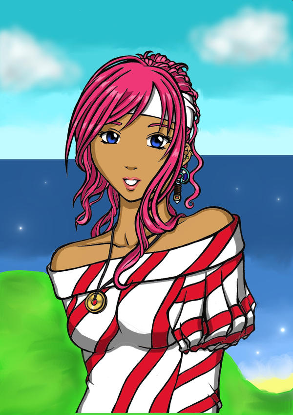
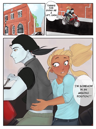
@hotsubsandwich Hi! I really like the backgrounds in your second example, and I see you're making use of some more dynamic angles in them. I also like the varied gutter width, architecture details and the man's face in profile on the last panel of the second example you provided.
I am not going to comment much on your anatomy as I feel that I can't really help much there, except for one thing and that's some basics for faces. In your first example, there is a very large difference in eyesize combined with confused face direction.
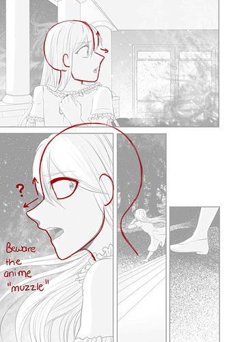
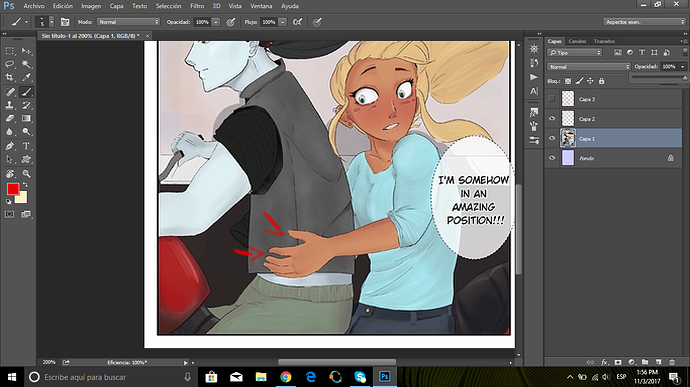
I have used red and blue lines to show what I mean. The red lines show how the eyes and right cheek indicate the head is tilted. The blue line indicates which way the nose, lips and left cheek indicate the face is tilted. Perfect symmetry doesn't exist in nature so you don't need to be spot on, but the indicators shouldn't differ as much as this. For frontal face drawings especially, try to keep direction like this in mind. You can also flip (mirror) the canvas multiple times during sketchin and inking to get a "new perspective" on it and spot any mistakes of this type. This trick is also useful to spot anatomy mistakes.
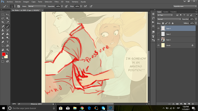
Since you work digitally, you can also easily mark, rotate, resize and move face parts in the sketching face if you find yourself with an overall good image but a few flaws. I have given this a spin myself with your image and this is what I came out with:

In this example, the face has a more unified direction.
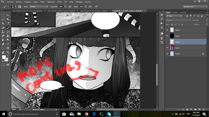
Style consistency is something that will come with time, don't worry about it! Everyone's style is inconsistent for the first bunch of years (my teacher always said you need to do something for 10,000 hours before you become really good at it, so how many years it would be specifically depends on how many hours you draw each day). Styles also have a slight temporary inconsistency when a more experienced artist learns new things and makes adjustments. Such inconstistencies shouldn't be feared or hated; they're a good thing and a sign of improvement.
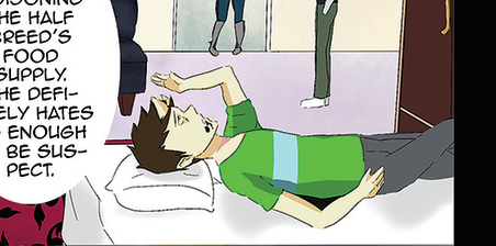
Instead, I think you should have a look at depth. When your girl grabs your guy, her hand should sink in a bit creating wrinkles (unless he is wearing a hard leather vest. Those don't wrinkle, trust my goth ass). When a character lies on a bed, he should sink in and parts of his body will be hidden. When someone grabs someone's arm, cheek, boob, whatever, it will bulge over a bit outside the grabbing area if the image allows/requires for such detail. Basically when things are pushed against each other, the materia will escape towards the sides to escape the point of pressure since the pressure minimizes the area it's allowed to take up. Hard objects don't do this (they break instead if the pressure is high enough), softer objects do it more.
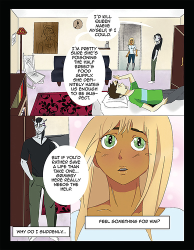
Here's an example with the bed guy. Here is the original image:
And here's the same but with wrinkles and "sink in" added:
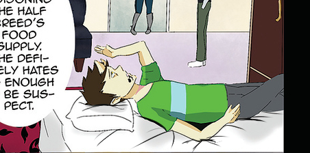
Sorry about the messy put together but basically it makes it look more like he's actually there!
I do think you have a bit of an issue with shading! I will divide it into two parts:
Firstly: Your characters need a shadow! Objects, too. They currently don't cast one!
This is a messy example I whipped up. You shouldn't go for plain black when doing this in real pages, it was just the fastest way for me to do it to give you an example.

This is a very quick addition that requires very little effort and will make it look like they're actually part of their environment rather than just pasted onto it 
Secondly: The way you are currently using the color wheel when you pick shadow colors and highlights, you are keeping way too close to the base color. Not in the sense that they aren't dark or bright enough, but that you keep in the same color and just pick a color that's closer to black on the slider for shadows, and a color that's closer to white on the slider for highlights. This makes for a rather dirty and dead look. I suggest you study color theory a bit if you haven't already. (if you have studied it, you probably just need to get more daring with your shading. I avoided the method I'm about to suggest for a long time because I was scared of doing it wrong)
Basically the trick to livelier highlights and shadows is to go to a different color on the wheel and then maybe going for a different brightness or darkness if neccessary within that color.
Here's what I mean, illustrated:
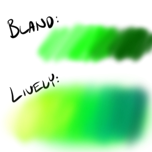
In the "bland" I stayed within the same color.
In the lively one I turned to a yellow color for the brightness and a bluish color to add to the shadowed part.
Here are some more examples of color shadings using the same method, the middle area of the shadings being the base color:
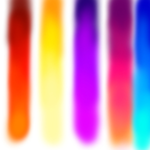
Now you don't need to get that extreme about it, but understanding how the method works and applying it in small bits will help bring some new life to your shading