You are 100% correct here. I tend to get out over my skis when drawing digitally, and my art definitely suffers for it. I focus more on shading and textures than I do on the actual drawing, and it consumes way too much time. I think this is a big part of the reason that I'm reluctant to get back into cartooning: I take the amount of time it takes me to draw a static, single-panel image, then imagine multiplying that across several panels for a comic, and then I just don't. I really do need to simplify.
When I did traditional art I much preferred monochromatic drawing with either crosshatching or different pressures on the pencil for shading. I still used to experiment with different shading methods though.
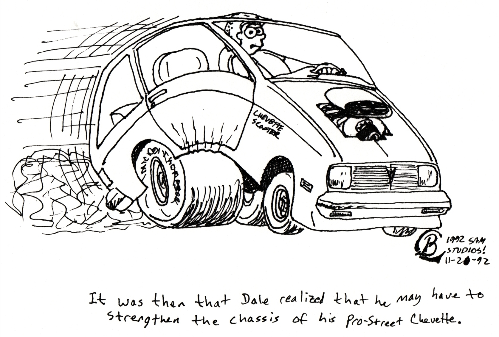
Take this old 4X4PLay comic that I drew in '92. Pretty simple, but a little bit of crosshatch shading on the tires. You can definitely see that The Simpsons show was influencing my style!
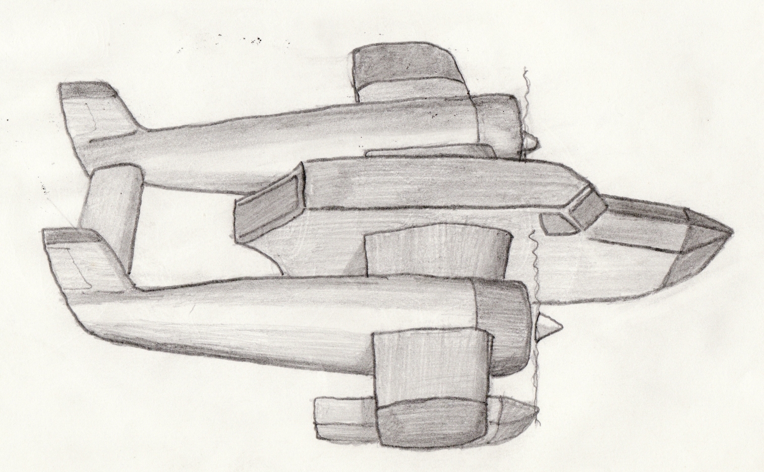
Here's an example of very simple pencil shading: A drawing of the Sea Duck plane from the old Disney cartoon Tale Spin:
I'm sure you've seen this more intricate example of pencil shading, because I'm certain that I've posted it before:
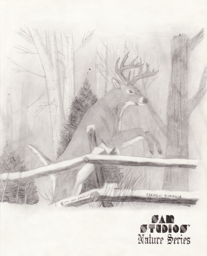
I was also experimenting with that one. Two things that I did here that I considered experimental back in the day: I drew and shaded it, then rubbed a piece of paper towel all over the drawing to blend the pencil's carbon, and then I used an eraser not to destroy art, but to make it: That snow on the fence, the deer's white spots, and that white birch bark were made by erasing the smudging done with the paper towel. This remains the only drawing that I've ever done that I framed and put on a wall.
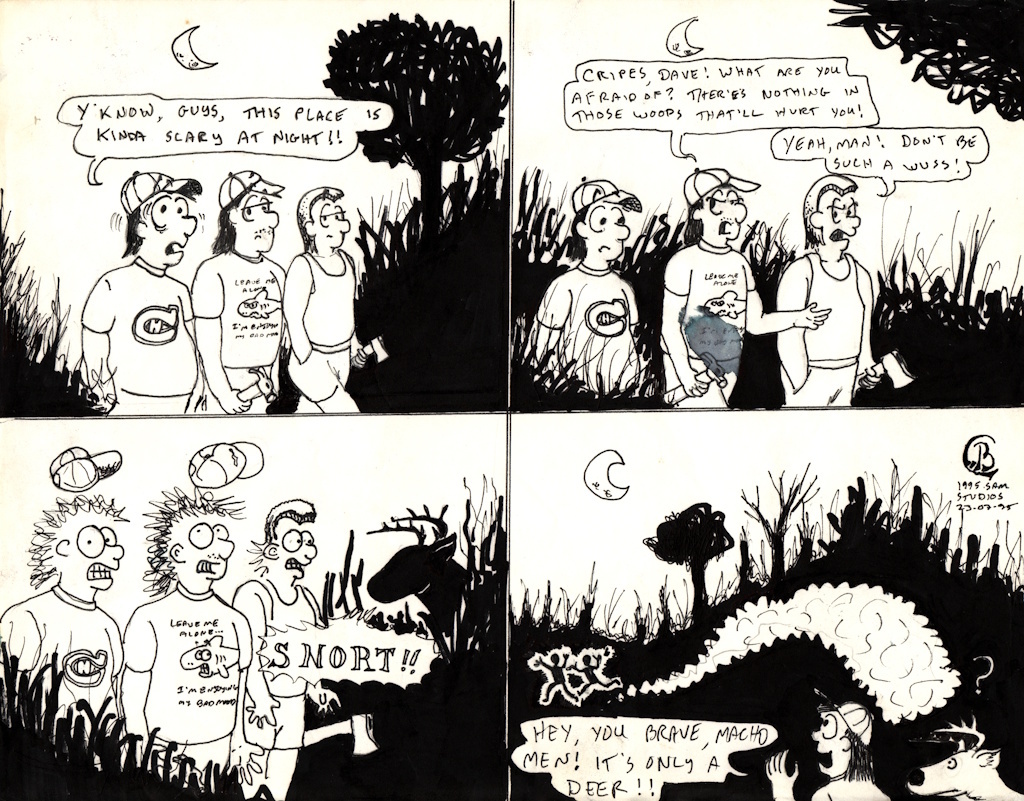
Speaking of experiments, here's an early monochromatic experiment in lighting. The art isn't particularly good, and the drawing was damaged by water many years ago, but you can see the effect that I was going for. Even then, it is a lighting disaster: The moon being behind the characters would have rendered them just as black as the background:
Even some of my favourite newer digital art that I've done is monochrome. I have always admired the crosshatching monochrome drawings of many political cartoons. Bruce Mackinnon is a local master, I highly recommend googling his stuff (I won't post an example here as he is highly defensive of his copyright, which I can't blame him) - a lot of it has been colourized but you can see the underlying monochrome drawings. While doing these drawings I do tend to notice that the time to do them goes way down and my enjoyment for doing them goes way up. Even still, I probably get a bit carried away because with digital it's just so easy to keep adding stuff until suddenly there is too much.
Like this simple drawing of Daecon flying. This was done digitally but I tried to make it like I used nothing other than a ballpoint pen:

And of course my monochrome magnum opus, Daecon driving the Big Boy locomotive. You can see that I was getting tired by the lack of detail toward the front end of the locomotive, especially the front set of driving wheels. This original drawing was over 10k pixels wide! I drew this as a personal challenge, though, so I forgive myself for going crazy:

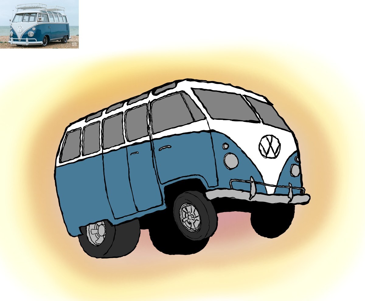
I did do a simple colour drawing recently though (by "recently" I mean within the last year, because I haven't been drawing or writing much at all lately): This simple Vokswagen split-window Kombi van. I set out to draw it cartoon style, and so I did. I think I need to do more like this. Back to basics.