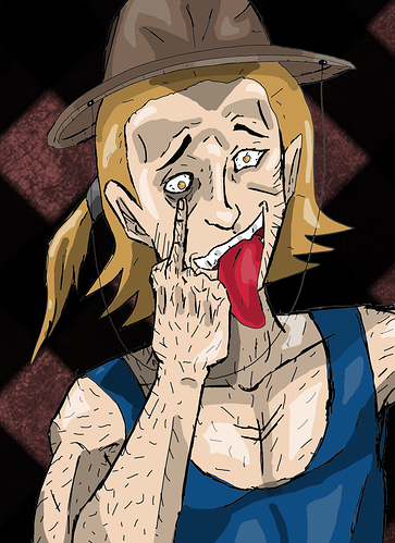
The choice of value isn't bad, but there are a few areas for improvement here...
Firstly and the biggest one is, it feels like you're putting down shadows next to lines, which is a good basic guideline... but without necessarily understanding the things you're drawing as a three dimensional object and where shadows should fall, so in a lot of places, the shadow is on the wrong side of the line, or there's a shadow next to a line that represents something more like texture rather than volume that would cast a shadow.
The vampire one in the middle particularly, there's no sense of a clear direction the light is coming from, and shadows in weird places like on top of hair, and in front of the tendons on the neck, or on top of the nose bridge. Try to think more about the head in 3D with light coming from a consistent direction. Like this:
The other thing to maybe just think about is using a colour in your shadows. They're a little grey, and you might find adding some purple or blue in there adds a bit more life.
Overall, keep trying, this stuff can be hard to learn, it's worth it!