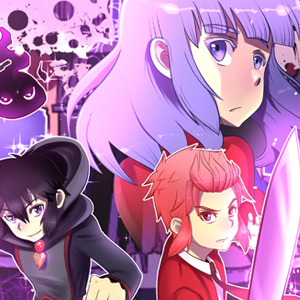
I feel a lot of people have weighed in already, but I tend to like the new one better due the dynamism of the poses. But I also agree it's a bit busy. If you picked a complementary color, like maybe a green, for the background, that would help the foreground pop out a bit more.
Since it's a thumbnail, I'm not sure how small it's going to be, but keeping it simple, but still dynamic (I really like how you've got a diagonal on the thumbnail,) will help make the image draw attention, but also have the characters be discernible.
I hope that actually helps XD I think I get too wordy...