1 / 10
Oct 2018

What are some tips you have for drawing black and white comics? and/or What are somethings you do to make them visually appealing?

This current project will be my first stab at black and white comics. Some of my main inspirations is manga of course. But transitioning form color can be a bit more challenge than i expected since some colors dont translate well value wise when compared to other colors.

  • created

    Oct '18
  • last reply

    Oct '18
  • 9

    replies

  • 3.0k

    views

  • 5

    users

  • 19

    likes

  • 4

    links

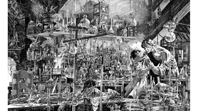
I would say that B/W comics, less is more. Don't go crazy with tons of shading like you would color. It just makes everything mush together. The beautiful thing about Manga is minimal shading, and even minimal backgrounds. There is usually an establishing shot and then everything else is left to the imagination.

For example:
51

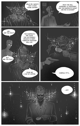
Notice how there is only 1 establishing shot.

18
Minimal use of grays, large areas of pure black and white

I think the hardest thing about going from color to BW is that you sorta have to let go a little bit, when you color you really have to color everything which isn't necessary anymore.

Here is my BW comic:

:smiley: Good luck!

Make sure your line work is STRONG and solid. "Scritchety" line work in most cases does not help the legibility of the artwork.

On the OTHER end of the advice spectrum...let's look at Bernie Wrightson.

A well thought out composition can use contrast and texture to create incredible atmospheres. This isn't to say the suggestions given for manga storytelling isn't sound but there are a variety of approaches. From Frank Miller's sparse Sin City to Jeff Smith's animation inspired Bone, look for the approach that fits you and your story best. Then break that down to find the guidelines that work best in that.

Thank you for coming to my TED talk, Ha Ha!

This is probably what my brain is trying to get me to do, but the whole reason i'm doing B/W is so i can save time, and try a new style of comic. A nice balance between both spectrums. Thank you for the advice!

This is something im really have to learn to cut back on. Working with color so long has put me on a learning curve with this. Gotta practice, thank you for the great advice!

If you haven't read Scott McCloud's UNDERSTANDING COMICS, he devotes a lot of time to a style used in Tin Tin where the characters are simplified and the backgrounds are more detailed. This approach also works well in black and white. Just an addition thought.

As a black and white guy, I try to think of pages in terms of light and darkness. Chiaroscuro and all that. When I plan the comic I try and think like Joseph Stefano designing an episode of The Outer Limits.

Blah, forgot my pic like an idiot.

But yeah, it's all about the interplay of light and dark. Bright lights and shadow. A lot of pages of my comic are like this.