This has been in the works for literal months...for the first draft, I drew a building specifically for this tutorial, and it turned out awful, so I had to scrap it. >_<
Then I finally started work on a comic page with a building in it, and decided to just use that for this. But honestly, having that one image tied to two separate obligations just made it easier to procrastinate...fast forward several weeks, and here we are. ^^;
So the first step of learning to draw buildings is convincing yourself, conceptually, of what buildings look like.
I don’t know if everyone is like this, but I personally have always had a hard time “believing” buildings. ‘So like, the building is just on the ground; like it’s just TOUCHING the ground with nothing in between??’ Yes, actually; in many cases it IS that simple: put a box on the pavement and you have a building.
What helps with believability is all the stuff around it: plants, cars, signs, lampposts, garbage cans, etc. But we’re mostly gonna focus on the big box.
So you’re getting ready to draw the building. The first thing that I recommend you do is to streamline the process as much as possible by compensating adequately for your weaknesses.
For example, if you can’t draw straight lines, FOR GOD’S SAKE USE A LINE TOOL! Or get a ruler, at least…the inability to draw perfectly straight lines without assistance is not some kind of moral failing; PLEASE feel free to just make things easier on yourself…
There are other things you can do to prepare as well: set up a perspective grid, decide what specific kind of building you want to draw (“convenience store” is a much less stressful concept to grapple with than just “building”) and what features it should have, and/or add whatever foreground elements are present so you have a reference for scale/angle.
If you feel like you need all the preparations, DO ALL THE PREPARATIONS. Don’t get lazy; you’ll thank yourself later.
Now all that’s left to do is to actually draw the building. ^^; It took a lot of self-convincing, but in the end I decided it’d be best if I showed my own process as an example:

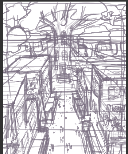
So here is my initial sketch. I drew it on paper first, because my eye for perspective is just better when I draw by hand (if you are a digital artist who struggles with perspective, you may want to try this...muscle memory IS a thing, y’know, and if switching mediums for a bit will save you some frustration, by all means).
Notice how ridiculously simple it is. ^^; The big rectangles up top are supposed to be double windows that I couldn’t be arsed to draw…but that’s okay. The point of the sketch is just to outline all the major parts, and make sure it all fits.
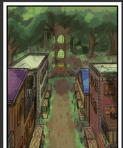
Time for the next step: so here we’ve traced over the sketch and straightened everything out.

This is still kind of a sketch (notice I haven’t filled any details in yet…). The point of this step is to perfect the rough perspective from the initial sketch. And by ‘perfect’, I mean make it the most logical version of itself. Be careful not to go overboard with your corrections…don’t let GEOMETRY!mania take over!
So this goes out to all the other intuitive artists out there: GEOMETRY!mania is what I call the urge to make everything into shapes you can understand once you get a line tool in your hand. This isn’t a bad thing: if you meant to draw a rectangle, you should definitely add a rectangle.
The problem arises when you don’t actually know what shape you meant to draw, but assume it’s a rectangle, or a triangle, or whatever because that “looks” correct (spoiler alert: when you have a straight-line tool in hand, EVERYTHING “looks” correct). And before you know it you’ve distorted the perspective of the entire drawing. =/
In technical language, I’d say that this is probably because you have a higher-point perspective than you realize (for example, you intuitively sketched in 2-point perspective, but corrected it thinking it was just 1-point perspective on a slant).
I don’t know how to solve this outside of just trial and error. ^^; If you feel you have a good handle on perspective, learn to just trust your sketch: trace over the whole thing first, then start looking for mistakes.
If you do not have a good handle on perspective yet, I’d advise you to just grid it out. Even if it’s just a 2-line grid (they can help more than you think).
And overall, trust your gut. If the grid says you should do one thing, but you really think it makes the drawing look worse instead of better, don’t do it! Go with your gut! Odds are you just drew the grid wrong!
Anyway:

Now I’m adding details with blue (technical) and red (decorative~). This is a comic panel, so I have text boxes, too.

A little cleaning~

Finally, I collapse the drawing to one layer, delete the sketch, and monochromize (I also resized some of the lawn décor, but I forgot to save that step separately). Doesn’t look half bad, if I do say so myself. ;9
And now that that's done, here's a contradictory-sounding piece of advice: in 80% of the comic panels you draw, the buildings won’t really matter. ^^;
Hardly anyone is going to look at them for longer than half a second, you know? Getting good at drawing them is a good thing (I mean, that other 20% still exists…) but a much more important skill to learn is the ability to throw some lines/shapes in the background that give the impression of a building being there, and moving on.
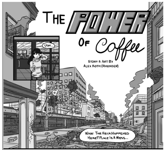
My comic Memor1n0 takes place in a city, so I've had to get into the habit of doing that:
If you inspect these backgrounds closely, they don’t always make total sense. ^^; But at first glance, due to the division of the space, you see “building”, and for those panels, where the focus is clearly on other things, that’s really all you need.
+++
Ooof, it's finally over. =P I dunno if this tutorial is particularly well written (it's kinda been stitched together haphazardly over time...) and the forum itself has been very uncooperative all day; I dunno if all the pictures loaded right...all that is to say, if you have any questions or tips of your own to share, as always, feel free. ^^;